Chomps

Source: chomps.com License: All Rights Reserved.


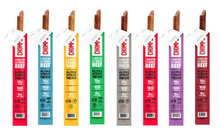
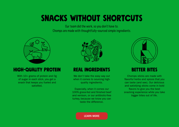
New York-based Zero Studios reimagined Chomps with a bold, cohesive identity built to dominate the snack aisle and scale across digital and retail environments. From packaging to social media, the work balances immediacy with clarity. The direct messaging, high contrast color, with a playful tone and visual presence position the brand as energetic and a little bit rebellious.
The typographic system is anchored by Mindset from PintassilgoPrints, an all-caps sans serif designed by Erica Jung and Ricardo Marcin, in just two weights (Regular and Slim) with enough range to establish hierarchy while keeping the brand voice tight and unmistakable. Colby from J Foundry runs deep (six widths, five weights, italics) but Zero pulls just a single cut, letting its character do the work. That kind of restraint says something about the confidence of the system. ITC Franklin Gothic handles the smaller text, bringing familiar American sans serif authority where structure and readability are key.
Together, the type palette reflects the broader strategy: strong, efficient, and built for impact. Zero’s work shows how a restrained typographic system—when deployed with precision—can carry an entire brand with confidence.
See more of the project on on Zero Studio’s site.
Source: chomps.com License: All Rights Reserved.

Source: www.instagram.com License: All Rights Reserved.

Source: chomps.com License: All Rights Reserved.

Source: chomps.com License: All Rights Reserved.
Source: chomps.com License: All Rights Reserved.
This post was originally published at Fonts In Use