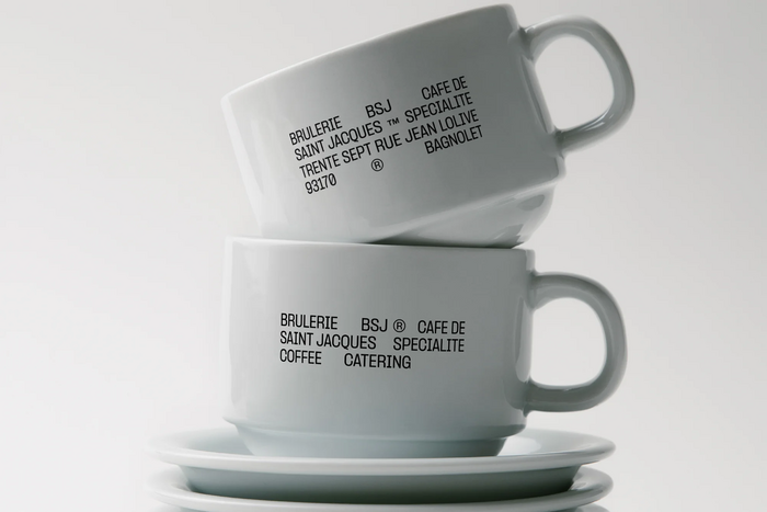
Brûlerie Saint-Jacques
Source: studioavenir.fr Photo: Pangram Pangram. Studio Avenir. License: All Rights Reserved.


Paris-based Studio Avenir designed the identity for Brûlerie Saint-Jacques a.k.a. BSJ Coffee in Bagnolet, France. From an article by The Brand Identity:
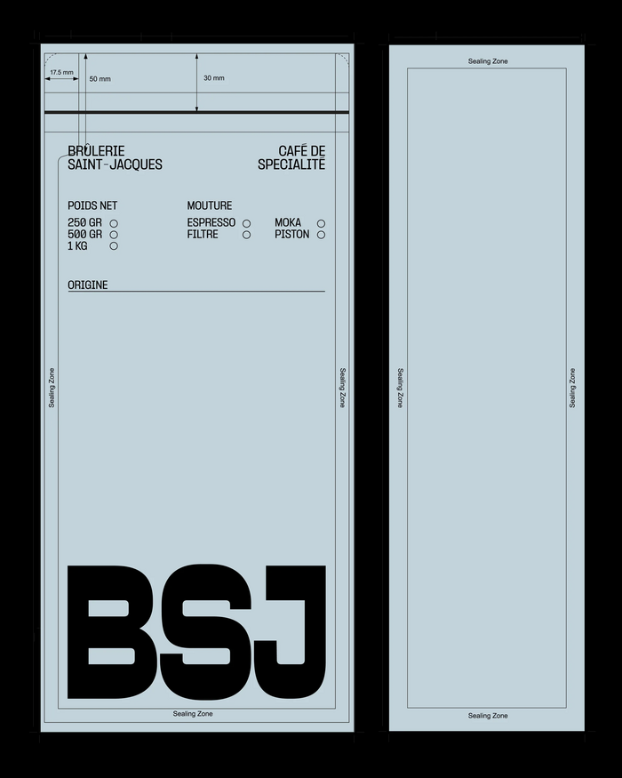
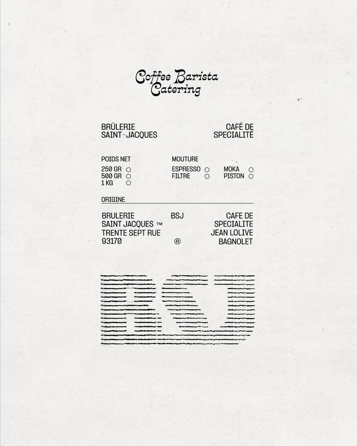
The decision to lead with utility is unusual for the coffee category. Speciality coffee tends to dress itself in warm browns, hand-drawn marks and analogue craft cues that signal artisanship through softness. BSJ says no to that. The label functions as a form, with the variables a roaster needs to communicate arranged with the structural clarity of a logistics document. “We designed the label in a way that emphasises the expertise of the roastery, drawing on technical layout conventions,” explains Clementine Cornu Thenard, Art Director & Co-founder at Studio Avenir.
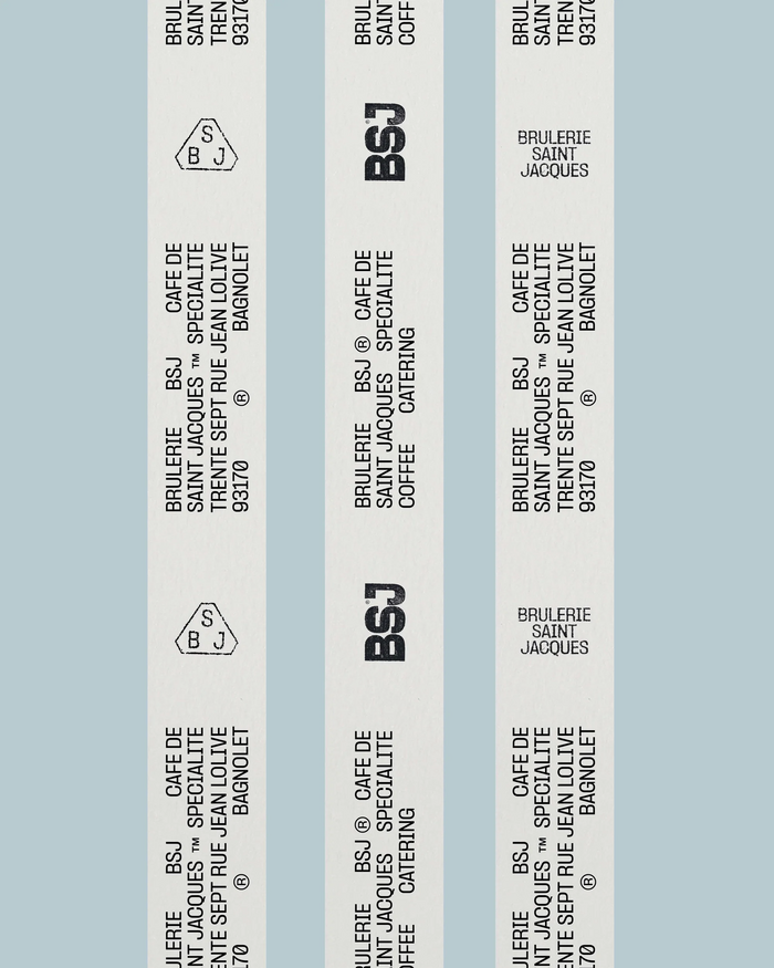
Anchoring the system is a modular BSJ monogram that exists in three distinct forms. A bold, condensed wordmark handles primary identification. A hatched, line-filled version reads as a textured, almost printed-on-paper variant that animates labels and tape. A geometric badge mark, set within a soft polygonal outline, behaves like a stamp or seal. Each appears in different contexts. “There are indeed several ways to write BSJ, which allows for a more expressive and flexible identity, while enabling both the old and new lettering styles to coexist,” Clementine notes. “All of these lettering variations also help showcase the research and exploration behind the work.”
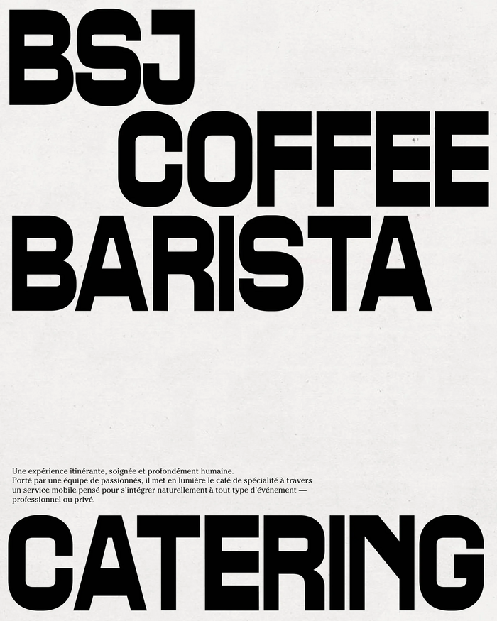
“We worked with two very different typefaces: one modular, and a more rounded script style,” Clementine explains. “The client wanted to highlight the modular and adaptable nature of their event offering, while also giving the brand a new identity that feels more institutional and authoritative. We aimed to balance the rigid, angular aspect of the modular lettering with a more rounded typeface that feels accessible and authentic.”
One of the typefaces is Formula. The bold one with horizontal contrast is yet unidentified. Collateral fonts in use include ITC Cheltenham and Crayonette DJR.
Source: studioavenir.fr Studio Avenir. License: All Rights Reserved.
Source: studioavenir.fr Studio Avenir. License: All Rights Reserved.
Source: studioavenir.fr Studio Avenir. License: All Rights Reserved.
Source: studioavenir.fr Studio Avenir. License: All Rights Reserved.
This post was originally published at Fonts In Use