Wölkchen
Source: www.brotsalz.de Brot & Salz. License: All Rights Reserved.

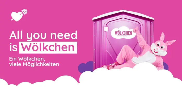
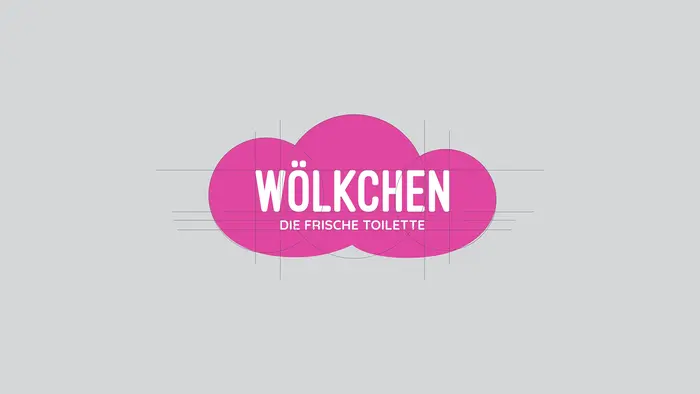
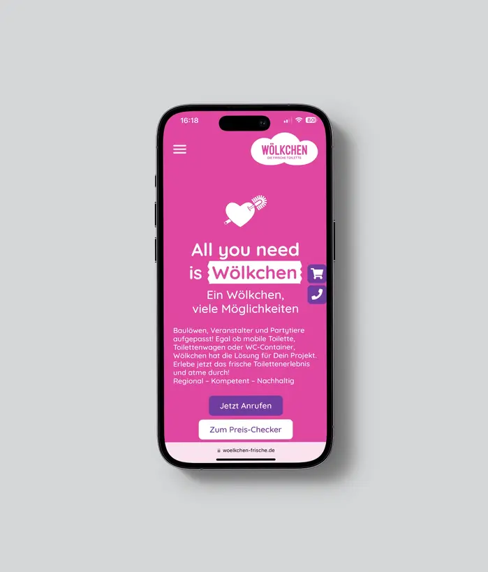
“Wölkchen” translates to “Little Cloud”. It is an intentionally delicate, harmless name that humorously contrasts with the gritty, odorous reality of a portable toilet. The brand’s promise is that ‘inside, you sit like on clouds’.
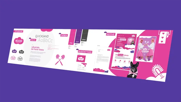
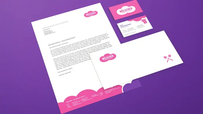
The typography is kept modern, airy, and self-assured, avoiding the heavy, industrial, caution-tape aesthetics usually seen in construction and event sanitation.
The portable sanitation market has traditionally been dominated by purely functional, clinical colors—usually sterile blues, deep greens, or drab greys. Wölkchen entirely rejects this. The brand's primary visual anchor is a vibrant pink. Described by its designers as ‘bright as pink cotton candy’, this color immediately disrupts the visual landscape of a muddy construction site, a city street, or a crowded festival. By using a color associated with playfulness, sweets, and pop culture, the design creates a stark contrast against established market participants. It refuses to blend in, instead demanding attention and embracing visibility.

Source: www.brotsalz.de Brot & Salz. License: All Rights Reserved.
Source: www.brotsalz.de Brot & Salz. License: All Rights Reserved.
Source: www.brotsalz.de Brot & Salz. License: All Rights Reserved.
Source: www.brotsalz.de Brot & Salz. License: All Rights Reserved.

Source: www.brotsalz.de Brot & Salz. License: All Rights Reserved.

Source: www.brotsalz.de Brot & Salz. License: All Rights Reserved.
Source: www.brotsalz.de Brot & Salz. License: All Rights Reserved.
This post was originally published at Fonts In Use