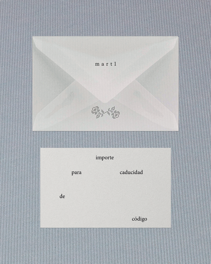
martl studio visual identity
Source: toston.studio Tostón Studio. License: All Rights Reserved.


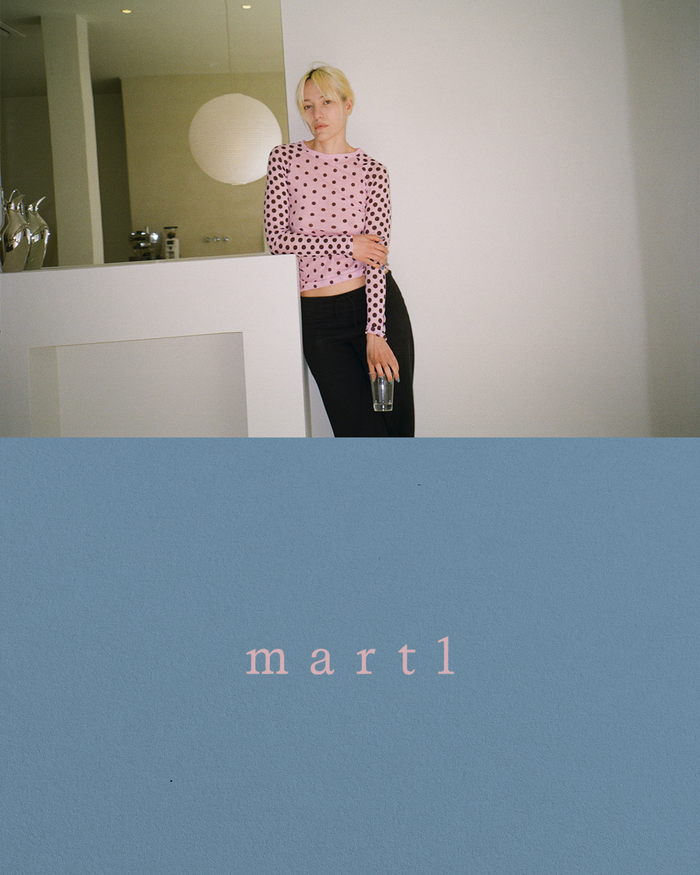
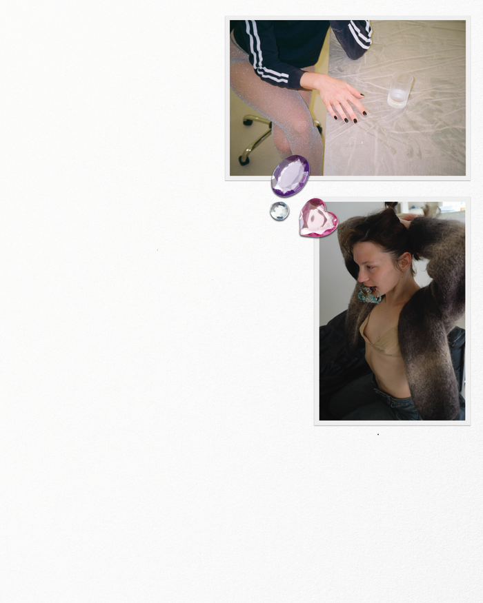
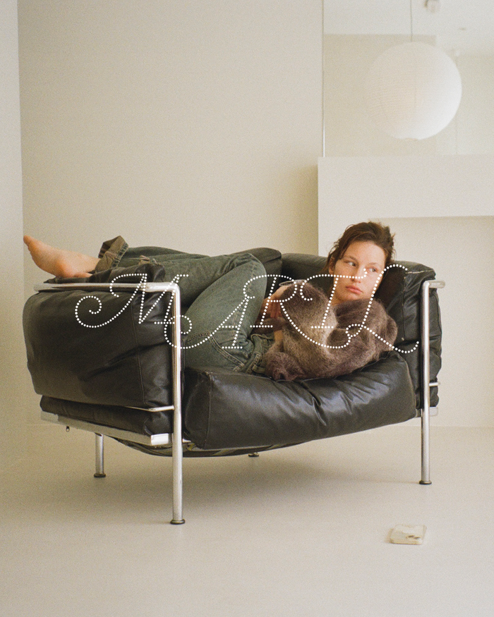
Visual identity for Martl, a nail studio in Madrid that moves away from the conventional codes of the industry and proposes a different way of seeing: nails not as an accessory, but as language and expression.
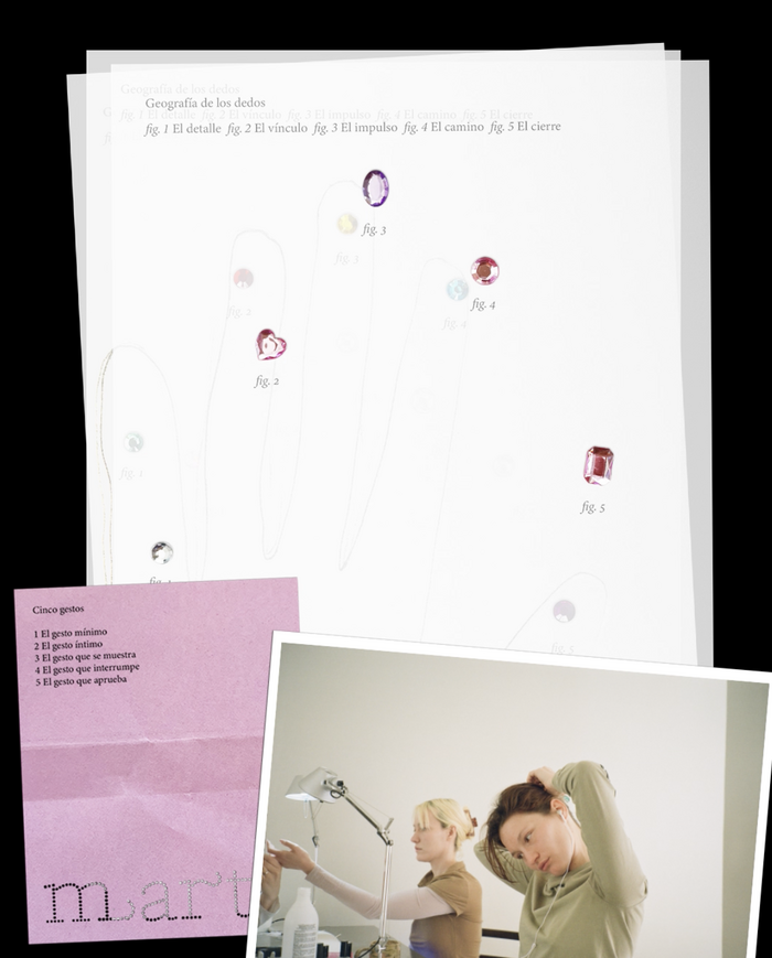
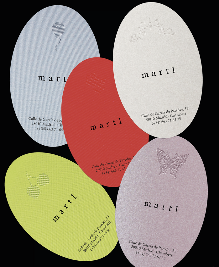
The identity is rooted in hands as a point of contact with the world. In the fingers, their movement, and the spaces created between them. That is where the structure lies: in space and silence. The visual system is built around this gesture, incorporating elements from the universe of nail art such as diamonds, glitter, and stickers.
The identity reflects a sober and conceptual brand that combines precision and sensitivity. It exists in a balance between mature femininity and a raw, almost underground attitude. A brand that avoids perfection and the promise of transformation, choosing instead to focus on what is already there.
Photography by @zooooooooooooooooe.
Source: toston.studio @zooooooooooooooooe. License: All Rights Reserved.
Source: toston.studio Tostón Studio. License: All Rights Reserved.
Source: toston.studio Tostón Studio. License: All Rights Reserved.
Source: toston.studio Tostón Studio. License: All Rights Reserved.
Source: toston.studio Tostón Studio. License: All Rights Reserved.
This post was originally published at Fonts In Use