Boldly
Published July 4, 2023
By FontsInUse
Contributed by Roy Cranston
Source: works.studio WØRKS. License: All Rights Reserved.


Source: works.studio WØRKS. License: All Rights Reserved.
Source: works.studio WØRKS. License: All Rights Reserved.
Source: works.studio WØRKS. License: All Rights Reserved.
Source: works.studio WØRKS. License: All Rights Reserved.
Source: works.studio WØRKS. License: All Rights Reserved.
This post was originally published at Fonts In Use
Source: works.studio WØRKS. License: All Rights Reserved.
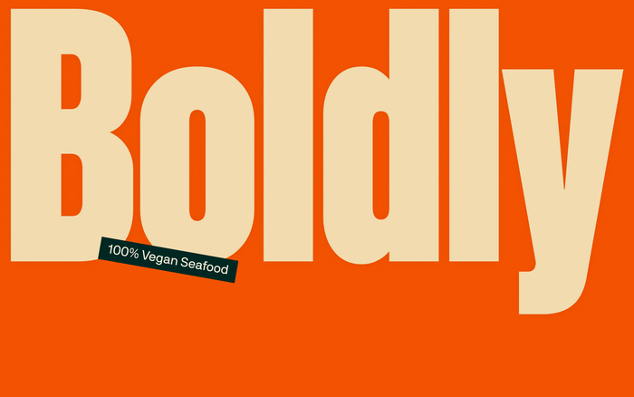
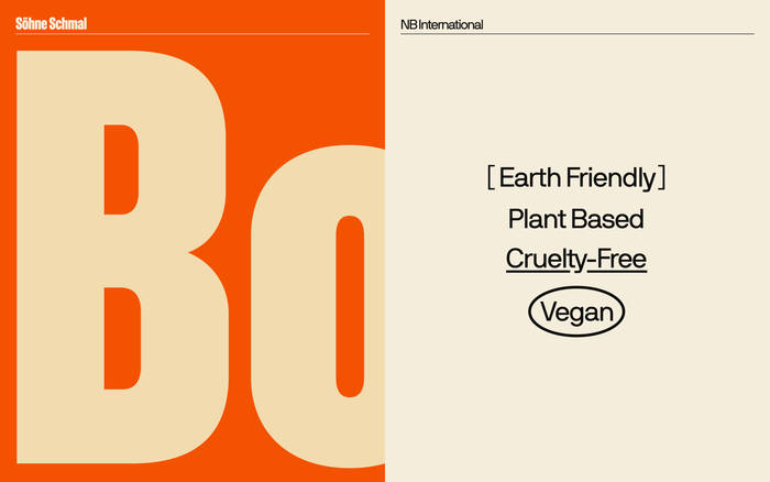
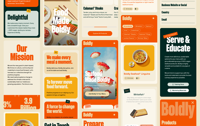
Boldly’s brand typeface is Söhne Schmal Fett. This weight of Söhne is narrow, bold, and condensed, delivering Boldly’s graphic feel. It’s a typeface that delights in tension.
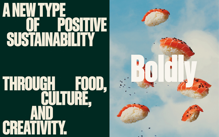
The secondary typeface is NB International. It is mainly used for subheadings, body copy, details, and other additional non-primary text. Its angled curves provide a unique quirk to the common grotesk and gives text an edge of personality that would otherwise be absent.
Source: works.studio WØRKS. License: All Rights Reserved.
Source: works.studio WØRKS. License: All Rights Reserved.
Source: works.studio WØRKS. License: All Rights Reserved.
Source: works.studio WØRKS. License: All Rights Reserved.
Source: works.studio WØRKS. License: All Rights Reserved.
This post was originally published at Fonts In Use
Read full story.
WRITTEN BY
FontsInUse
An independent archive of typography.