Karls Erdbeeren campaign
Published July 3, 2023
By FontsInUse
Contributed by Sebastian Johansen
Source: www.kreuzbergkind.de Kreuzbergkind. License: All Rights Reserved.


Source: www.kreuzbergkind.de Kreuzbergkind. License: All Rights Reserved.
Source: www.kreuzbergkind.de Kreuzbergkind. License: All Rights Reserved.
Source: www.kreuzbergkind.de Kreuzbergkind. License: All Rights Reserved.
Source: www.kreuzbergkind.de Kreuzbergkind. License: All Rights Reserved.
Source: www.kreuzbergkind.de Kreuzbergkind. License: All Rights Reserved.
Source: www.kreuzbergkind.de Kreuzbergkind. License: All Rights Reserved.
This post was originally published at Fonts In Use
Source: www.kreuzbergkind.de Kreuzbergkind. License: All Rights Reserved.
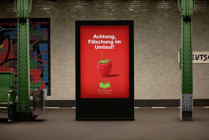
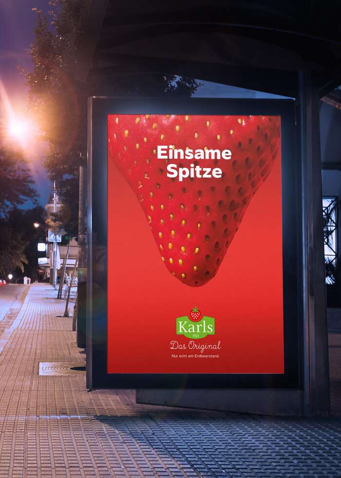
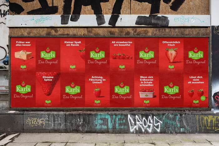
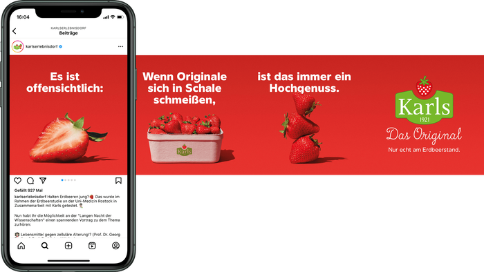
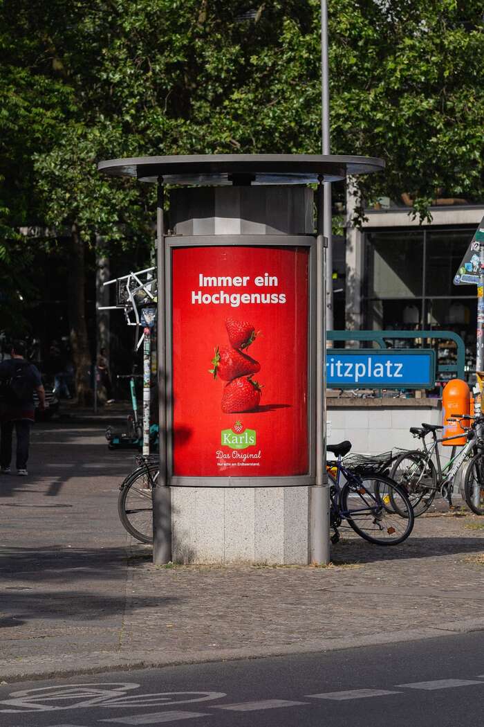
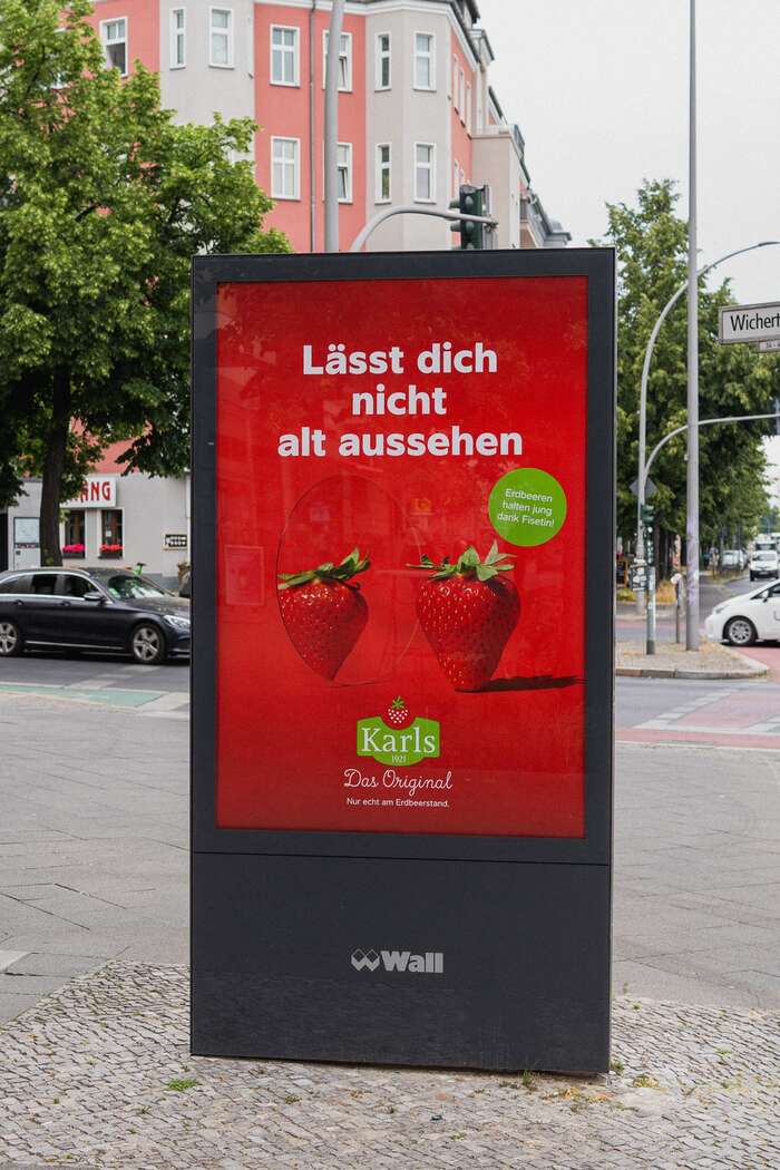
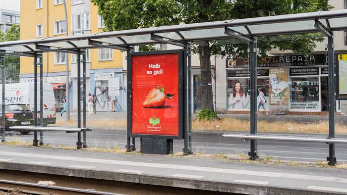
From agency Kreuzbergkind (translated):
With our funny campaign we bring Karls strawberries on everyone’s lips. Because after a century, the strawberry original is advertising its delicious little fruits for the first time. So we gave them the appearance they deserve: iconic, playful, red. So that every motif feels like a visit to Karls adventure villages. Sweet, right?
The typeface used for the campaign is Arnet by Ultra Kuhl. The (preexisting) logo combines Res Publica for “Karls” with True North Script for “Das Original”.
Photography by EyeCandy Berlin
Post production: Tilmann Classen
Food styling: Natasha van Velzen
Motion design: DORIAN dodo HEHN
Online media planning: Robert Helbig
Source: www.kreuzbergkind.de Kreuzbergkind. License: All Rights Reserved.
Source: www.kreuzbergkind.de Kreuzbergkind. License: All Rights Reserved.
Source: www.kreuzbergkind.de Kreuzbergkind. License: All Rights Reserved.
Source: www.kreuzbergkind.de Kreuzbergkind. License: All Rights Reserved.
Source: www.kreuzbergkind.de Kreuzbergkind. License: All Rights Reserved.
Source: www.kreuzbergkind.de Kreuzbergkind. License: All Rights Reserved.
This post was originally published at Fonts In Use
Read full story.
WRITTEN BY
FontsInUse
An independent archive of typography.
More from FontsInUse