Favrit brand identity
Source: sdg.no License: All Rights Reserved.


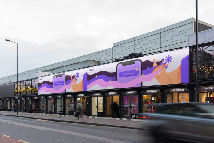
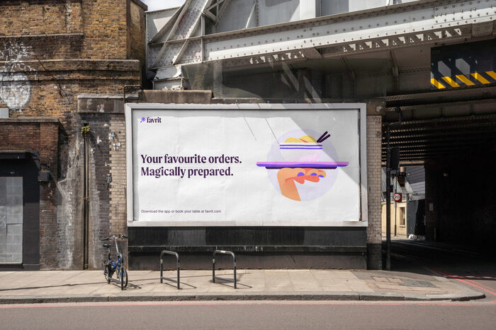
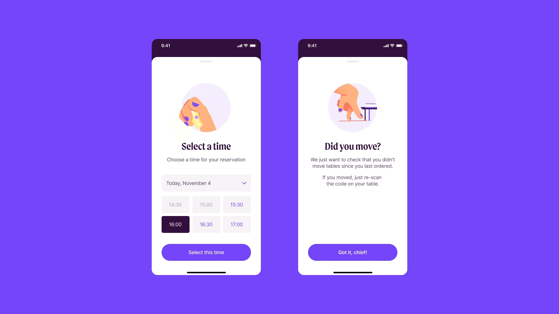
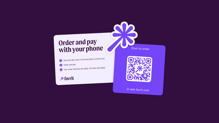
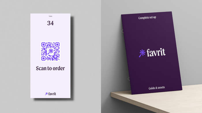
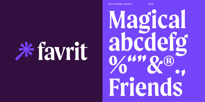
Scandinavian Design Group rebranded Favrit, one of Norway’s leading ordering and payment solutions in the hospitality industry. Moret by The Northern Block is the brand’s primary display typeface, alongside Inter for supporting text and information.
The design studio explains:
The brand identity builds on Favrit as your invisible friend—the magical genie—always in your pocket. The design concept runs through the entire identity program and lays the foundation of a brand that’s able to provide extraordinary customer experiences. Simple, disruptive, surprising and hopefully a tad magical.
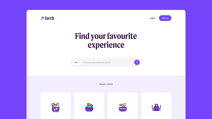
A bold but controlled serif display typeface gave Favrit the perfect voice to communicate the engaging tone of voice, across all screens and mediums. It provides human warmth and a personal sensibility to the brand. Combined with a pragmatic and highly functional sans serif to maximise legibility on smaller copy, the typopgraphy strikes a balance between human warmth and technical precision — a combination also embodied in Favrit’s product.
Source: sdg.no License: All Rights Reserved.
Source: sdg.no License: All Rights Reserved.
Source: sdg.no License: All Rights Reserved.
Source: sdg.no License: All Rights Reserved.
Source: sdg.no License: All Rights Reserved.
Source: sdg.no License: All Rights Reserved.
Source: sdg.no License: All Rights Reserved.
Source: sdg.no License: All Rights Reserved.
Source: sdg.no License: All Rights Reserved.
This post was originally published at Fonts In Use