Board Game movie poster and titles
Joe Fordham. License: All Rights Reserved.


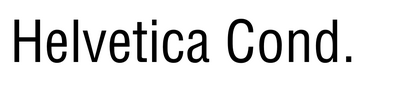
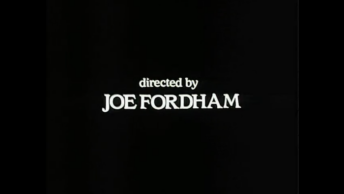
Denby Medium was my weapon of choice as font for my first 16mm short film, Board Game, made in 1985. I loved the old world classic style that, I now think, I subconsiously associated with the ITC Souvenir font used in JAWS (I may be projecting wishful thinking there).
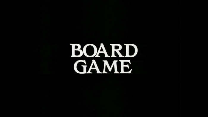
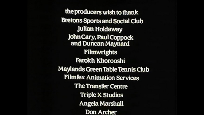
I purchased two giant sheets of Letraset from an art supplier on Old Compton Street (I forget the name but it has now long gone) and I mocked up all the titles by hand. I was not very accurate, particularly in my long end-title crawl, which drifted here and there.
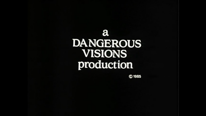
I then had a local photo supplier create high-contrast black and white Kodaliths, which I mounted into opaque black A1 sheets and handed off to my friend, Laurie Calvert, who was working as a rostrum camera operator at Filmfex Animation Services in Soho. He shot my art backlit on 16mm Eastmancolor film on his computerized animation stand, working after hours to push the footage through on the end of his day’s work on TV commercials.
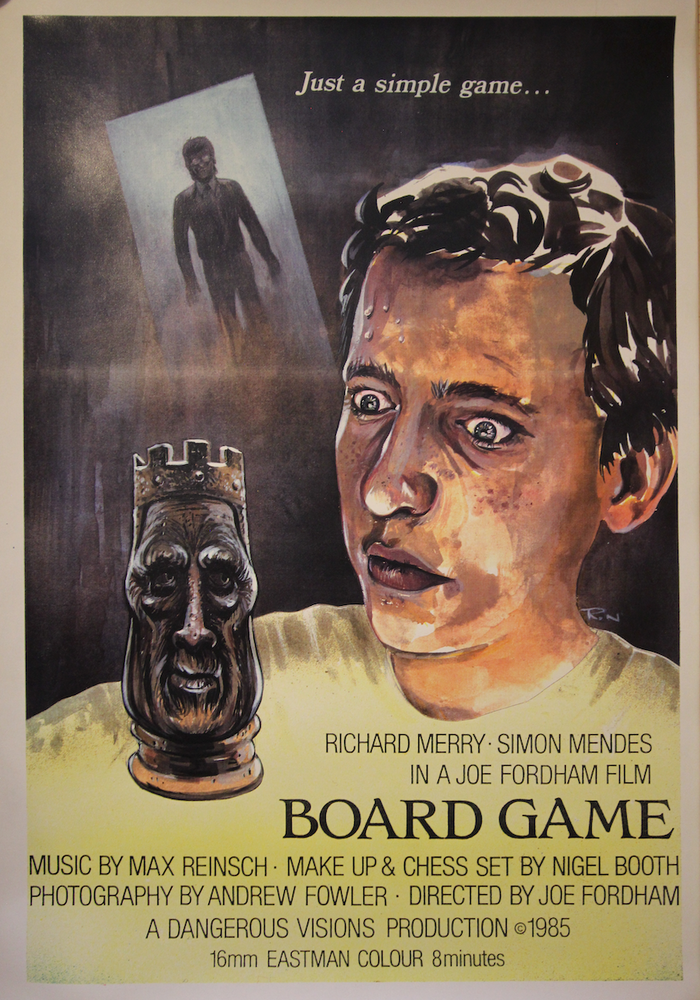
Laurie handed me the negative and I was thrilled to have my own nicely timed animated titles, complete with a nice smooth end-roller. Rank Film Labs edited the negative. I handed the remnants of my Letraset to an artist friend, Richard Nye, who incorporated my Denby Medium logo and hand-painted my poster.
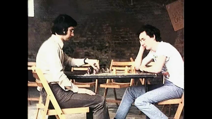
My film went on to win the BBC TV Showreel 86 competition, and I have a page devoted to it at my website.
Joe Fordham. License: All Rights Reserved.
Joe Fordham. License: All Rights Reserved.
Joe Fordham. License: All Rights Reserved.
Joe Fordham. License: All Rights Reserved.
Joe Fordham. License: All Rights Reserved.
This post was originally published at Fonts In Use