Ligne magazine and website
Source: www.principal.studio Principal. License: All Rights Reserved.


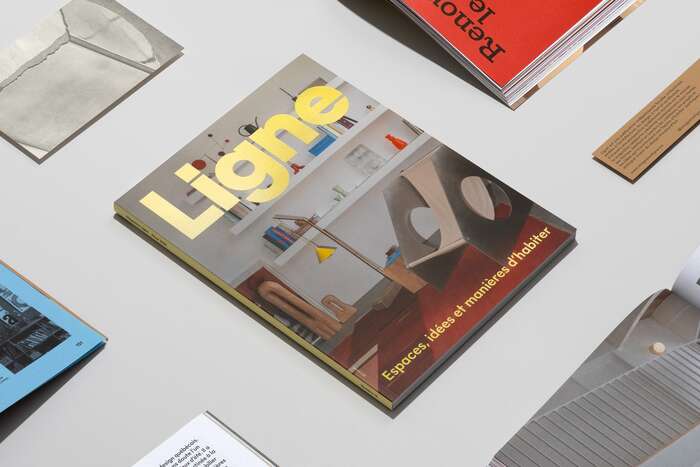
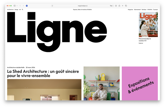
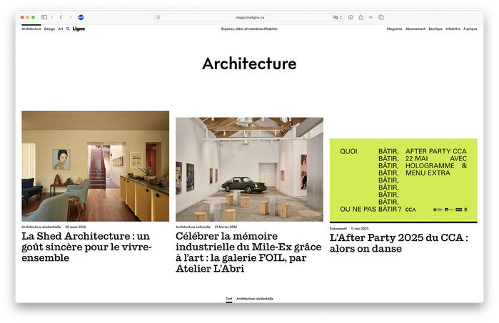
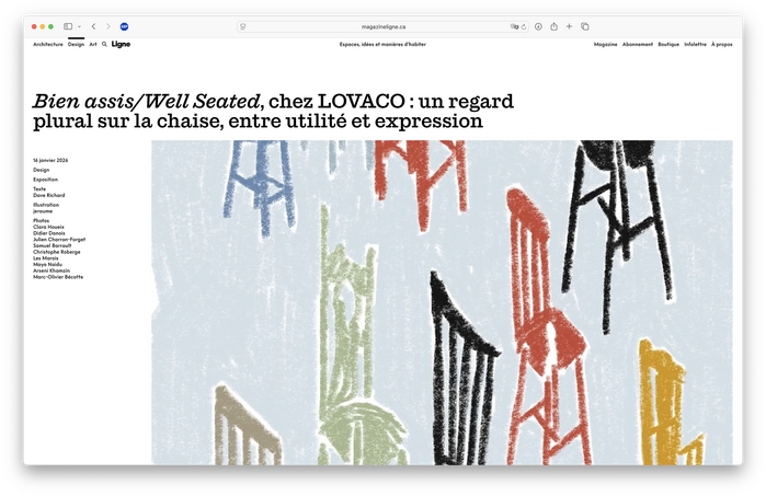
Founded in Montréal, Ligne is an independent magazine dedicated to art, architecture, design, and lifestyle. In 2025, Ligne brought in Principal to overhaul their branding, logo, magazine layout, and digital experience. The redesign employs FT Habit from Formula Type as the primary typeface and Commercial Type’s Successor for display. The new look debuted in the November 2025 issue of the print magazine.
From a case study of the rebrand on Principal’s website:
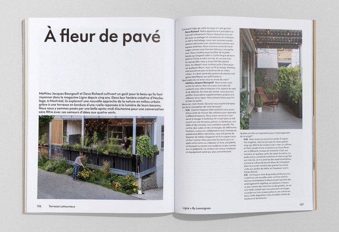
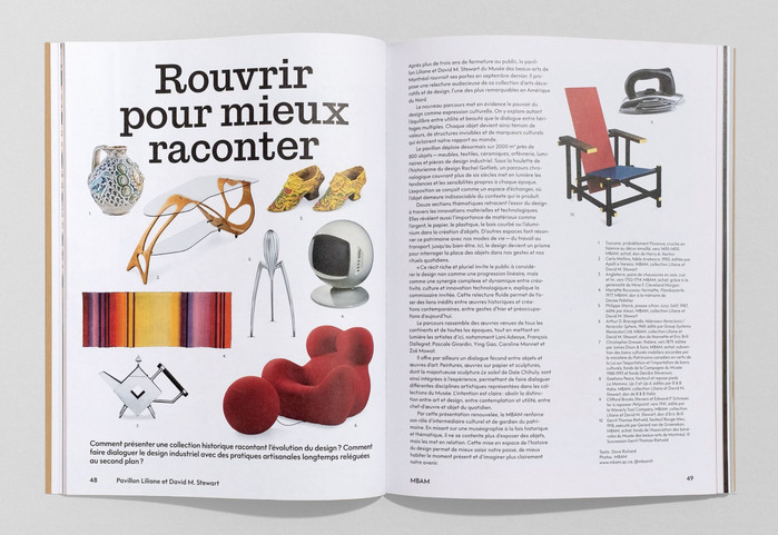
The new positioning stems from a simple conviction: design practices can reach a broad public. This is achieved not by simplifying or diluting the subject matter, but by making Ligne’s world more welcoming, vibrant, and open. The logo serves as a minimalist anchor. Understated yet assertive, its simplicity allows it to coexist with rich editorial compositions and an ever-evolving graphic universe. The visual system is built on a bold typographic approach and a flexible grid that modulates the rhythm of the reading experience. Colour plays a central role, utilizing a dynamic visual language that modulates between magazine issues and digital presence, while maintaining total brand consistency.
Source: www.principal.studio Principal. License: All Rights Reserved.
Source: www.principal.studio Principal. License: All Rights Reserved.
Source: www.magazineligne.ca Principal. License: All Rights Reserved.
Source: www.magazineligne.ca Principal. License: All Rights Reserved.
Source: www.magazineligne.ca Principal. License: All Rights Reserved.
This post was originally published at Fonts In Use