Basha-Franklin Architects
Source: www.campbellhay.com Campbell Hay. License: All Rights Reserved.


Description of the project by the designers of the studio Campbell Hay:
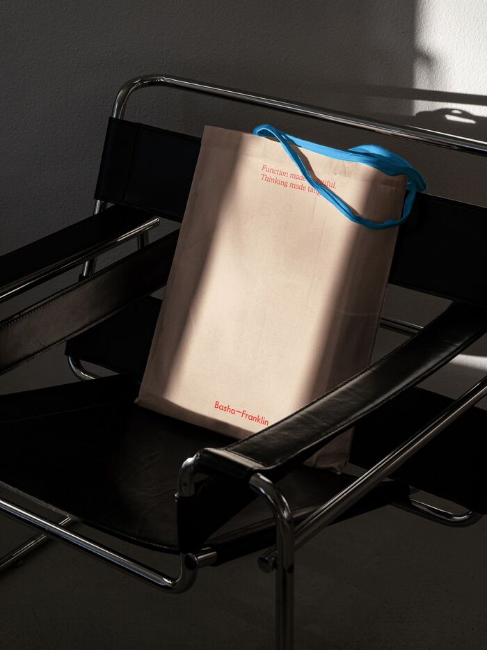
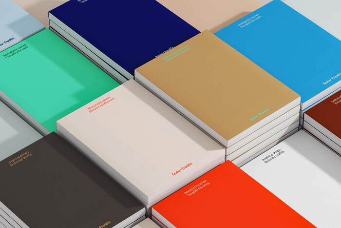
A new vibrant identity for interiors and architecture practice Basha-Franklin, where colours and language play an integral role in bringing their approach and work to life.
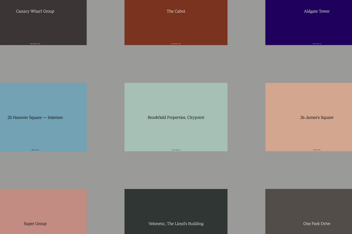
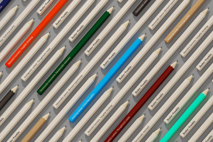
The project uses STK Bureau Sans and STK Bureau Serif throughout the new applications. The focus of the new identity is a series of carefully crafted copy lines, communicating the brand’s values and messaging, and a new extensive colour palette consisting of vibrant hues, deep darks, and soft pastels, allowing for full flexibility across all brand collateral. The result is a brand that showcases Basha-Franklin’s ability to create buildings and spaces rich with meaning and generous in spirit. The logo is based on Futura.
Source: www.campbellhay.com Campbell Hay. License: All Rights Reserved.
Source: www.campbellhay.com Campbell Hay. License: All Rights Reserved.
Source: www.campbellhay.com Campbell Hay. License: All Rights Reserved.
Source: www.campbellhay.com Campbell Hay. License: All Rights Reserved.
Source: www.campbellhay.com Campbell Hay. License: All Rights Reserved.
This post was originally published at Fonts In Use