A Child’s Garden of Grass album art, book cover and campaign

Source: archive.org Internet Archive. License: All Rights Reserved.


A Child’s Garden of Grass started out as a handbook written by Jack S. Margolis and Richard Clorfene, first published by Contact Books in 1969. In 1971, it was adapted into A Child’s Garden of Grass (A Pre-Legalization Comedy), a long-playing record produced and directed by Ron Jacobs, along with Margolis.
Dave Davison’s Fandango is used for the title both on the album cover and on the paperback reissue of the handbook by Pocket Books, as well as for the promotional campaign. Fandango is similar to Davison Bolero, with noticeable differences – such as Fandango having additional ornaments in certain glyphs or double notches in letters such as O and D. Both Fandango and Bolero are modelled after Central’s Othello.
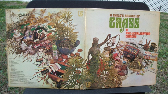
The album was art directed “in a joint effort” by Robert L. Heimall and William S. Harvey. The photo was styled by John Balsley. It features all kinds of topical items from marijuana plants, a hookah, tobacco crumbs, papers, and matchboxes to a Lady Justice scale, a package of Stoned Wheat Thins, pinback buttons, headphones, a can of air freshener with green leaves, and a Monopoly board.

Source: archive.org Internet Archive. License: All Rights Reserved.
There are some words at the top left of the back cover that use Smoke (“GRASS”), Flirt (“MARIJUANA”) and Karnac (“CANNABIS SATIVA”). Track list and credits are set in sober Helvetica.
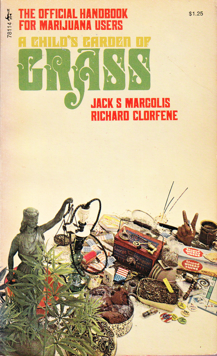
Source: www.abebooks.com John Thompson. License: All Rights Reserved.
Cover of the handbook as reissued by Pocket Books. The secondary typeface is (a phototype version of) Page No. 506.
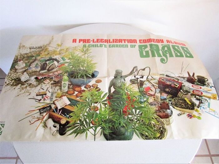
Elektra. License: All Rights Reserved.
Promotional poster by Elektra Records
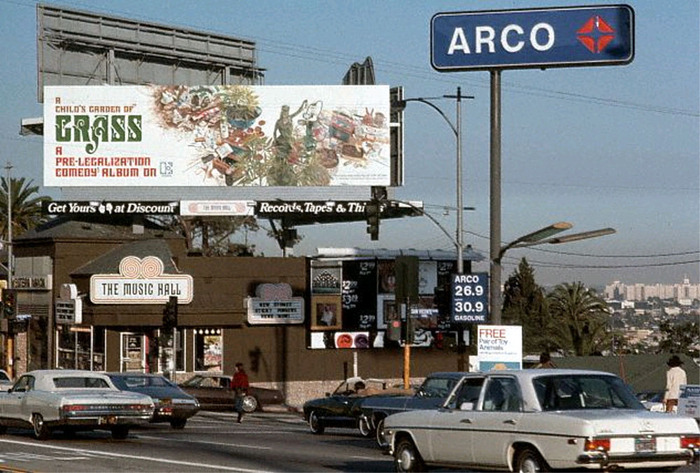
Source: www.flickr.com gsjansen. License: All Rights Reserved.
A billboard on Sunset Strip, advertising the release of the album in 1971. Coincidentally, the Music Hall sign below uses a stylistically related typeface, Rubens.
Source: www.flickr.com westcoastpopart1. License: All Rights Reserved.
Front and back of the gatefold LP
This post was originally published at Fonts In Use