The Byrds – Turn! Turn! Turn! album art
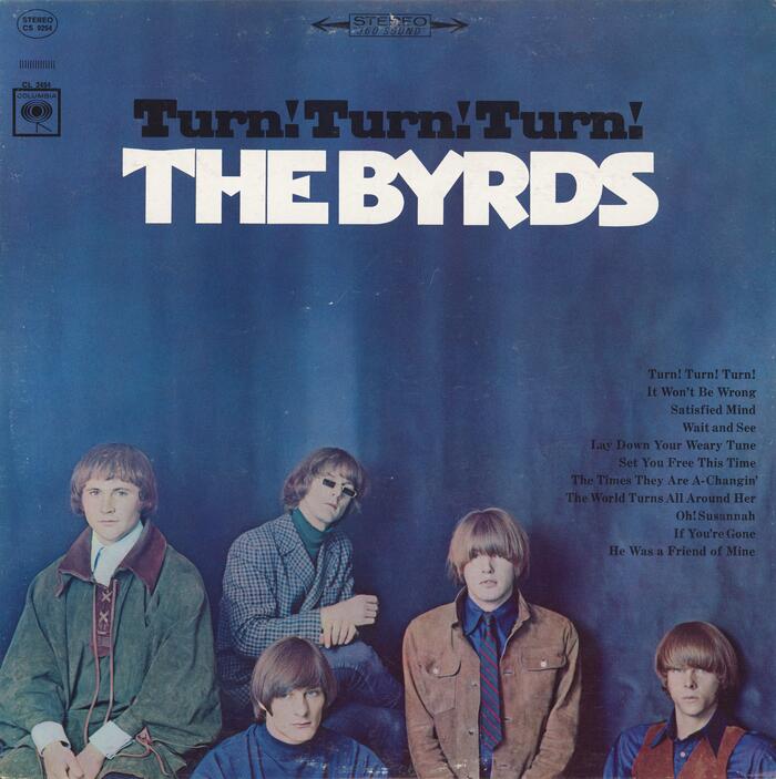
Source: archive.org Columbia Records; Photograph by Guy Webster. Scan: Internet Archive. License: All Rights Reserved.
Album cover – U.S. Stereo version


The novel triangular features of Novel Gothic turn up in another Columbia album, 1965’s Turn! Turn! Turn! by the Byrds.
The title, with rounded lowercase r might be hand-drawn, with a triangularized exclamation mark that seems to have been inspired by the Novel Gothic below. The song names are set in Century Schoolbook Bold. Liner notes are printed on the back of the cardboard sleeve in Akzidenz-Grotesk.
Ancillary text uses the record label’s typical house style and typefaces, which vary in some cases by market. For example, the record labels of the German version use a combination of Metro No. 2 and Erbar-Grotesk.
Columbia Records used the CBS imprint outside of the USA and was owned at the time by the Columbia Broadcasting System (then a major radio and television company).
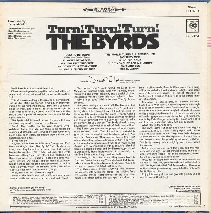
Source: archive.org Columbia Records; Photograph by Guy Webster. Scan: Internet Archive. License: All Rights Reserved.
Rear of album cover – U.S. Stereo version
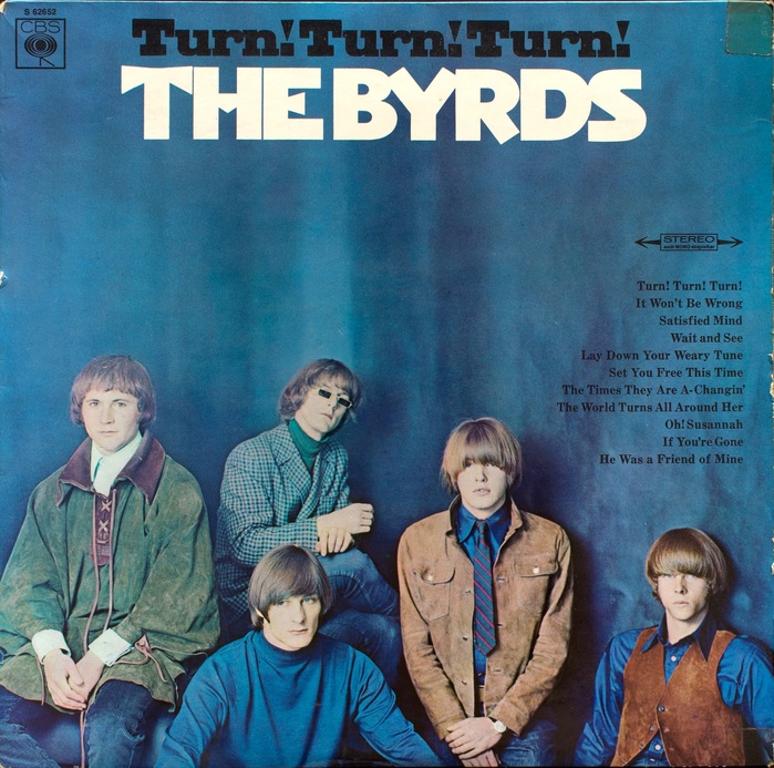
Columbia Records; Photograph by Guy Webster. License: All Rights Reserved.
Album cover – Germany Stereo version
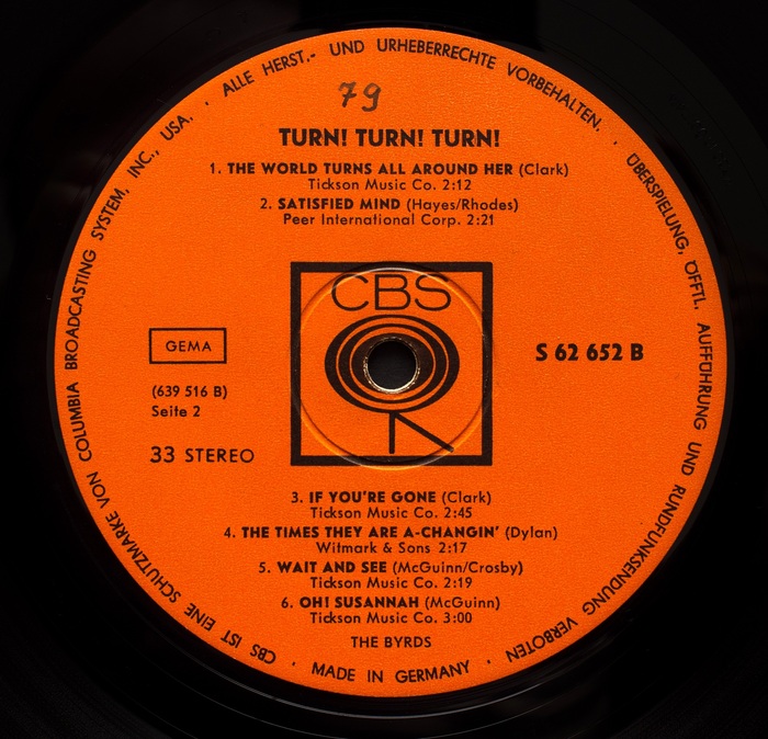
Columbia Records/CBS. License: All Rights Reserved.
Record label – Germany version
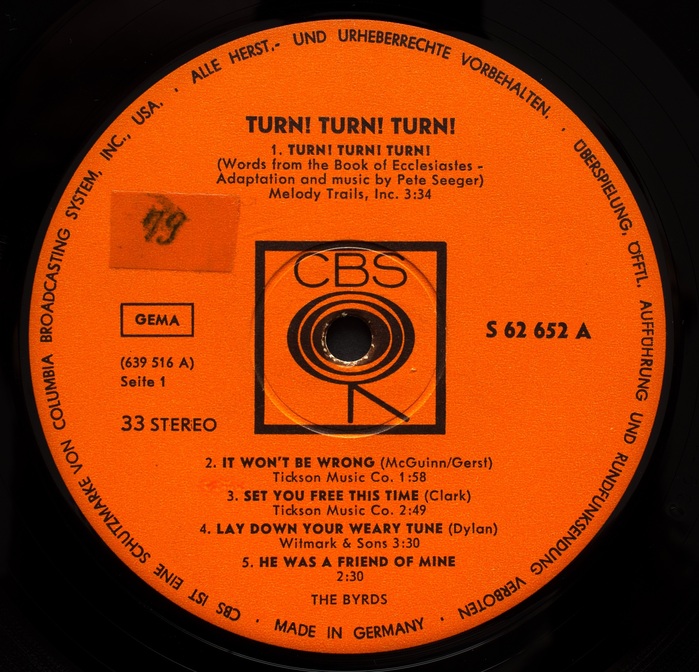
Columbia Records/CBS. License: All Rights Reserved.
Record label – Germany version
This post was originally published at Fonts In Use