Werte Wandel Wirken. 275 Jahre Ordensklinikum Elisabethinen
Source: mooi-design.com Lisa Edi. License: All Rights Reserved.


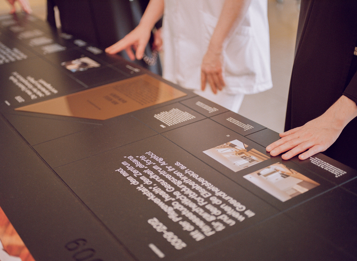
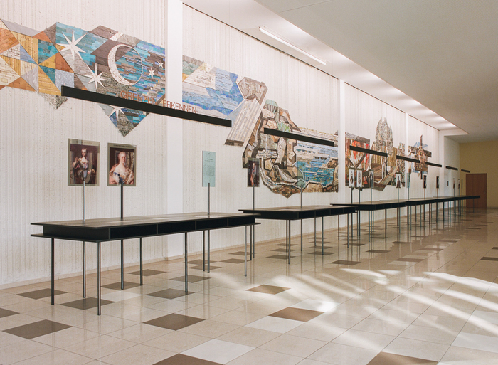
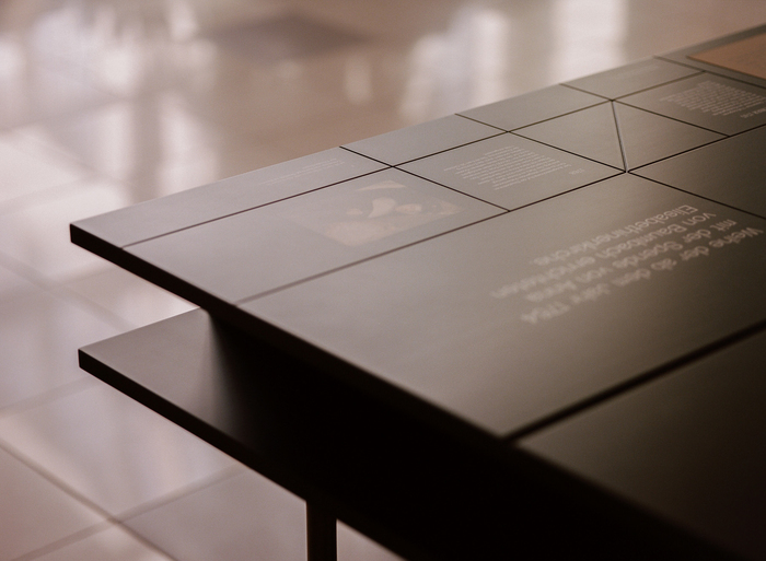
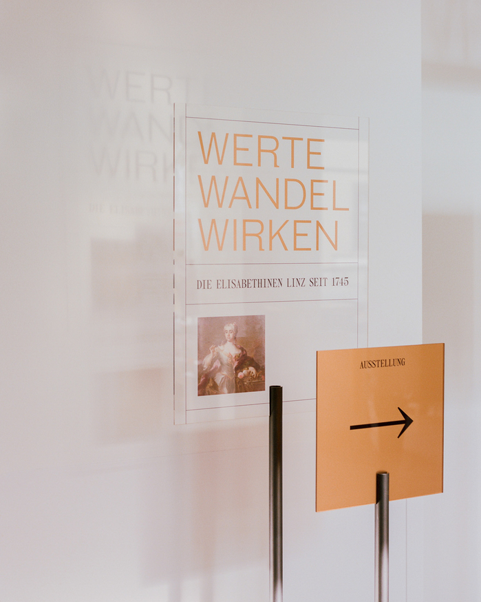
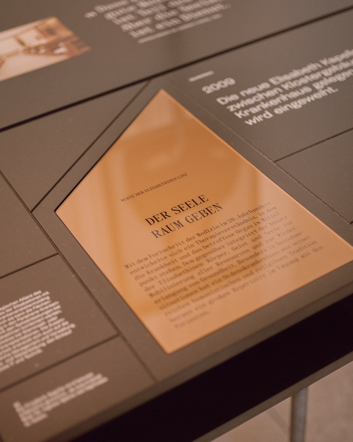
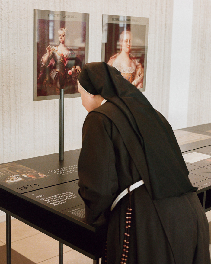
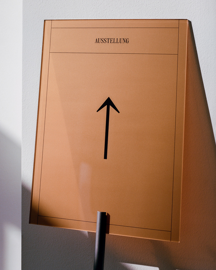
The exhibition Werte Wandel Wirken (which roughly translates to “Values Changes Actions”) commemorates 275 years of the Elisabethinen order in Linz. Located directly within the hospital, the exhibition unfolds at the very heart of its own history. In the Palm Hall – a space bridging convent and medical facility – the display spans seven tactile tables. These installations trace the order’s values, milestones, and key figures, inviting visitors into a dialogue that intertwines past and present, spirituality and care. Typography is not merely a design element here. It becomes a structuring principle of the exhibition’s visual identity, echoing themes of continuity, transformation, and human connection.
Aktiv Grotesk by Dalton Maag is used as the primary typeface for body text. With its clean lines and neutral appearance, this sans-serif grotesque ensures clarity and accessibility. Its versatility across sizes and media supports the exhibition’s educational focus and positions historical content in a contemporary, approachable framework.
Steinbeck is employed as a headline typeface and is also used in extended passages of text.
It complements Aktiv Grotesk by reinforcing the structured tone of the exhibition’s layout, while also establishing a clear visual hierarchy that guides the reader through varying layers of content.
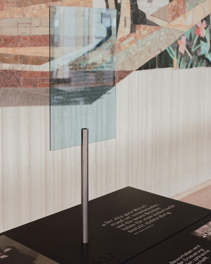
Panama – like Steinbeck by The Temporary State – is applied selectively for typographic contrast. Used in quotes and emphasized passages, it offers a distinct formal counterpoint to the other two typefaces. This typographic variation introduces tension and depth, enriching the reading experience and supporting orientation across content types.
Together, the three typefaces create a deliberate balance between clarity, structure, and emphasis – mirroring the Elisabethinen’s lasting dedication to community, compassion, and thoughtful communication.
Source: mooi-design.com Lisa Edi. License: All Rights Reserved.
Source: mooi-design.com Lisa Edi. License: All Rights Reserved.
Source: mooi-design.com Lisa Edi. License: All Rights Reserved.
Source: mooi-design.com Lisa Edi. License: All Rights Reserved.
Source: mooi-design.com Lisa Edi. License: All Rights Reserved.
Source: mooi-design.com Lisa Edi. License: All Rights Reserved.
Source: mooi-design.com Lisa Edi. License: All Rights Reserved.
This post was originally published at Fonts In Use