B’MUSE Clinic
Oni studio. License: All Rights Reserved.


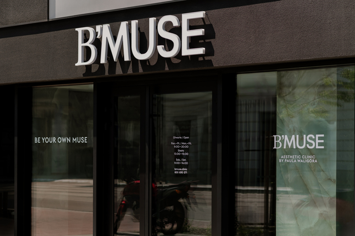
The visual identity for B’Muse Clinic reflects the brand’s philosophy that every woman is her own muse. The system is refined, calm and understated, built on contrast, geometric clarity and subtle femininity. A monochrome palette of black, white and beige echoes both the clinic’s interiors and natural skin tones, creating an atmosphere of quiet luxury.
The identity is anchored in Euclid Circular A, a geometric typeface by Swiss Typefaces valued for its clarity, purity and timeless modernist balance. Its precise, monolinear forms communicate professionalism and trust, grounding the brand in medical expertise.
To introduce contrast and a sense of sensuality, Euclid Circular A is paired with a seriffed letter B from Rotation Roman by Linotype. Its sculptural curves soften the geometry and add an elegant, feminine accent. Within this composition, the apostrophe in B’Muse becomes a symbolic detail. Its shape recalls the curve of an eyelash and the oval of a face, evoking subtle enhancement and the essence of individualized beauty. Together, these typographic choices create a dialogue between rigor and softness, mirroring the clinic’s combination of precision and intuition.
The wordmark is set with tight spacing to create a compact, confident form, while the widely spaced uppercase descriptor beneath it introduces air and balance, reinforcing a contemporary premium tone.
The identity includes the logo, descriptor, the claim “Be Your Own Muse”, cosmetic bags, exterior signage, window treatments, printed leaflets, vouchers, business cards and a website presenting services and pricing. Consistent typography and a restrained palette ensure coherence across all uses.
Motivational statements are an essential element of the identity. They express the brand’s mission and appear within the clinic’s interior, on social media and across printed applications such as leaflets and cosmetic bags. Set in Euclid Circular A, these messages function as both visual and emotional anchors, reinforcing a voice that is precise yet intimate and modern yet personal.
Design by Gabriela Baka and Damian Nowak, with web development by FCG Apps.

Photo: Gabriela Baka. License: All Rights Reserved.

Photo: Gabriela Baka. License: All Rights Reserved.

Photo: Gabriela Baka. License: All Rights Reserved.
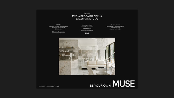
Photo: Gabriela Baka. License: All Rights Reserved.

Photo: Gabriela Baka. License: All Rights Reserved.

License: All Rights Reserved.
This post was originally published at Fonts In Use