Ateljee
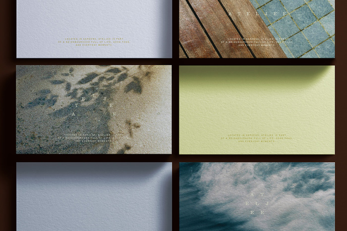
Photo: Studio Böreck. License: All Rights Reserved.


The visual identity of Ateljee – a thoughtfully designed apartment in Cape Town – is inspired by the movement of the sun throughout the day and the unique atmosphere of the surrounding landscape.
Instead of a fixed logo, the wordmark shifts its form depending on the position of the sun, almost like a contemporary sundial. Subtle changes in shape and balance reflect different moments of light, rhythm and temperature – from sharp morning shadows to the warm, slower evenings of Cape Town.
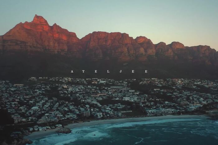
The identity draws heavily from the local atmosphere: the soft haze above Table Mountain, dry grasses moving in the wind, earthy tones, long sunsets and the calm pace of summer days close to nature. A visual system shaped by light, stillness and the feeling of slowly arriving somewhere. Warm earth tones, sun-faded surfaces, soft shadows, tactile fabrics and natural materials translate the visual identity into a physical atmosphere.
License: All Rights Reserved.
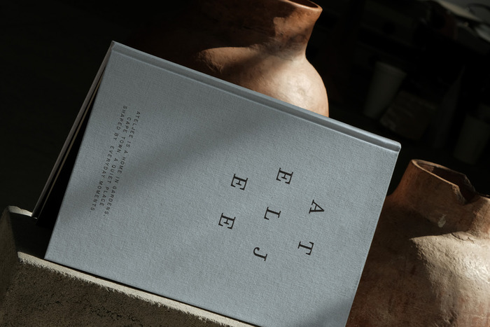
Photo: Studio Böreck. License: All Rights Reserved.
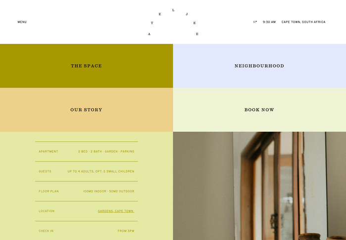
Source: ateljeecapetown.com License: All Rights Reserved.
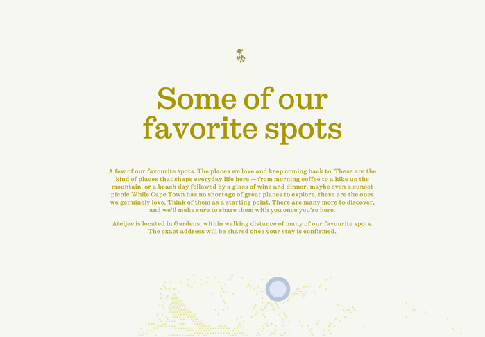
Source: ateljeecapetown.com License: All Rights Reserved.
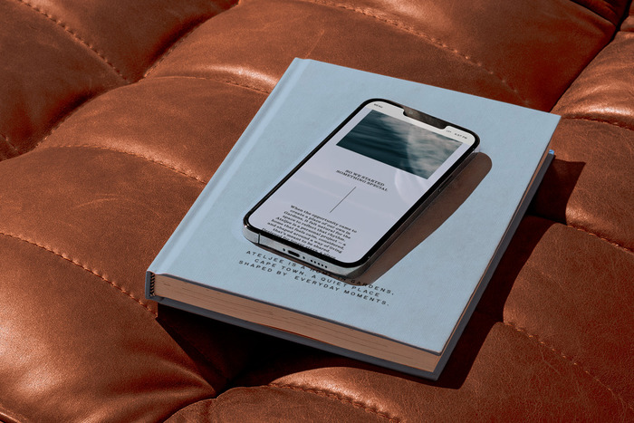
Photo: Studio Böreck. License: All Rights Reserved.
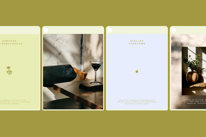
Photo: Studio Böreck. License: All Rights Reserved.
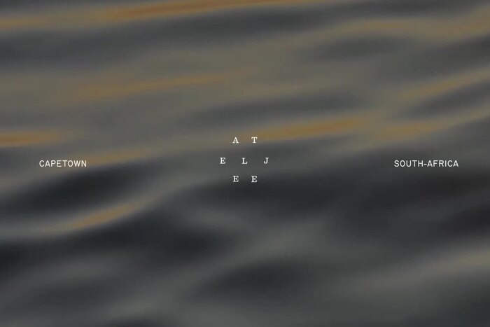
License: All Rights Reserved.
This post was originally published at Fonts In Use