ARCH+ 262

ARCH+. License: All Rights Reserved.



Issue 262 of the iconic architecture magazine ARCH+ is the second issue designed by Dan Solbach. Dedicated to African Spatial Thinking, it anticipates the first Pan-African Biennale of Architecture, to be held in Nairobi in September 2026.
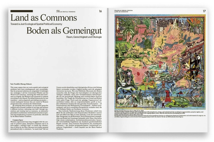
The cover and layout differ from the previous issue through the use of new weights and widths of the typefaces that form the magazine's renewed identity. AL Sigla by Alex Lescieux now appears in its Neretta style for headlines and introductory paragraphs, alongside Display Grotesk by Chi-Long Trieu, now used in an ultra-light weight ahead of its release by Dinamo, also for headlines and introductory texts. Futura Bold by Paul Renner, the typeface that has shaped the magazine's graphic identity since 1968, remains an essential part of the system.
As in the previous issue, the articles are introduced through the simple fragmentation of their titles, allowing the surrounding white space to become an active part of the composition.
By varying the weights and widths of two distinct typefaces from one issue to the next, and setting them alongside Futura, the magazine’s historic typeface, ARCH+ questions the foundations and limits of what a magazine identity can be. The result is an unusual typographic configuration—both flexible and robust—that offers a remarkably broad range of formal possibilities.

ARCH+. License: All Rights Reserved.
ARCH+. License: All Rights Reserved.

ARCH+. License: All Rights Reserved.

ARCH+. License: All Rights Reserved.

ARCH+. License: All Rights Reserved.

ARCH+. License: All Rights Reserved.

ARCH+. License: All Rights Reserved.

ARCH+. License: All Rights Reserved.

ARCH+. License: All Rights Reserved.
This post was originally published at Fonts In Use