amtm
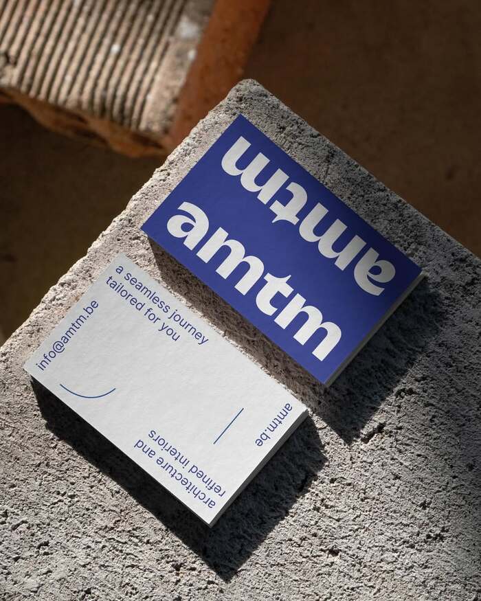
Source: bloudruk.be Bloudruk. License: All Rights Reserved.


amtm is an architecture studio founded by Jasper and Tim. The name is an abbreviation of “architecture made to measure”, expressing their approach to architecture as a precise, tailored practice shaped around each project.
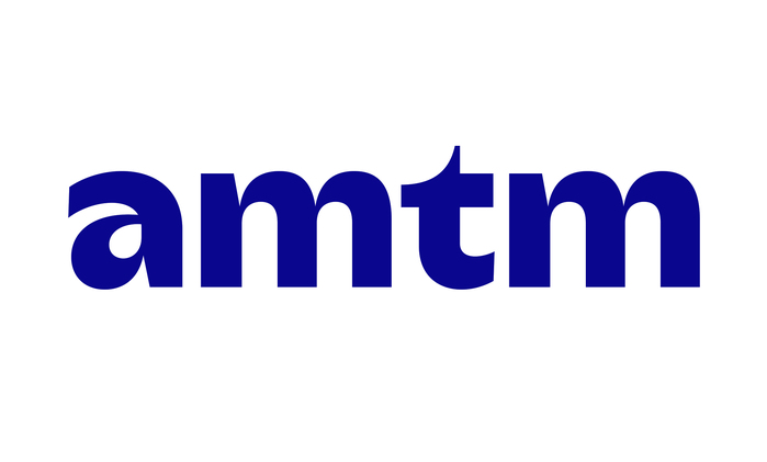
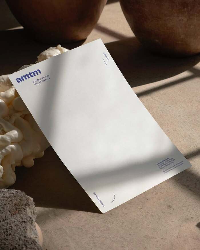
For the studio’s new visual identity, the pre-existing International Klein Blue (IKB) was retained, while the typography was refined to give the brand a more distinctive and contemporary character.
The amtm wordmark is set in Kaio from Lift Type. Its fluid curves and precise forms bring a subtle sense of personality to the name. Inter is used alongside it for secondary information, providing a clear and functional typographic complement.
The combination creates a simple, refined identity that balances the expressive character of Kaio with the practicality of Inter.
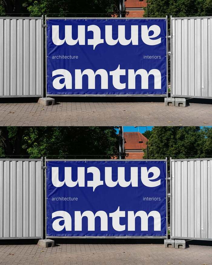
Source: bloudruk.be Bloudruk. License: All Rights Reserved.
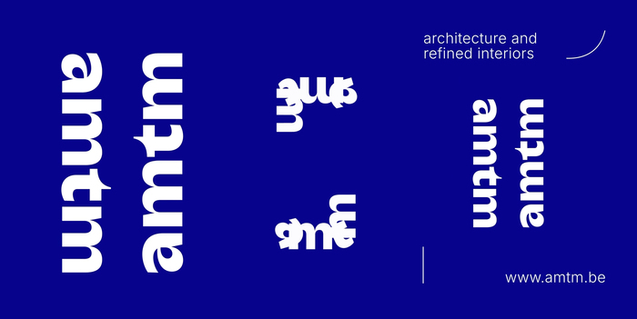
Source: bloudruk.be Bloudruk. License: All Rights Reserved.
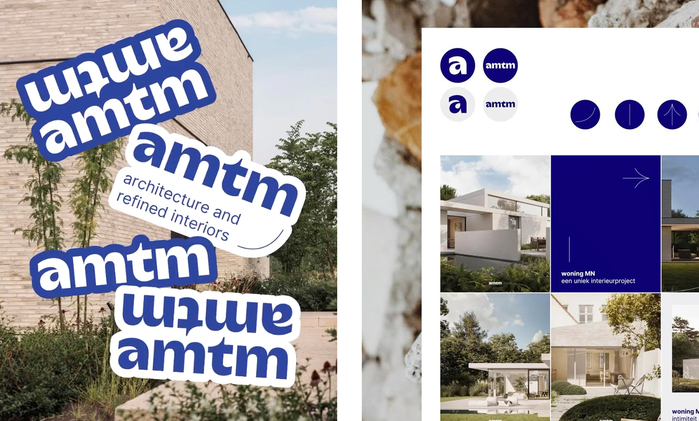
Source: bloudruk.be Bloudruk. License: All Rights Reserved.
Source: bloudruk.be Bloudruk. License: All Rights Reserved.
Source: bloudruk.be Bloudruk. License: All Rights Reserved.
This post was originally published at Fonts In Use