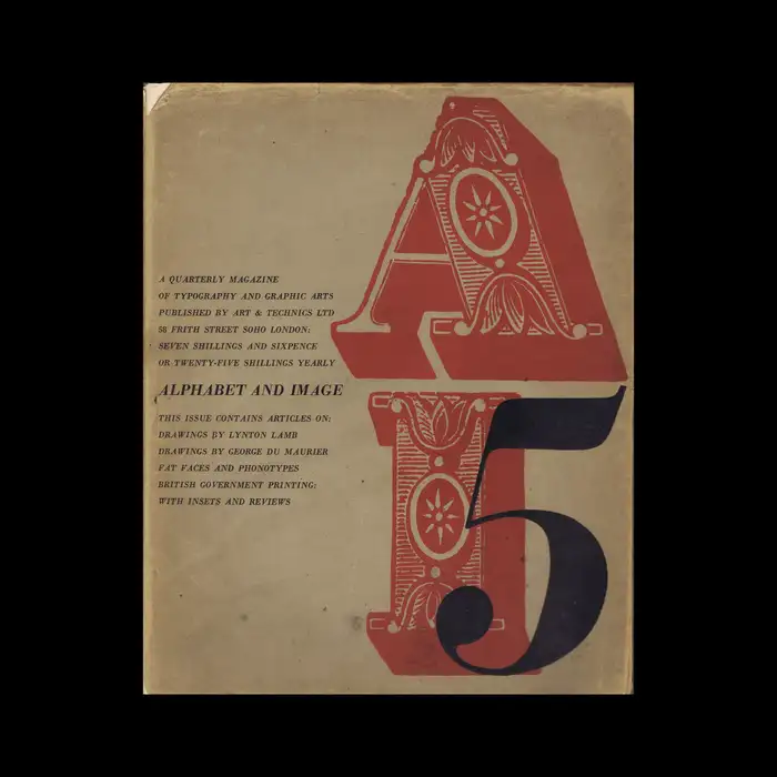
Alphabet and Image 5, September 1947

Source: designreviewed.com Design Reviewed. License: All Rights Reserved.


In the introduction to the Imprimit edition of the Pouchée alphabets, James Mosley and Julia Horsfall tell the story of Macdonald (via Blythwood):
Shortly after the Second World War, Mr. William Webb, a typographic designer, was working at a printing office in Maryport, Cumberland, which possessed a set of ornamental capitals engraved on wood, one inch and three-quarters or just over ten lines of pica in height. Mr. Webb’s proofs of this alphabet, which he named ‘Macdonald’ after its owner, were published on a reduced scale in 1952 [in Graphis magazine], but the original blocks were probably destroyed.
In 1947 – five years before Paul Arthur’s article in Graphis – Robert Harling used two initials from the ornamented wood typeface in his cover design for the fifth issue of Alphabet and Image. The quarterly magazine of typography and graphic arts was printed by James Shand at the Shenval Press in Hertford and published by Art & Technics Ltd, London. Chances are it was the first use of Macdonald in many decades.

Source: designreviewed.com Design Reviewed. License: All Rights Reserved.
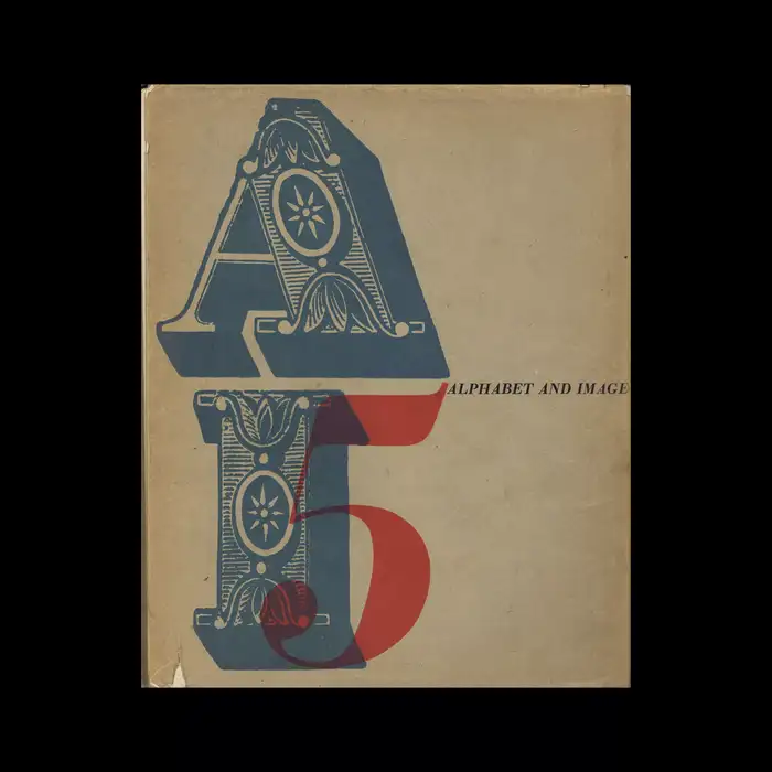
The back cover has a color variant with the numeral 5 printed in red over blue Macdonald initials.
This post was originally published at Fonts In Use