30,000 on the Hoof by Zane Grey
Source: www.abebooks.com Rare Book Cellar. License: All Rights Reserved.

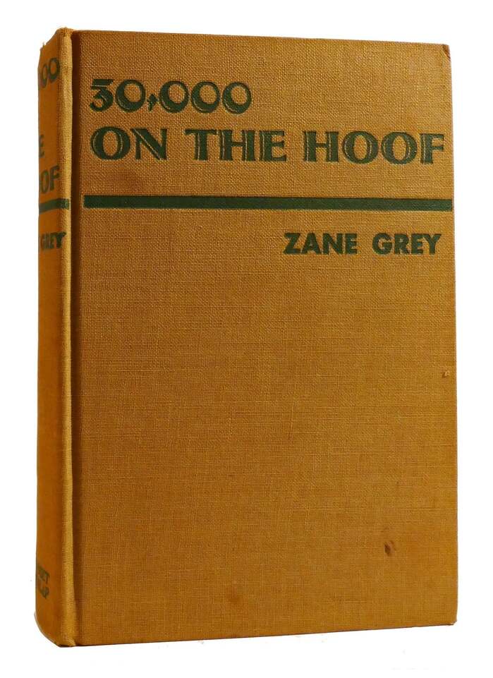
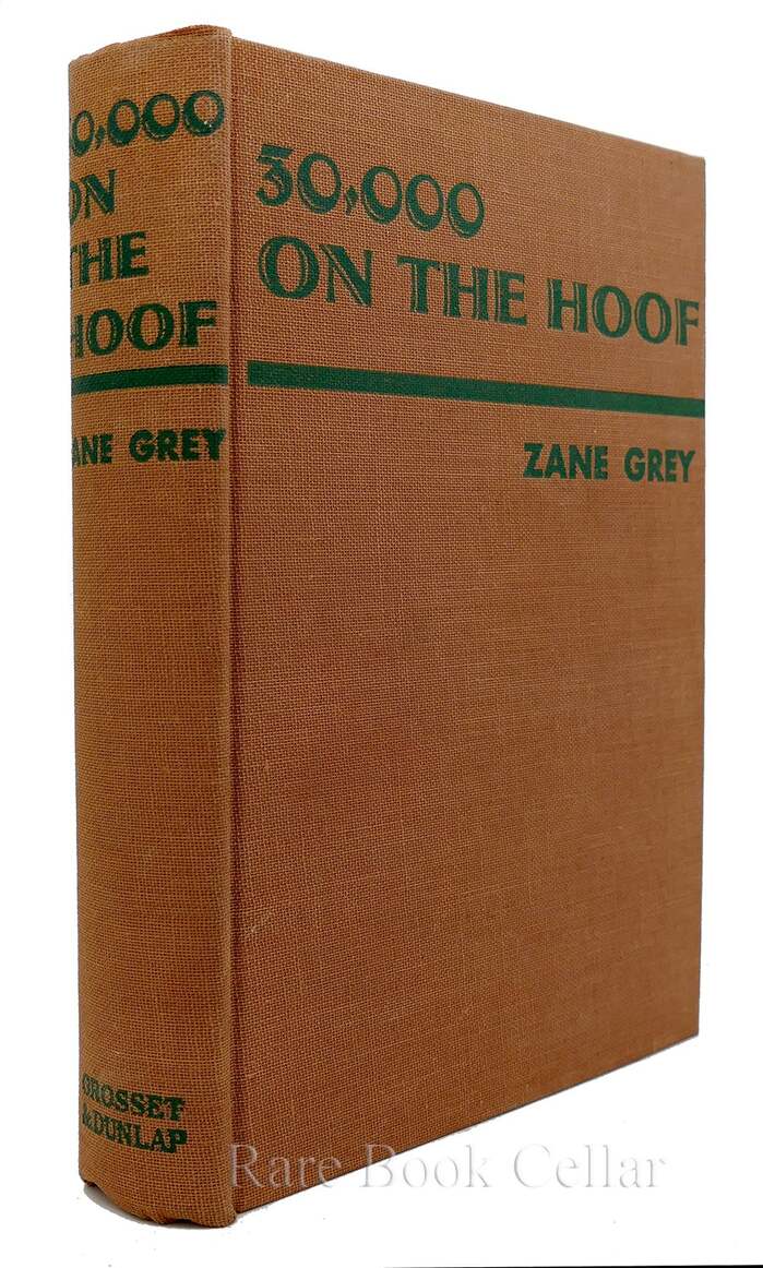
30,000 on the Hoof is a Western novel by Zane Grey (1872–1939), published posthumously in 1940. Shown here is the first-edition cover by Grosset & Dunlap.
The title typeface, an all-caps roman with flare serifs and inline effect, is Atrax. “Thirty thousand” is written as a number. This way, we get to see Atrax’ numerals, which exhibit diagonal contrast – unlike the letters, which are drawn around a vertical contrast axis. With all weight apportioned to the bottom left, the zero almost looks like a dimensional ball.
If you try to learn about the origins of Atrax from a font marketplace like Monotype’s MyFonts, you’ll find that it was designed by “URW Design Staff” and that the design is owned by URW Type Foundry (a publisher acquired by Monotype in 2020). The tags hint at a date in the 1990s. That’s misleading at best, and only relates to one of the digitizations.
In fact, Atrax is a design by Heinrich Jost (1889–1948), a student of Paul Renner and Emil Preetorius. From 1923 until his premature death, Jost served as the art director for Bauer, during the type foundry’s most successful years, overlooking the release of his former teacher’s Futura. Issued in 1926, Atrax was Jost’s first published type design of his own. It was followed by Beton and Bauer Bodoni, among others.
Source: www.abebooks.com Rare Book Cellar. License: All Rights Reserved.
The name of the author is added in all-caps Futura fett.

Source: archive.org Internet Archive. License: All Rights Reserved.
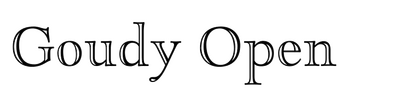
On the title page, the book’s title is set in Goudy Open. The designer apparently didn’t like this typeface’s zero, which is a monolinear circle, and used the lowercase letter o instead (in his own book, Goudy agreed).
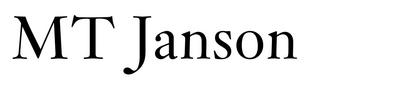
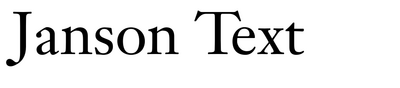
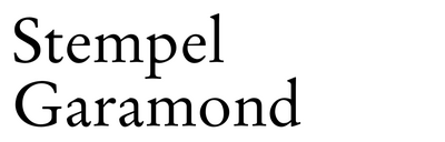
Most of the smaller text is set in Janson, apparently using the version by Mergenthaler Linotype. Judging from the narrower Z in “ZANE”, the heading at the top of the left page is set in Monotype Janson, though. The publisher’s name at the bottom right looks like it’s Mergenthaler Linotype’s Garamond (No. 1), a design based on Stempel Garamond.
This post was originally published at Fonts In Use