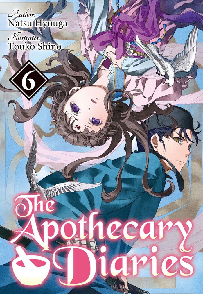
The Apothecary Diaries by Natsu Hyuuga and Touko Shino, Light Novel covers
Published April 5, 2025
By FontsInUse
Contributed by D Jones

Source: cdn.kobo.com License: All Rights Reserved.


Source: cdn.kobo.com License: All Rights Reserved.

Source: cdn.kobo.com License: All Rights Reserved.

Source: cdn.kobo.com License: All Rights Reserved.

Source: www.netflix.com License: All Rights Reserved.
This post was originally published at Fonts In Use

Source: cdn.kobo.com License: All Rights Reserved.


The light novel series of The Apothecary Diaries uses Black Chancery for the covers of its English translation.
Black Chancery is a typeface from the 1990s who naive quirkiness seems to have given it enduring qualities. Here, it’s consistently used in white over the image, with a shadow blur effect the colour of which varies from cover to cover.
Netflix have also opted to use this timeless typeface for their title cards. Classic.
The y of “Apothecary” has a small inline highlight, which suggests a typeface modification; also copied by Netflix’s use.
Credits are added in Minion and Tangerine.
See all issues at J-Novel Club.

Source: cdn.kobo.com License: All Rights Reserved.

Source: cdn.kobo.com License: All Rights Reserved.

Source: cdn.kobo.com License: All Rights Reserved.

Source: www.netflix.com License: All Rights Reserved.
Detail from the Netflix page for The Apothecary Diaries
This post was originally published at Fonts In Use
Read full story.
WRITTEN BY
FontsInUse
An independent archive of typography.
More from FontsInUse