Saintly

Source: universalfavourite.com.au Universal Favourite. License: All Rights Reserved.


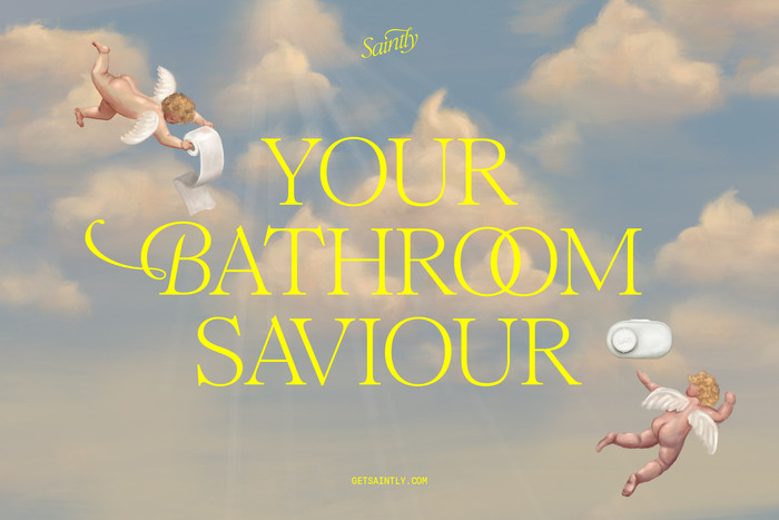
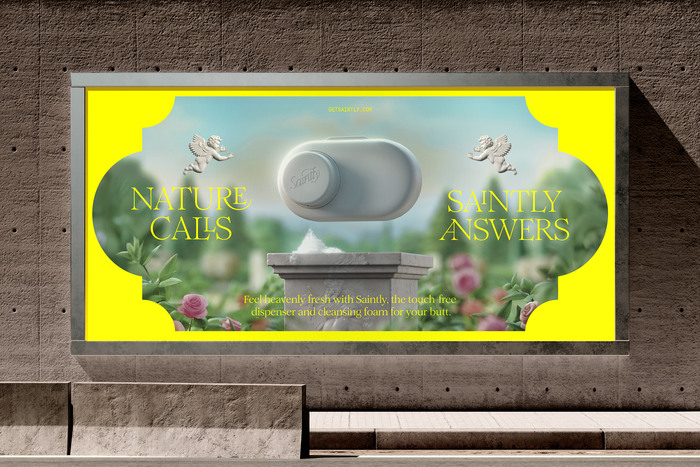
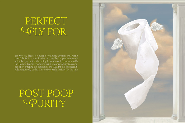
Saintly is on a mission to lead the world to a cleaner future from behind. They are reimagining the personal care and toilet hygiene space starting with a cleansing foam dispenser that serves as a flushable wipe upgrade. With the cheeky belief that “cleanliness is next to godliness” and a promise to deliver “that new butt feeling, every time,” Saintly redefines the category with a Renaissance-inspired aesthetic that turns the everyday bathroom routine into a ritual of confidence.
From strategy and naming to visual identity, packaging, and web design, the team at Universal Favourite reimagined every detail of the brand, ensuring Saintly’s launch was nothing short of heavenly. Working alongside Doris Dev, we helped bring to life a cleansing foam dispenser that serves as a flushable wipe upgrade— setting a new standard for heavenly bathroom upgrades.
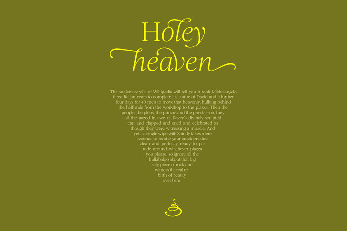
The Saintly typography system builds upon Romie, a contemporary take on a classic serif, featuring elegant glyphs and flourishes that mimic hand-drawn calligraphy. Universal Favourite expanded on this concept through typographic layouts that emphasise graceful, flowing forms, drawing inspiration from the rich history of Renaissance Italian printing presses. The supporting typeface is GT Pressura Mono.
Universal Favourite. License: All Rights Reserved.

Universal Favourite. License: All Rights Reserved.
Universal Favourite. License: All Rights Reserved.
Universal Favourite. License: All Rights Reserved.
Universal Favourite. License: All Rights Reserved.

Universal Favourite. License: All Rights Reserved.

Universal Favourite. License: All Rights Reserved.
This post was originally published at Fonts In Use