Kein & Aber
Source: www.scholtysik.ch License: All Rights Reserved.

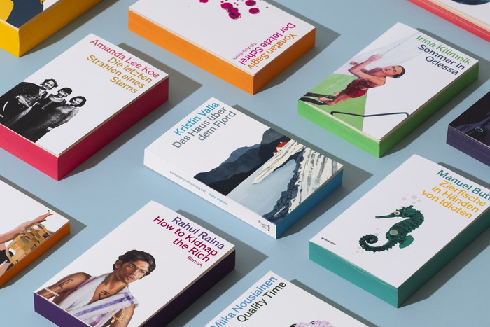
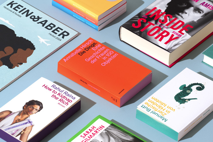
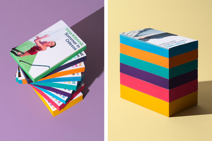
Kein & Aber stands for exceptional books and an unmistakable signature. Since 1997, this Swiss publishing house has produced influential voices in German and international literature: Truman Capote, Elke Heidenreich, Gerhard Polt, Hazel Brugger, Bryan Washington are among the publishers’ many cherished authors. Kein & Aber places great importance on the design of its publications, for each book shall match the individual tone its author has given it. The new brand identity embodies this commitment: it strengthens the publisher's brand and honours the distinctiveness of each work at the same time.
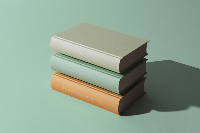
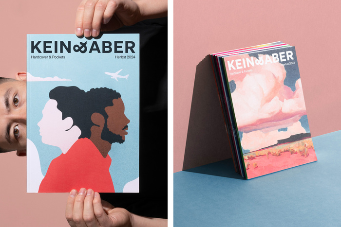
The tilted ampersand in the revised logo is an effective design finesse, which sums up the publisher’s unconventional yet clear identity. Without imposing itself, it creates recognition across all applications. The logo fits seamlessly into the individual book and cover designs from linen-bound to paperbacks without disturbing them. The contrast of the tilted ampersand between the upright capital letters works equally well in the full wordmark and the shortened K&A version used on book spines, in social media profiles and marketing collateral.
Source: www.scholtysik.ch License: All Rights Reserved.
Source: www.scholtysik.ch License: All Rights Reserved.
Source: www.scholtysik.ch License: All Rights Reserved.

Source: www.scholtysik.ch License: All Rights Reserved.
Source: www.scholtysik.ch License: All Rights Reserved.

Source: www.scholtysik.ch License: All Rights Reserved.
Source: www.scholtysik.ch License: All Rights Reserved.
This post was originally published at Fonts In Use