“Les distractions de la semaine” in Vu magazine


French weekly magazine Vu was the brain child of Lucien Vogel (1886–1954). It was first published on March 21, 1928, with a logo designed by Cassandre. 637 more issues followed until May 29, 1940. Vu is best known for pioneering photojournalism, featuring works by contributing photographers such as Cartier-Bresson, Man Ray, Brassaï, Robert Capa, and André Kertész.
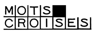
From the very start, it included a section titled “Les distractions de la semaine” (“The week’s distractions”) with various puzzles, or problèmes. Initially, the crosswords came with handwritten numbers, see this example from issue 5. In the sixth issue from April 25, 1928, Vu introduced solutions for the crosswords. These no longer used lettering. Instead, they were composed from a special font. Simply named Mots Croisés (French for “crosswords”), it offered blank and black squares as well as such with capital letters for clues and solutions, internal and external numbers, and border elements. Mots Croisés is shown in Deberny & Peignot’s Spécimen Générale from around 1936.
Last month, Poem released Phông, a digital typeface inspired by crossword puzzles. It was created by Khải Quang Nguyễn during his research residency at Atelier National de Recherche Typographique. While his primary inspiration were the puzzles in Phong-Hóa, a Vietnamese satirical journal first published in 1932, he also looked into Vu – which led me to Mots Croisés. Cảm ơn, Khải!

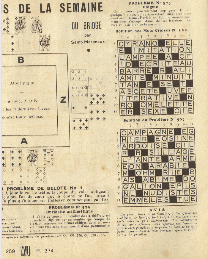
The other fonts in use for “Les distractions de la semaine” are worth a look, too. While the dancing fat face with the checkered fill used for the title is lettering, the thin caps for “Résultats” in the first image are typographic: they come from the generically named Antique Fine. The puzzles themselves are set in Beaudoire’s Elzevir, which started about 1860 as a commercial copy of Louis Perrin’s Caract. Headings are in the accompanying Elzevir Gras, which has more in common with Alexander Phemister’s Old Style Antique No. 7.

The bold italic caps used for the solution du problème № 37 (above) are from Sphinx italique. One of the sans serifs seen in issue 249 from March 1933 (below) is Consul, which was available from several French foundries, including from Peignot & Fils as Antiques maigres larges.
This post was originally published at Fonts In Use