RUNdgang 2025, HBKsaar

Studio 63. License: All Rights Reserved.
The RUNDgang 2025 campaign poster in 70×100 cm
Each February, the Hochschule der Bildenden Künste Saar (University of Art and Design Saar – HBKsaar) presents its annual exhibition, Rundgang, showcasing student work from the past year. For the 2025 edition, the visual identity was developed by Studio 63, the student-run design studio at HBKsaar. The FW 24/25 class included students Jinyu Wang, Lena Görgen, Marietta Stucky, Matti Henn, Klara Köhl, Saleh Alsaid, and Sandro Spaniol, under the guidance of instructor Manuel Wesely. Studio 63 was responsible for the entire visual concept – from identity and graphic design to posters and signage.
The team reinterpreted Rundgang as RUNdgang, emphasizing movement and urgency. Drawing inspiration from Lucius Burckhardt’s theories of “strollology,” they flipped the idea of a casual walk-through into something more dynamic – as in “we don’t just walk, we RUN.” The theme plays with multiple associations of “running” and disrupts expectations for an art school exhibition. Conveniently, the concurrent PeteR UNd Luise Hager Prize could be integrated seamlessly into the typographic concept.
The exhibition posters translate the RUN motif into recursive spirals based on the golden ratio, extending infinitely – a visual metaphor for relentless forward motion.
The identity is complemented by invitation cards, several flyers, a billboard poster, and a signage system (designed by Lena Görgen).
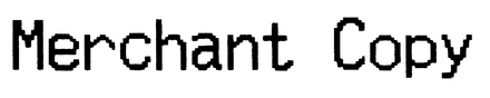
Typographically, the design references the aesthetic of receipts and endless printers, evoking a continuous, unstoppable process. This reflects both the exhibition’s theme of movement and the ongoing nature of creative work. The typeface used is Merchant Copy.
With RUNdgang, Studio 63 offers a fresh take on the exhibition identity, shifting the focus toward speed, repetition, and the persistent momentum of artistic practice.

Joas Strecker. License: All Rights Reserved.
The billboard, freshly prepared for the occasion. Saleh Alsaid and Matti Henn discussing application fine-tuning.

Joas Strecker. License: All Rights Reserved.
Details of different poster sections. The poster is split into a collection of DIN sizes, ranging vom A1 to ~A11.

Joas Strecker. License: All Rights Reserved.
Marietta Stucky went CRAZY and designed and sewed these banners.

Joas Strecker. License: All Rights Reserved.
Behind the scenes of the banner production

Saleh Alsaid, Studio 63. License: All Rights Reserved.
Saleh Alsaid’s motion design of the RUN motif
This post was originally published at Fonts In Use