“Handled with care!” wine labels
Published July 31, 2025
By FontsInUse
Contributed by David Einwaller

Source: freude.studio Studio Freude. License: All Rights Reserved.

Source: freude.studio Studio Freude. License: All Rights Reserved.
Source: freude.studio Studio Freude. License: All Rights Reserved.
Source: freude.studio Studio Freude. License: All Rights Reserved.
Source: freude.studio Studio Freude. License: All Rights Reserved.
Source: freude.studio Studio Freude. License: All Rights Reserved.
Source: freude.studio Studio Freude. License: All Rights Reserved.
Source: freude.studio Studio Freude. License: All Rights Reserved.

Source: freude.studio Studio Freude. License: All Rights Reserved.
This post was originally published at Fonts In Use
Source: freude.studio Studio Freude. License: All Rights Reserved.
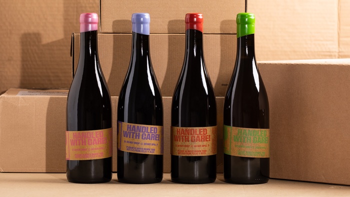
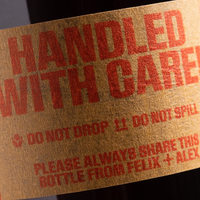
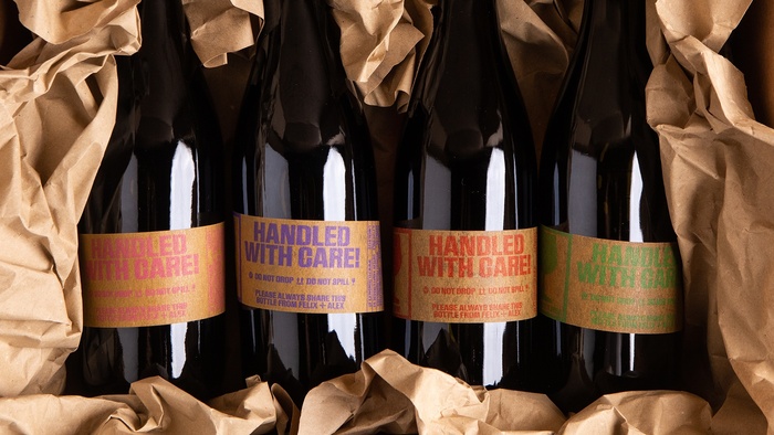
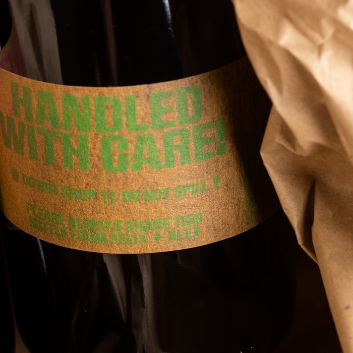
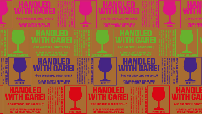
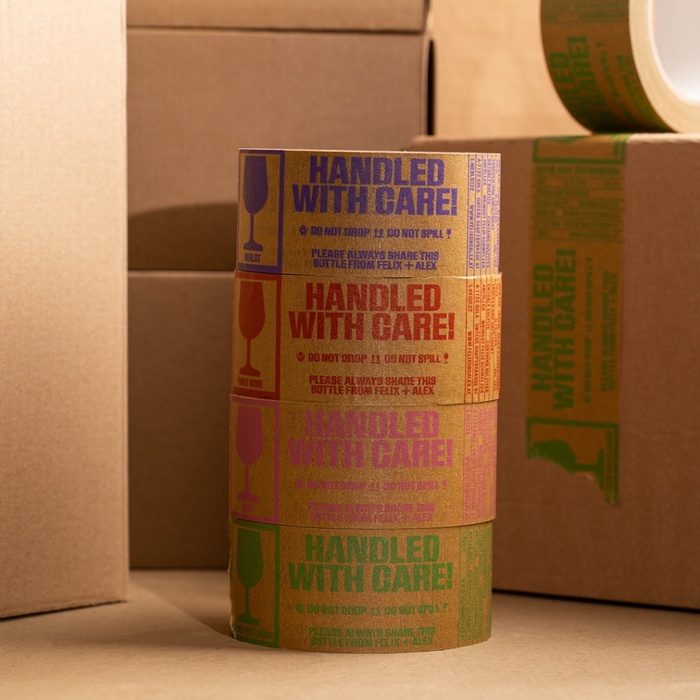
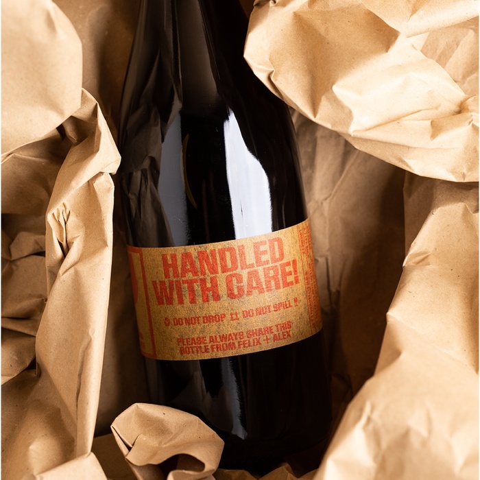
For the wine series “Handled with Care” by Felix and Alex, Studio Freude developed a visual identity centered around sustainability and individuality. Instead of using traditional wine labels, each bottle is wrapped with a strip of printed tape—making every unit unique and emphasizing the handcrafted nature of the product.
The typographic centerpiece of this design is Brubeck, a bold, condensed sans-serif. Set in tight, headline-sized arrangements, Brubeck adds powerful presence without overflow. Its compact proportions and strong graphic presence are ideal for the narrow, linear format of the tape. Brubeck’s retro-inspired forms evoke a tactile, analog feel that aligns with the project’s emphasis on care, craft, and minimal intervention.
Source: freude.studio Studio Freude. License: All Rights Reserved.
Source: freude.studio Studio Freude. License: All Rights Reserved.
Source: freude.studio Studio Freude. License: All Rights Reserved.
Source: freude.studio Studio Freude. License: All Rights Reserved.
Source: freude.studio Studio Freude. License: All Rights Reserved.
Source: freude.studio Studio Freude. License: All Rights Reserved.
Source: freude.studio Studio Freude. License: All Rights Reserved.
Source: freude.studio Studio Freude. License: All Rights Reserved.
This post was originally published at Fonts In Use
Read full story.
WRITTEN BY
FontsInUse
An independent archive of typography.