Acrea
Published July 31, 2025
By FontsInUse
Contributed by Antonio Stojceski

Source: alphamark.design Alphamark. License: All Rights Reserved.

Source: alphamark.design Alphamark. License: All Rights Reserved.

Source: alphamark.design Alphamark. License: All Rights Reserved.

Source: alphamark.design Alphamark. License: All Rights Reserved.
Source: alphamark.design Alphamark. License: All Rights Reserved.
Source: alphamark.design Alphamark. License: All Rights Reserved.
This post was originally published at Fonts In Use

Source: alphamark.design Alphamark. License: All Rights Reserved.

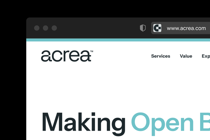
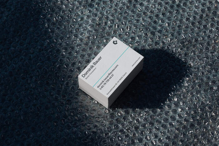
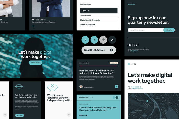
The new visual identity of Acrea is rooted in simplicity and approachability. Clean, compact layouts paired with people-focused photography give the brand a human touch. A subtle “a → a” detail in the logo symbolizes continuous digital transformation; the core of Acrea’s work. We also developed a flexible brand symbol and defined a balanced color palette to bring clarity, contrast, and energy.
The reimagined identity results in a more consistent but also dynamic brand that allows Acrea to position itself as a sole professional but boutique consultancy in the Swiss financial market.
Source: alphamark.design Alphamark. License: All Rights Reserved.

Source: alphamark.design Alphamark. License: All Rights Reserved.

Source: alphamark.design Alphamark. License: All Rights Reserved.

Source: alphamark.design Alphamark. License: All Rights Reserved.

Source: alphamark.design Alphamark. License: All Rights Reserved.
This post was originally published at Fonts In Use
Read full story.
WRITTEN BY
FontsInUse
An independent archive of typography.
More from FontsInUse