XTC – Go 2 album art

Source: jp.mercari.com License: All Rights Reserved.


XTC’s Go 2 is one of the most unique album cover designs; certainly in the meta (self-referential) and typographic sense. It was handled by the legendary album design studio Hipgnosis who are credited for having a hand in the design of over 800 album covers.
The design uses typewritten text for every element of the overall package of the album. The text describes the design and the thinking behind what record covers do. It reads (in part):
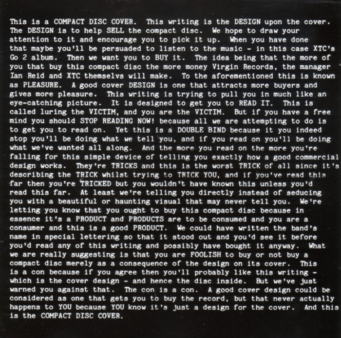
This is a RECORD COVER. This writing is the DESIGN upon the record cover. The DESIGN is to help SELL the record. We hope to draw your attention to it and encourage you to pick it up. When you have done that maybe you’ll be persuaded to listen to the music – in this case XIC’s Go 2 album. Then we want you to BUY it. The idea being that the more of you that buy this record the more money Virgin Records, the manager Ian Reid and XTC themselves will make. To the aforementioned this is known as PLEASURE. A good cover DESIGN is one that attracts more buyers and gives more pleasure. This writing is trying to pull you in much like an eye-catching picture. It is designed to get you to READ IT. This is called luring the VICTIM, and you are the VICTIM. But if you have a free mind you should STOP READING NOW! because all we are attempting to do is to get you to read on.
The typewriter typeface used here, Elite, was identified in Rick Poynor’s article “This is a column” for Eye magazine. A very good piece, by the way, on the recursive approach to design.
Source: jp.mercari.com License: All Rights Reserved.
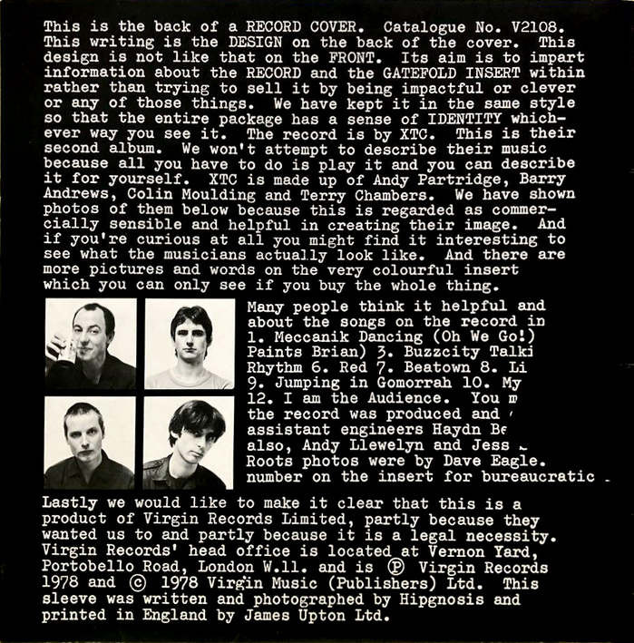
Back cover of the vinyl release
Source: www.discogs.com License: All Rights Reserved.
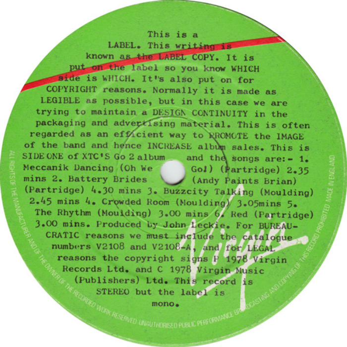
The same typographic treatment extends to the vinyl labels. The text on side one reads:
This is a LABEL. This writing is known as the LABEL COPY. It is put on the label so you know WHICH Bide is WHICH. It's also put on for COPYRIGHT reasons. Normally it is made as LEGIBLE as possible, but in this case we are trying to maintain a DESIGN CONTINUITY in the packaging and advertising material. This is often regarded as an efficient way to PROMOTE the IMAGE of the band and hence INCREASE album sales. […] This record is STEREO but the label is mono.
Source: www.ebay.com License: All Rights Reserved.
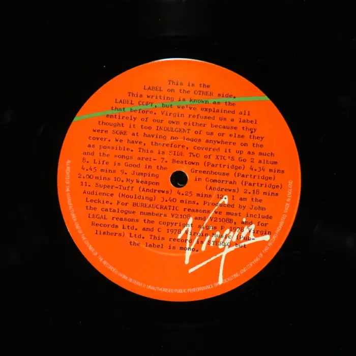
The second side of the vinyl label. The text here reads:
This is the LABEL on the OTHER side. This writing is known as the LABEL COPY, but we've explained all that before. Virgin refused us a label entirely of our own either because they thought it too INDULGENT of us or else they were SORE at having no logos anywhere on the cover. We have, therefore, covered it up as much as possible.
Source: www.discogs.com License: All Rights Reserved.
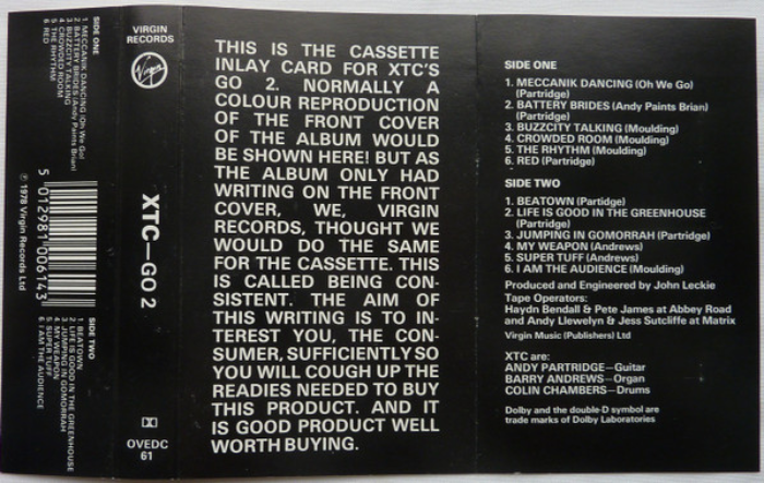
The design was also adapted to the cassette release as well. Strangely, the text here was set in Univers.
Source: www.discogs.com License: All Rights Reserved.
The same was adapted to the eventual CD release
Source: www.discogs.com License: All Rights Reserved.
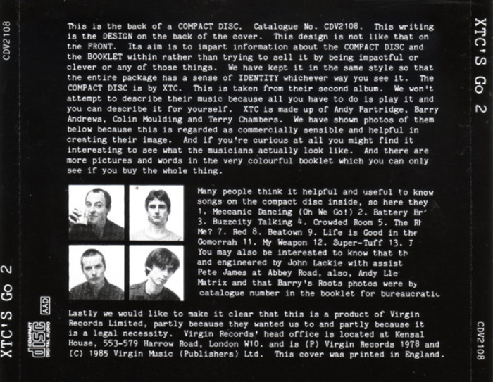
Back of the CD
This post was originally published at Fonts In Use