Woman of the Hour movie posters
Published August 4, 2025
By FontsInUse
Contributed by Mark Simonson
Source: percivalandassociates.com Percival & Associates. License: All Rights Reserved.


Source: percivalandassociates.com Percival & Associates. License: All Rights Reserved.
This post was originally published at Fonts In Use
Source: percivalandassociates.com Percival & Associates. License: All Rights Reserved.
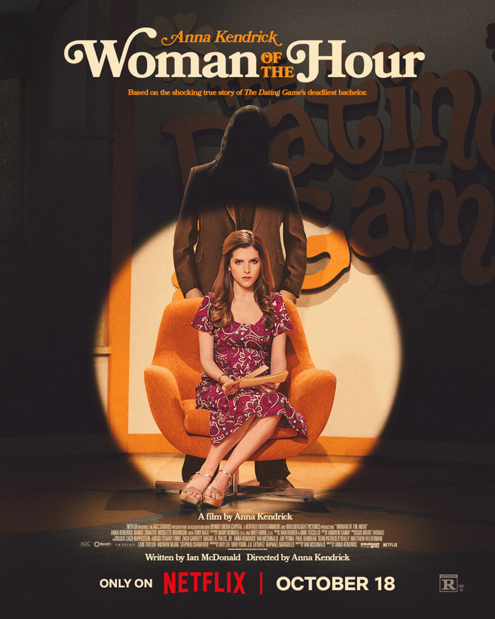
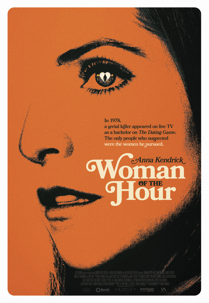
Bookmania, as the lead typeface for the Woman of the Hour posters, is typecasting in a good way. Percival & Associates leaned into the Netflix film’s 1970s television aesthetic without going full pastiche. The typeface, used for logotype and copy, effectively supports the imagery, and delivers a strong tonal weight for the series.
Of course, Bookmania was the appropriate choice because of its heritage. It is a revival of Bookman that saturated advertising, packaging, and headlines in mid-century America. It’s chunky, upright, and filled with swash alternates, and here it nails a specific cultural cue: mainstream, upbeat, just a touch clever. It’s just the kind of type you might see on a dating game show backdrop.
Source: percivalandassociates.com Percival & Associates. License: All Rights Reserved.
This post was originally published at Fonts In Use
Read full story.
WRITTEN BY
FontsInUse
An independent archive of typography.
More from FontsInUse