Witry & Witry
Claudia Eustergerling. License: All Rights Reserved.
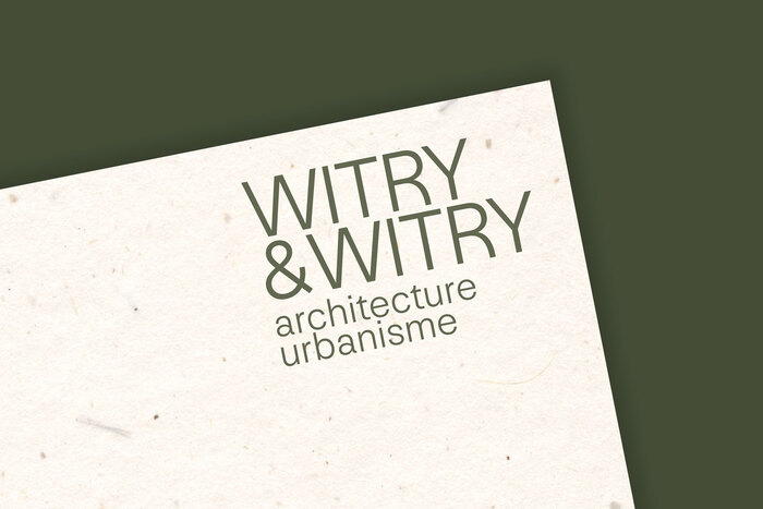
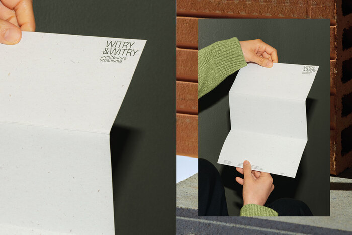
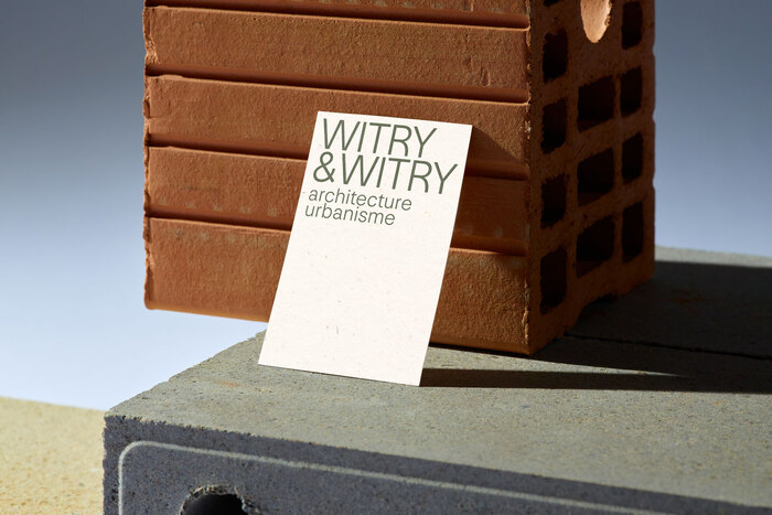
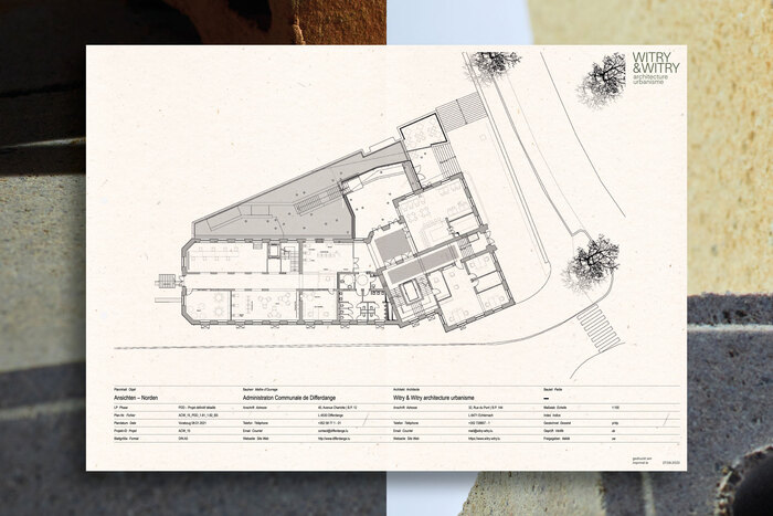
Witry & Witry is a Luxemburg based office for architecture and urbanism. Their visual identity was recently overhauled by Claudia Eustergerling:
Witry & Witry architects and urbanists, with a rich history rooted in Luxembourg, stand as pioneers in embracing circularity in their construction practices. Having seamlessly transitioned to the second generation, they are poised to embrace the challenges of the future. Recognizing the need for a logo redesign to align with contemporary standards and enhance visibility, we proposed a corporate design overhaul that reflects their name and ethos of responsibility. The new logo, devoid of round forms or three-dimensional effects, boldly presents the company name in uppercase letters (...). Retaining the iconic ampersand symbol and the corporate green color, albeit in a deeper shade, ensures continuity while signaling a fresh perspective.
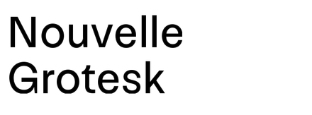
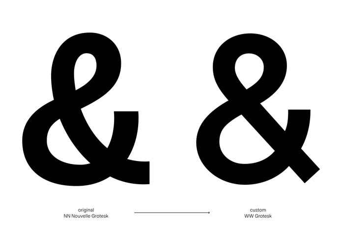
NN Nouvelle Grotesk is used throughout, with a custom ampersand.
Claudia Eustergerling. License: All Rights Reserved.
Claudia Eustergerling. License: All Rights Reserved.
Claudia Eustergerling. License: All Rights Reserved.
Claudia Eustergerling. License: All Rights Reserved.
This post was originally published at Fonts In Use