Independent Art Fair
Source: www.team.design Team. License: All Rights Reserved.
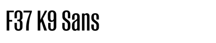

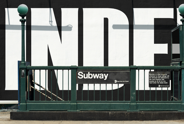
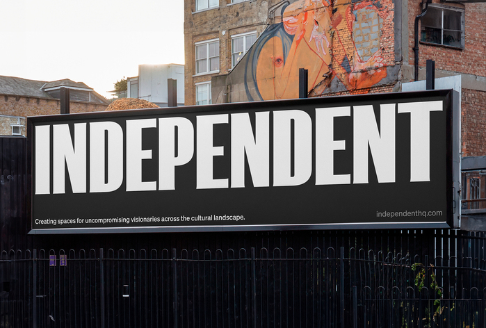
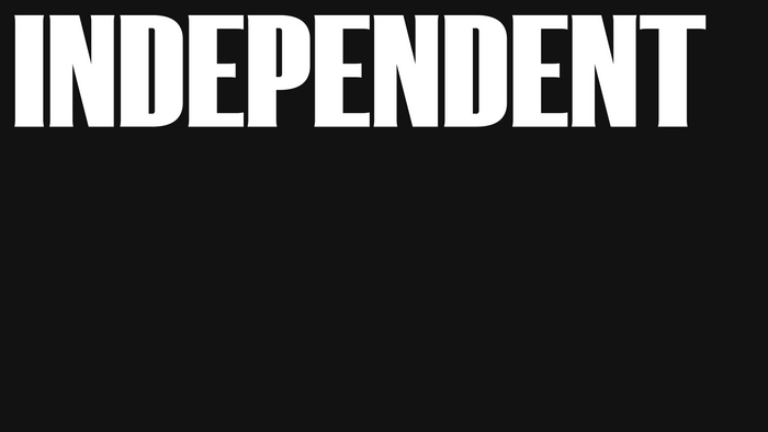
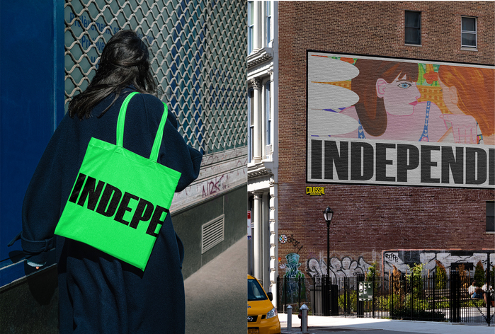
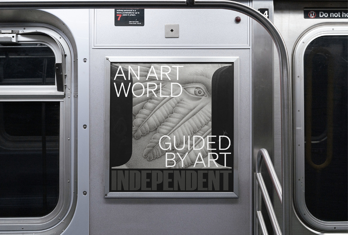
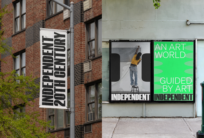
F37 K9 Bold forms the logo for the Independent Art Fair. Slightly modified, F37 K9’s sans letters were given subtle vestigial serifs. The logo is used at all sizes from discrete exhibition catalogues to meter-high wall art. This made the serifs a feature at large sizes, but provided barely a whiff a serif at small sizes. F37 K9 Bold is used along side Söhne by Klim Type Foundry as the copy typeface. From Team’s website:
Independent was founded in 2010 as a refreshing voice in a homogenous art landscape. Its original art fair, a consciously-scaled, curatorial-focused exhibition at the former Dia Center for the Arts, developed a strong reputation as the “insider’s favorite fair.”
Fifteen years on, Independent has grown into a leading arts organization working to create a level playing field in an increasingly unequal art ecosystem. The organization produces multiple art fairs, year-round events, research, editorial content, and a consultancy dedicated to gallery practice.
Team worked with Independent to craft a robust strategic framework and brand identity that fully reflects the organization’s visionary evolution from a seasonal event to a vital support system for artists and the industry. Refined messaging and brand architecture further clarify their transformation, positioning the organization for future growth as it continues to expand its ambitions and offerings.
Source: www.team.design Team. License: All Rights Reserved.
Source: www.team.design Team. License: All Rights Reserved.
Source: www.team.design Team. License: All Rights Reserved.
Source: www.team.design Team. License: All Rights Reserved.
Source: www.team.design Team. License: All Rights Reserved.
This post was originally published at Fonts In Use