We ❤️ NYC
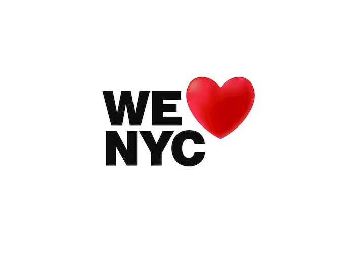
We Love NYC. License: All Rights Reserved.


Graham Clifford Design, the team behind the recently launched We Love NYC campaign, writes about the project:
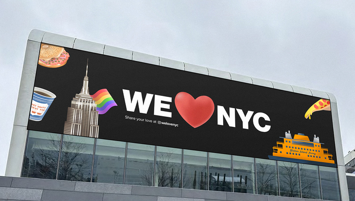
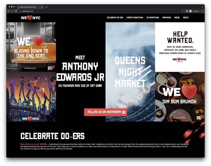
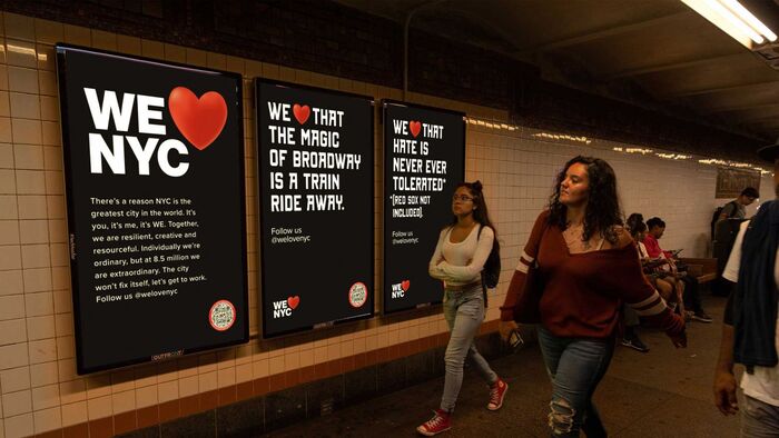
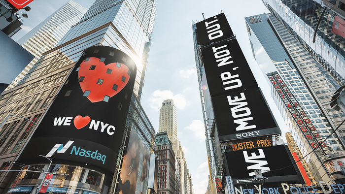
How does one expand on a pure original and stay true to its spirit? We were asked to design the system around the sequel to the original Milton Glaser mark as part of a campaign to celebrate our extraordinary city. Since the phrase now involved “we” and the famous acronym, we needed to make it as versatile as possible: not just boldly expressive in all media and environments, but also making the phrase modular, with emojis replacing the heart to express all the vitality and variety of the five boros. Proud to be a part of it.
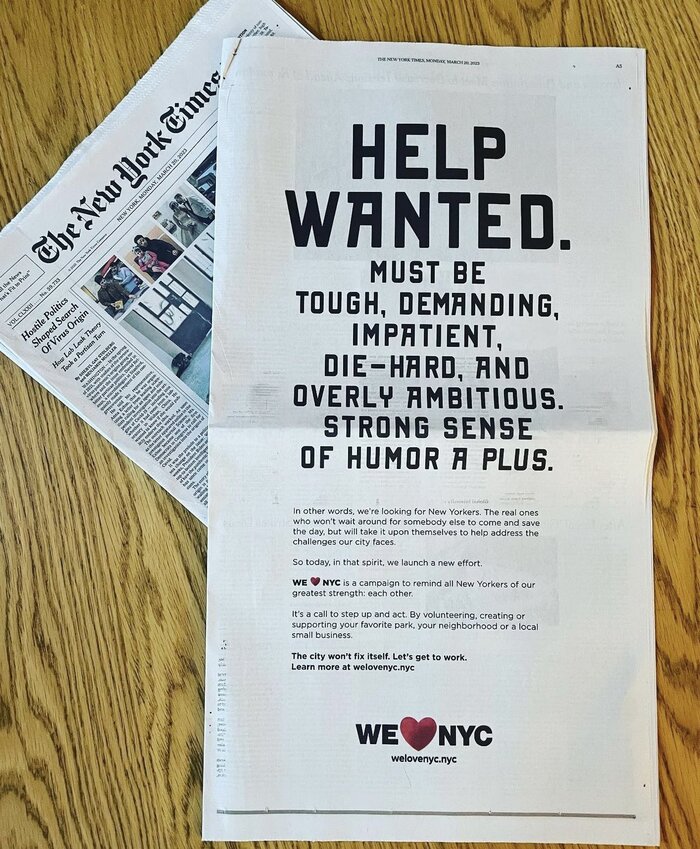
On March 20th, 2023, New York City Mayor Eric Adams, New York Governor Kathy Hochul, and the Partnership for New York City launched “We ❤ NYC” — “a civic campaign to showcase the city’s strengths and mobilize New Yorkers in every community.”
According to the official website of the City of New York:
The citywide campaign will kick-off with a celebration of New Yorkers who are making a difference through community service and will identify volunteer opportunities where everyone will have the opportunity to contribute.
There are three typefaces used in the system thus far:
The logo uses caps from the Black weight of a Helvetica – possibly Neue Haas Grotesk, which is distinguished from Neue Helvetica by a shorter middle bar in E. It might also be another version, with customizations. According to Graham Clifford, the logo is meant to invoke the subway system’s use of Helvetica: “The subway system is the veins or the beating heart of the city,” he told the New York Times.
The secondary display type is New York Line, designed by Coert De Decker and published by Kustomtype.
The typeface used on the website and for text is Proxima Nova, designed by Mark Simonson, published by Mark Simonson Studio.
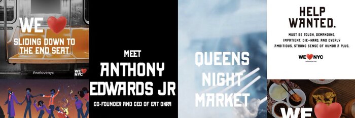
Graham Clifford Design worked together with agencies MaryamB and Founders and illustrator Rox Cristaldo.
Source: grahamclifforddesign.com Graham Clifford Design. License: All Rights Reserved.
Source: grahamclifforddesign.com License: All Rights Reserved.
Source: www.welovenyc.nyc We Love NYC. License: All Rights Reserved.
Source: twitter.com We Love NYC. License: All Rights Reserved.
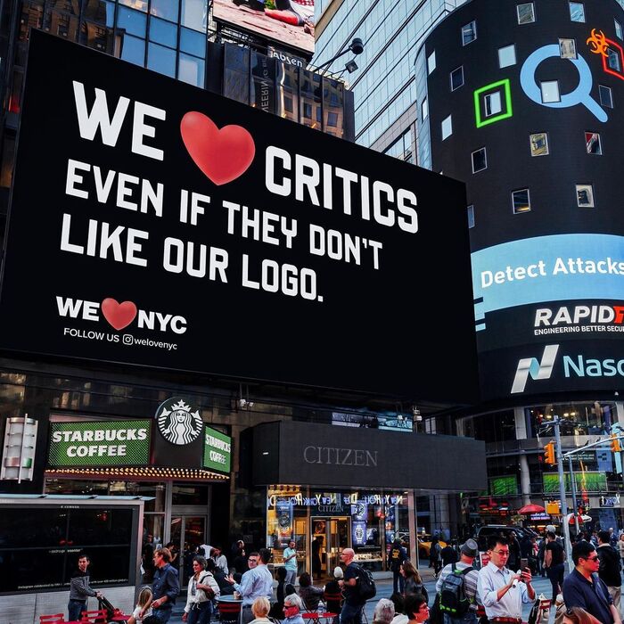
Source: welovenyc.nyc Photo: Raven Mo. License: All Rights Reserved.

Source: grahamclifforddesign.com Graham Clifford Design. License: All Rights Reserved.
Source: www.creativeboom.com License: All Rights Reserved.
Source: grahamclifforddesign.com License: All Rights Reserved.
Source: www.instagram.com Founders. License: All Rights Reserved.
This post was originally published at Fonts In Use