Aftersun movie posters
Source: mubi.com License: All Rights Reserved.


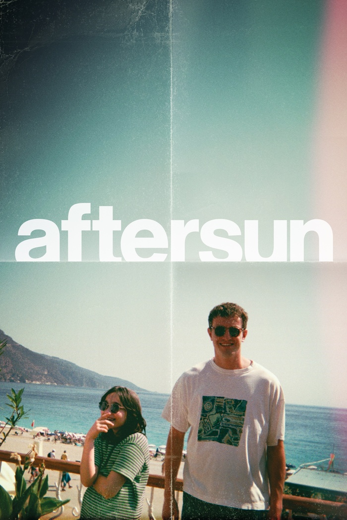
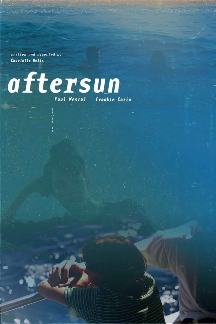
There are several posters for Charlotte Wells’ debut film Aftersun. They may be classified based on the fonts in use. Mubi – the UK distributor of the film – favors an unidentified Helvetica version (possibly Nimbus Sans Bold with modifications) for a cropped low-caps title of the movie on its folded poster. A24 – the US distributor – makes use of Avenir Next for an all-caps title.
A third version of the poster employs Base Monospace, which is also used for the opening credits and the title sequence of Aftersun. The latter has been designed by Version Industries (Caspar Newbolt and Josiah Newbolt) on very short notice, according to their website's blog. The typeface was chosen in discussion with Charlotte Wells.

Source: a24films.com A24. License: All Rights Reserved.
Avenir Next, Gill Sans and Univers Ultra Condensed
Source: themoviedb.org License: All Rights Reserved.
This post was originally published at Fonts In Use