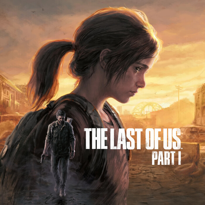
The Last of Us posters and titles
HBO. License: All Rights Reserved.


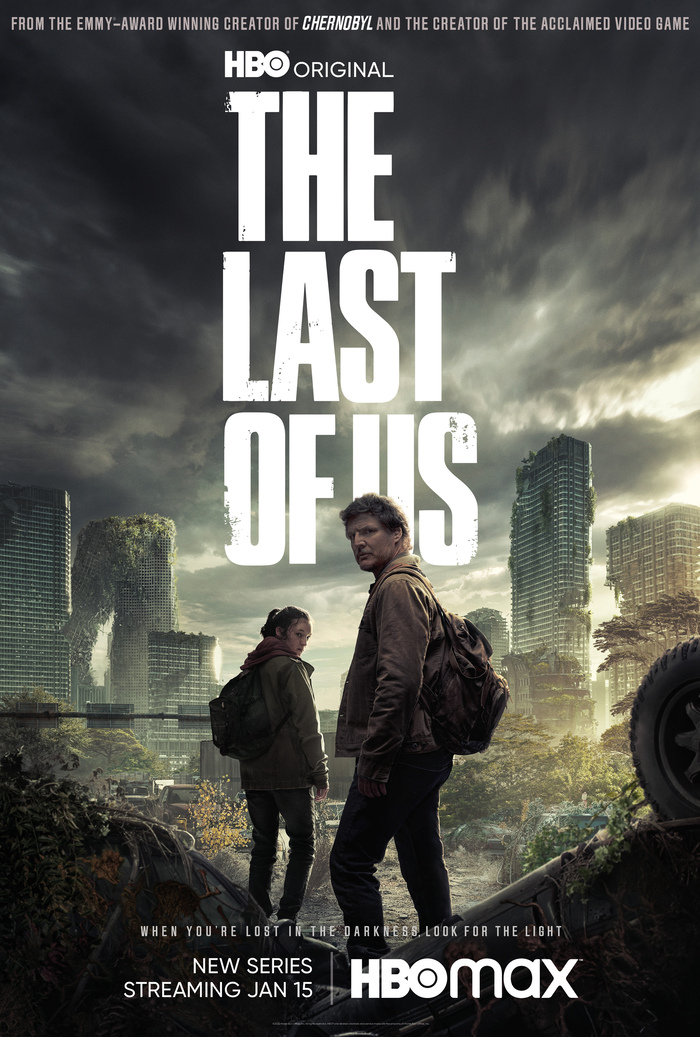
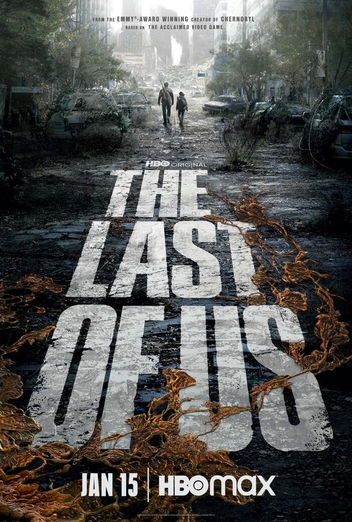
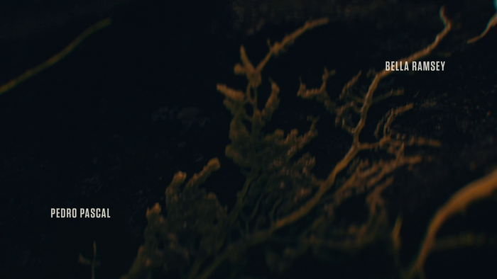
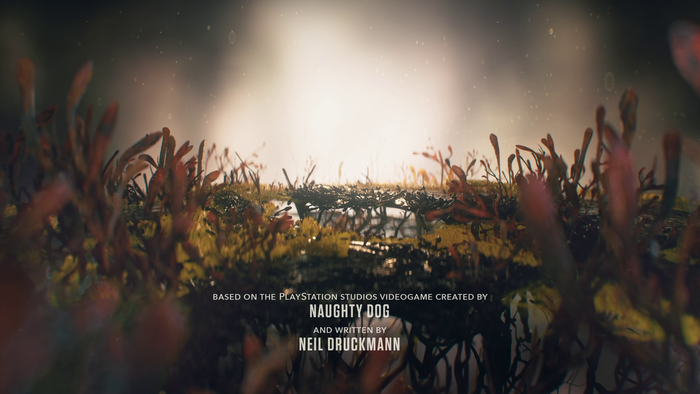
The Last of Us is a HBO TV show based on the eponymous cult game released by Sony in 2013. It tells the story of a hardened survivor and teenage girl after a global pandemic destroys civilization.
Title sequences were created by American studio Elastic. The official font of the show and game is Press Gothic by Canada Type. From their website:
Press Gothic Pro is a retooling and major expansion of Aldo Novarese's Metropol typeface, released by Nebiolo in 1967 as a competitor to Stephenson Blake's Impact (designed by Geoffrey Lee). Though Metropol enjoyed a few short months of popularity and use in Italy, Germany and France, Impact won the technological outlasting battle by moving on to film type then to computer outlines bundled with mainstream software, while Metropol never made it past the metal state until now. Too bad really, since this is one of the few faces that could have played well with all the horrendous stretch’n’squeezing of the 1970s.
Press Gothic is paired with various other sans serifs. In the poster shown above, it’s Jay Gothic and HBO Max’s standard Gilroy. The poster shown below has Helvetica Inserat and Neue Plak Compressed for the date. The titles feature Tungsten with Avenir.
HBO. License: All Rights Reserved.

HBO. License: All Rights Reserved.
HBO. License: All Rights Reserved.
HBO. License: All Rights Reserved.
HBO. License: All Rights Reserved.
This post was originally published at Fonts In Use