Vital Signs: Artists and the Body at MoMA
Source: www.instagram.com Photos: Jonathan Muzikar, Miki Takashima, Eline Mul. License: All Rights Reserved.


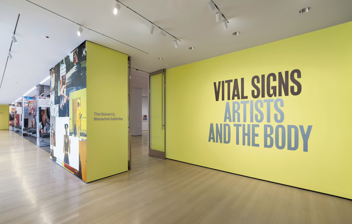
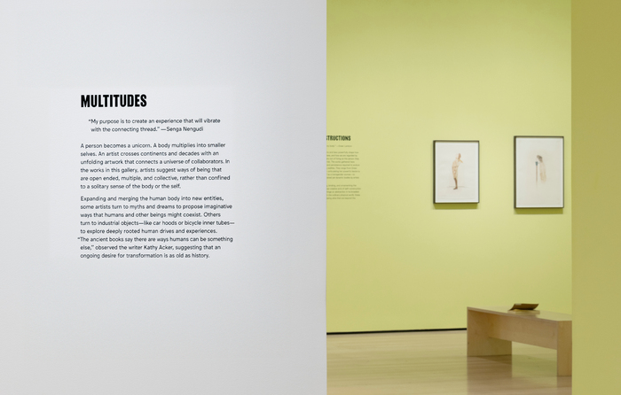
Throughout the 20th century, artists have imagined the body and ideas of the self as fluid and open to ongoing transformations. The exhibition Vital Signs: Artists and the Body included over 100 works by artists who’ve questioned what we think we know about our physical selves and our place in the world.
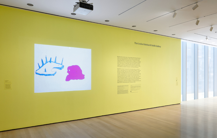
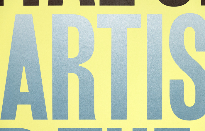
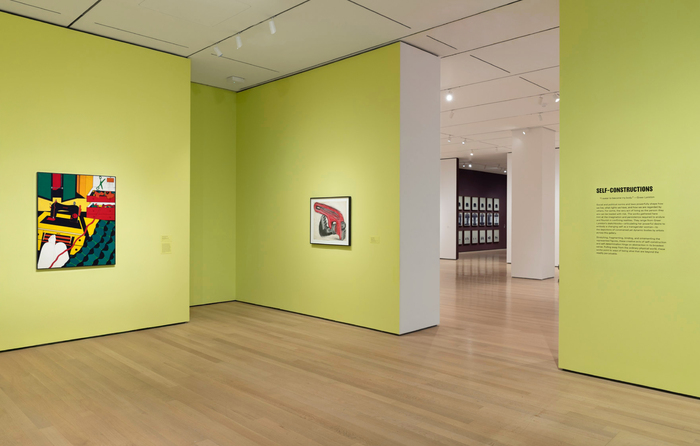
For the exhibition identity we wanted to create a feeling of energy and movement, and embody a design that was gender-expansive, bold and full of life. The entryway for the exhibition was painted in an active yellow with green undertones. The bright color made a statement—catching visitors’ attention and setting a mood when entering the space. The strong title was set in Girott and painted in two contrasting metallic colors, a warm deep brown and a silver-blue. We opted for metallic as this activated the type by making it responsive to the light in the space and to the position of the viewer, creating a feeling of constant movement. The texts throughout the exhibition were set in Jungka, a warm and rhythmical font that helped establish an inviting atmosphere for the exhibition.
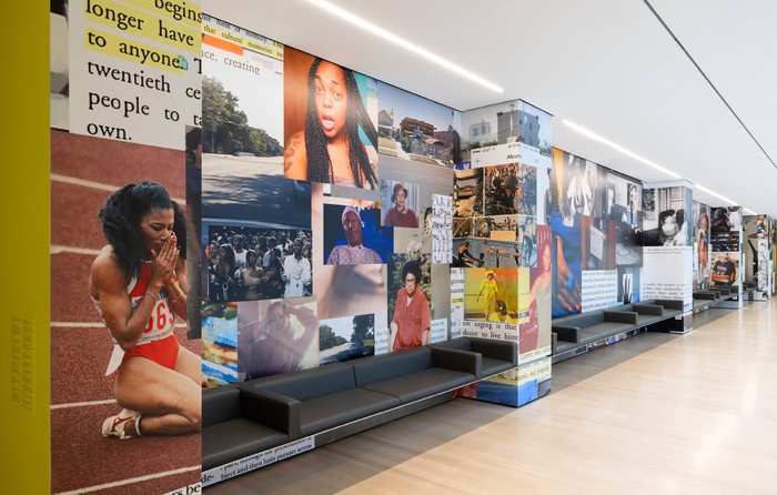
The artwork that spanned the loggia walls, Misdirected Kiss by artist Martine Syms, was produced by MoMA Design Studio to especially fit this space. The work originated as a performative lecture where Syms told a story about movement, gesture, and language through observations about Black female performers both in the media and her own life.
The fonts in use are Girott (by Radim Peško, RP Digital Foundry) for headers and Jungka (by Karel Martens and Jungmyung Lee, Jung Lee Type Foundry) for body text.
Graphic design: Eline Mul, Minhwan Kim
Curatorial team: Lanka Tattersall, Margarita Lizcano Hernandez
Exhibition design: Aimee Keefer
Production: MoMA Design Studio
Production title wall: Paulette Giguere
Screenprinting: Crown Prints
Vinyl: Art World Sign
Source: www.instagram.com Photos: Jonathan Muzikar, Miki Takashima, Eline Mul. License: All Rights Reserved.
Source: www.instagram.com Photos: Jonathan Muzikar, Miki Takashima, Eline Mul. License: All Rights Reserved.
Source: www.instagram.com Photos: Jonathan Muzikar, Miki Takashima, Eline Mul. License: All Rights Reserved.
Source: www.instagram.com Photos: Jonathan Muzikar, Miki Takashima, Eline Mul. License: All Rights Reserved.
Source: www.instagram.com Photos: Jonathan Muzikar, Miki Takashima, Eline Mul. License: All Rights Reserved.
This post was originally published at Fonts In Use