VBALANCE

iseenow.co. License: All Rights Reserved.


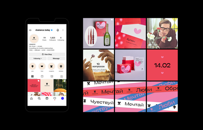
In a world of perpetual movement and infinite possibilities, maintaining balance and fostering genuine relationships are essential for well-being. VBALANCE is a community that brings together individuals who strive for equilibrium and trustworthy connections.
The distinctive identity and clean, recognizable packaging for VBALANCE were crafted by the creative studio iseenow.co. The design incorporates the playful Stinger Wide alongside graphics with similar shapes and lines, and utilizes Milligram Text New for body text. These fonts were designed and published by the team of Francesco Canovaro, Cosimo Lorenzo Pancini, Andrea Tartarelli, and Maria Chiara Fantini at Zetafonts.

iseenow.co. License: All Rights Reserved.
Packaging for three card games developed by Viktoriya “Vika” Dmitriyeva: Узнай себя! (“Get to know yourself!”), Вопросов про любовь (“Questions about Love”), and Вопрос дня ребёнку (“Question of the Day for a Child”)
iseenow.co. License: All Rights Reserved.

iseenow.co. License: All Rights Reserved.

iseenow.co. License: All Rights Reserved.
This post was originally published at Fonts In Use