Leeners Biotech

iseenow.co. License: All Rights Reserved.

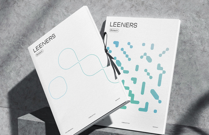
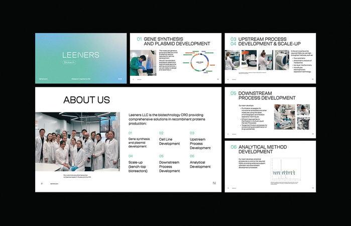
Leeners Biotech excels in transforming innovative ideas into fully operational biopharmaceutical technologies, inspired by nature and life. Their medicines represent modern, effective solutions in the field. The brand’s visual identity features a container-molecule icon, reflecting elements of DNA and the end product—a medicinal pill. The corporate pattern narrates the brand’s approach to molecular-level problem-solving through systematic sequences and connections in development. The visual play of gradients symbolizes the natural inspiration, while cool, pure colors depict human control over chaos, aiming to achieve specific goals.
The brand font is Coil, designed by Vyacheslav Kirilenko and Gayaneh Bagdasaryan in 2020–21 at Brownfox. In the Leeners logo, the glyphs for E, N and R were modified.
iseenow.co. License: All Rights Reserved.
iseenow.co. License: All Rights Reserved.
This post was originally published at Fonts In Use