The Global Entertainment Marketing Academy of Arts & Sciences
Published May 1, 2024
By FontsInUse
Contributed by Sean O'Connor
Source: matchstic.com License: All Rights Reserved.


Source: matchstic.com License: All Rights Reserved.
Source: matchstic.com License: All Rights Reserved.
Source: matchstic.com License: All Rights Reserved.
Source: matchstic.com License: All Rights Reserved.
Source: matchstic.com License: All Rights Reserved.
Source: matchstic.com License: All Rights Reserved.
Source: matchstic.com License: All Rights Reserved.

Source: matchstic.com License: All Rights Reserved.
This post was originally published at Fonts In Use
Source: matchstic.com License: All Rights Reserved.
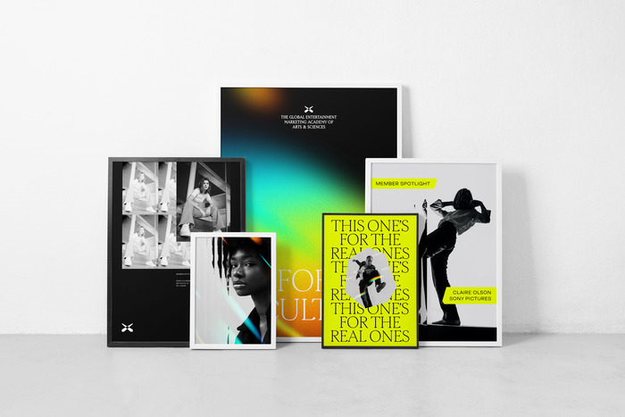
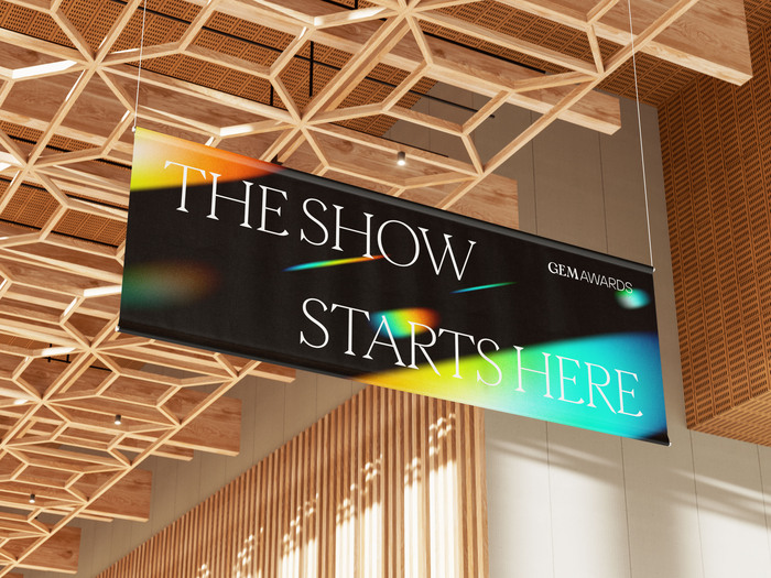
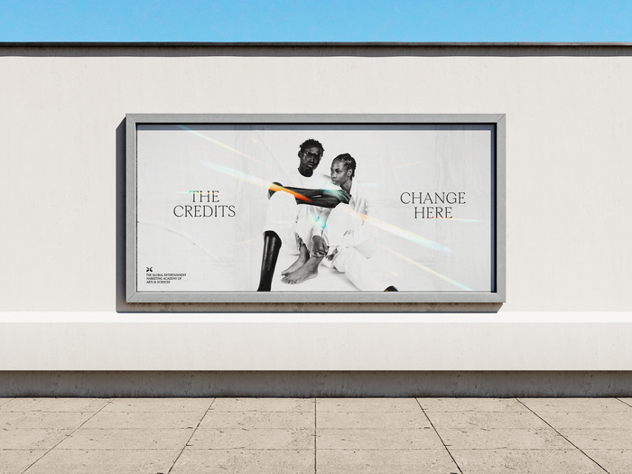
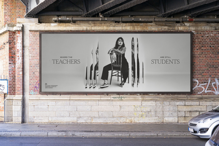
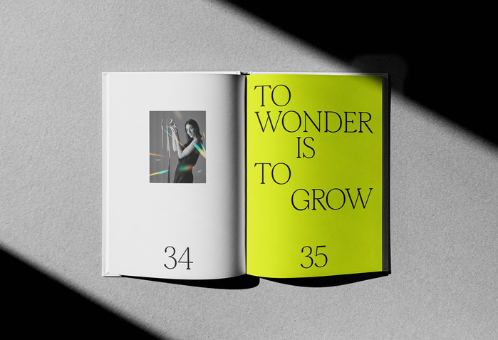
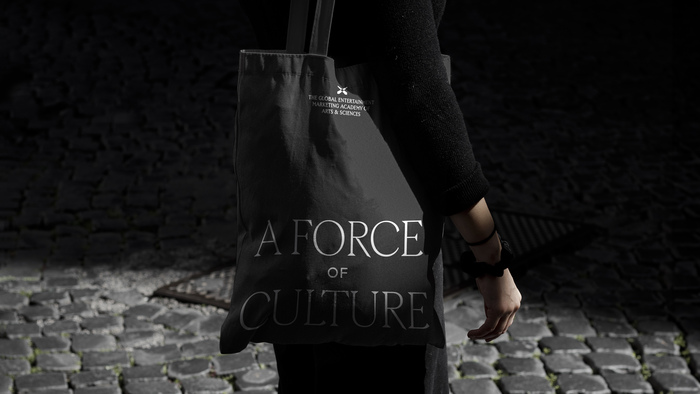
In the process of rebranding Promax to The Global Entertainment Marketing Academy of Arts & Sciences, we landed on Morion as the brand's primary headline font because of its sophisticated spirit and its gem-like wedge serifs. Morion is paired with TT Hoves, which offers a sharp, structured, utilitarian quality that helps anchor the typographic palette.
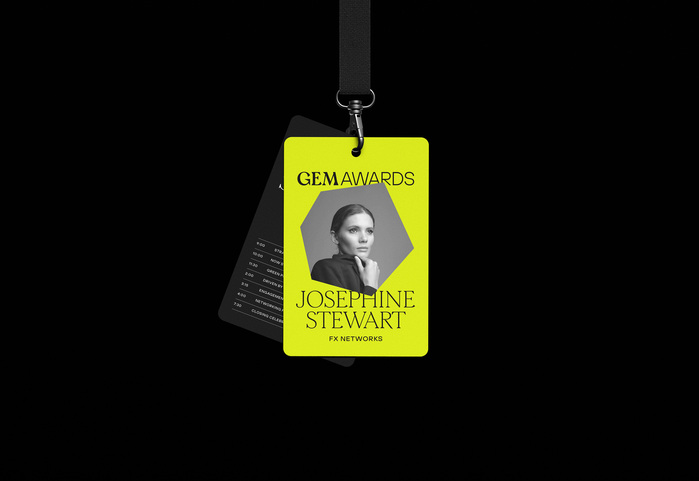
For the academy's logotype, we minimally modified Off Type's Jubilee, which beautifully captures the elevated and time-honored prestige that the award and academy represent.
Source: matchstic.com License: All Rights Reserved.
Source: matchstic.com License: All Rights Reserved.
Source: matchstic.com License: All Rights Reserved.
Source: matchstic.com License: All Rights Reserved.
Source: matchstic.com License: All Rights Reserved.
Source: matchstic.com License: All Rights Reserved.
Source: matchstic.com License: All Rights Reserved.
Source: matchstic.com License: All Rights Reserved.
This post was originally published at Fonts In Use
Read full story.
WRITTEN BY
FontsInUse
An independent archive of typography.
More from FontsInUse