Unterm Techno liegt der Punk
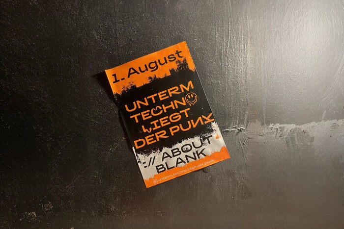
Photo: Swiss Typefaces. gegenfeuer. License: All Rights Reserved.


gegenfeuer is a political design firm based in Berlin. Since 2010, they have been organizing solidarity parties, the profits of which go to individual assistance for refugees and support anti-fascist work in Berlin and Eastern Germany. Among those parties, since 2016, Unterm Techno liegt der Punk has been held once a year at the club ://about blank. The party, still running today, promotes a solid music selection with DJs playing techno, trance, and punk.
For their design work, gegenfeuer is often collaborating with party collectives and occasionally with friends invited to contribute to the posters. Since 2019, the party adopted its current visual identity, centered on the use of the typeface BRRR in a clever balance of some of its alternates. In particular, in the party name, the K in “PUNK” uses the Rotation stylistic set, while in “TECHNO LIEGT”, the C and L are from the Fluid stylistic set. Added to this is the mirroring of the N in “PUNK” and the substitution of the O in “TECHNO” with a custom dripping smiley, designed for the party and echoing the long lineage of acid smileys in acid/rave graphics.
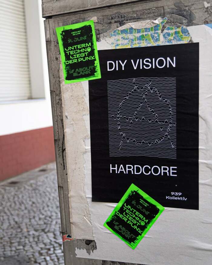
Instead of producing a single polished poster, the group produces 20 to 30 rough, experimental variations, mixing lineups, artist names, illustrations, and textures. Fluorescent stickers with the party name, date, and location unify the series, creating a kind of anarchic, collage-like campaign across Berlin. Combining BRRR with hand-drawn illustrations and high-contrast neon colors, their intervention evoke rave flyers and punk DIY print culture.
These design features and the campaign approach underline the punk soul of the party, reflected in the subversive use of the typeface and in its angled terminals, which connect well to the chisel-tip markers used for underground tagging. At the same time, the typographic choice function as political gesture: accessible, disruptive, and highly visible in public space. The guerrilla sticker bombing can be seen not just as promotion but also a way of reclaiming urban visual culture, resonating with both punk traditions and anti-fascist activism.

Source: www.gegenfeuer.net gegenfeuer. License: All Rights Reserved.

Source: www.gegenfeuer.net gegenfeuer. License: All Rights Reserved.

Source: www.instagram.com gegenfeuer. License: All Rights Reserved.

Source: www.instagram.com gegenfeuer. License: All Rights Reserved.

Source: www.instagram.com gegenfeuer. License: All Rights Reserved.
Source: www.instagram.com gegenfeuer. License: All Rights Reserved.
Source: www.instagram.com gegenfeuer. License: All Rights Reserved.
The poster designed for the dj DIYVISION (from the Flensburg techno 939avantgarde community) parodies the Joy Division's Unknown Pleasures album cover. Here Helvetica can be seen paired with BRRR.

Source: www.instagram.com gegenfeuer. License: All Rights Reserved.

Source: www.instagram.com gegenfeuer. License: All Rights Reserved.
For the 2019 party, BRRR was adopted as all lowercase for the main advertisement. The font can be also seen in all caps using the Stylistic Set 1 “Rotation” for the STRAND poster.
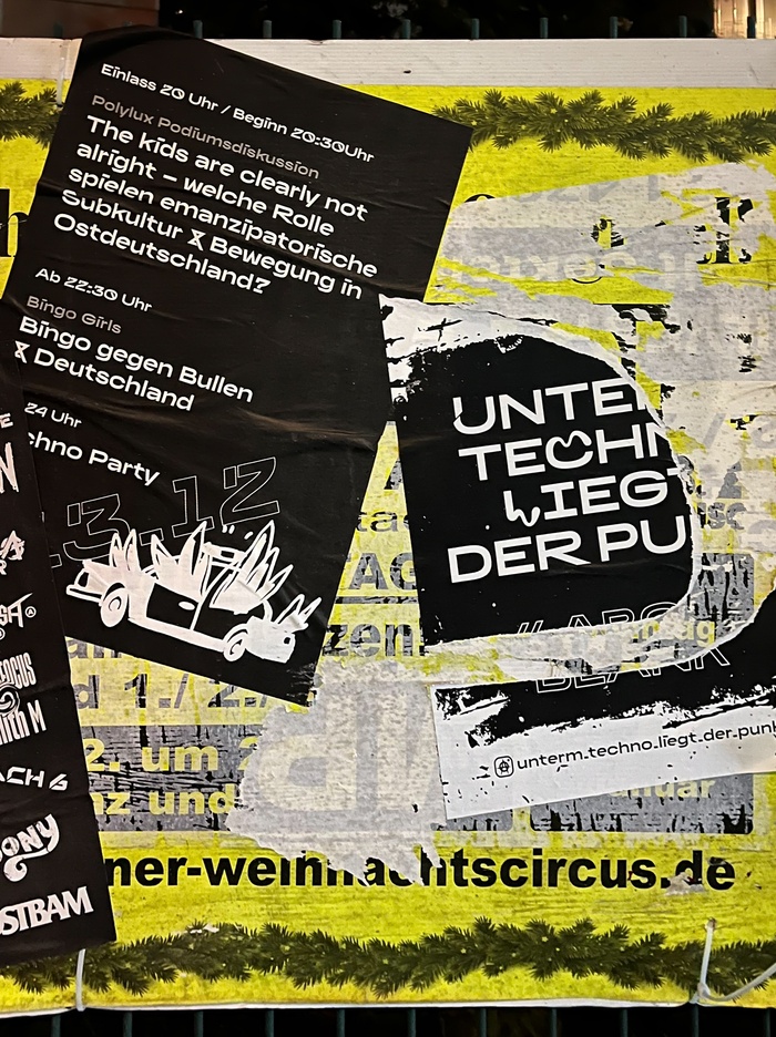
Photo: Swiss Typefaces. gegenfeuer. License: All Rights Reserved.

Source: www.instagram.com gegenfeuer. License: All Rights Reserved.
This post was originally published at Fonts In Use