Piccalio
License: All Rights Reserved.


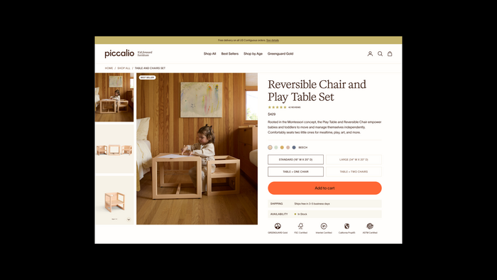
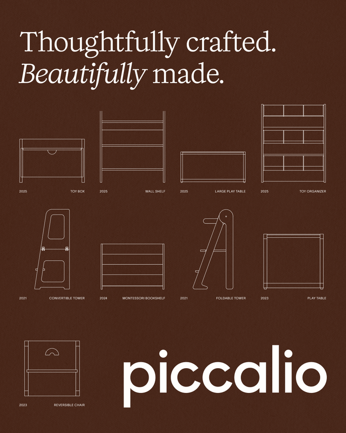
Founded in 2020 in Los Angeles, Piccalio first gained recognition for crafting beautiful wooden toys that combined high safety standards with elegant design. Over the past five years, the brand has expanded its core collection to include multifunctional furniture pieces for children – products designed not only to support development and play, but also to blend seamlessly into the family home.
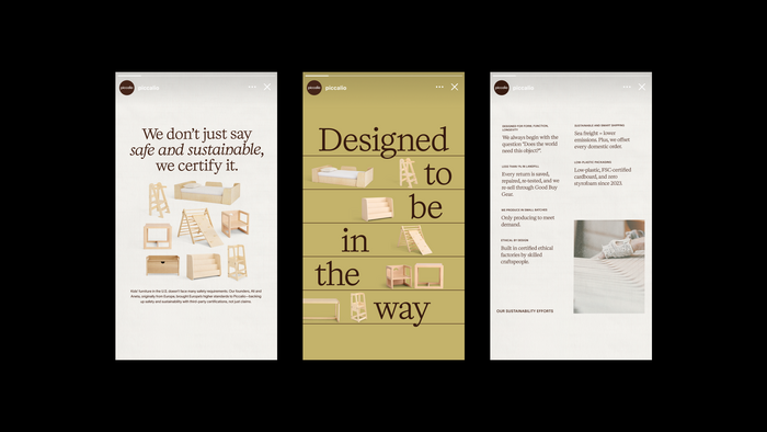
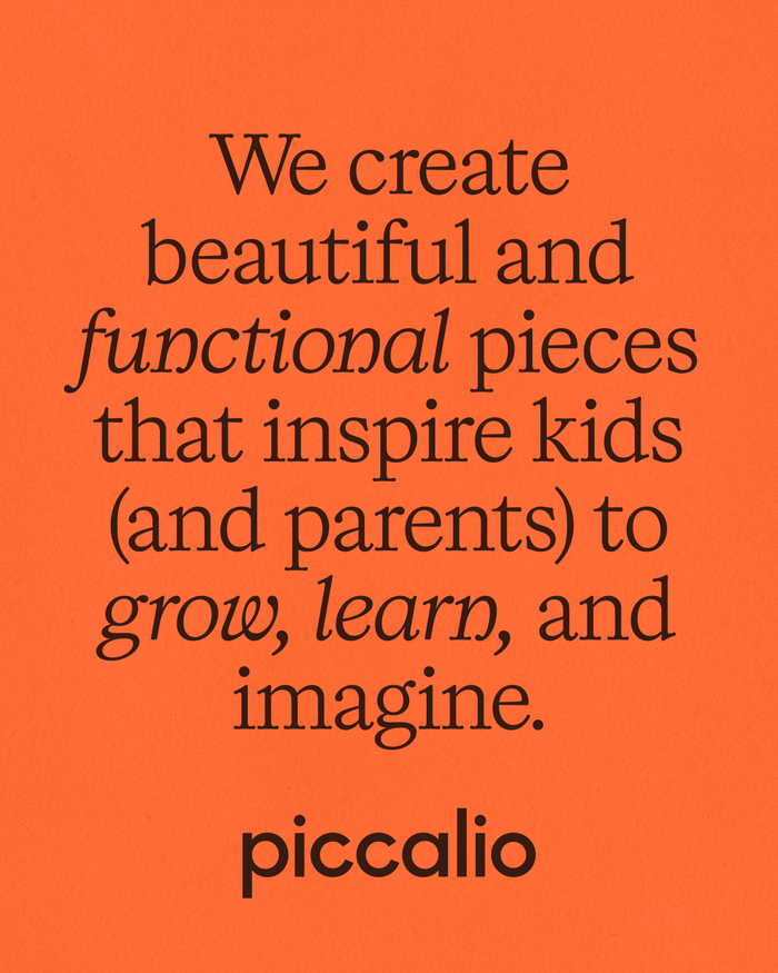
The brand’s transformation has led to an inflection point, sparking a desire to evolve the visual landscape to reflect its growth and deepened sense of purpose. “In a sea of plastic kids’ products, our mission is clear: bring design and beauty back into the everyday,” said Aneta Kostic, Co-founder and Creative Director. “Children’s things don’t have to feel like clutter. They should be objects you’re proud to live with – backdrops to everyday memories, both big and small.”
At the heart of Piccalio’s brand refresh is a new logo and wordmark that strikes a balance between timelessness and playfulness. With the update, we wanted to connect to our brand guideposts of elegance and simplicity. The challenge was to keep some of the playful spirit of the original wordmark while also achieving a more polished look.
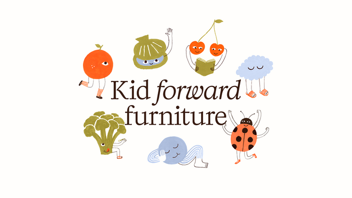
The new wordmark is based on a customized version of Rothek by Groteskly Yours. It is sharp, clean, and elegant, while maintaining the approachability and slightly playful quality of the brand's original mark.
Piccalio's new family of fonts balances elegance and warmth. Headlines are set in Kalice, customized for Piccalio by Margot Lévêque. TWK Lausanne, with its organic idiosyncrasies, is the perfect pairing, adding a contemporary edge.

License: All Rights Reserved.
License: All Rights Reserved.
License: All Rights Reserved.
License: All Rights Reserved.
License: All Rights Reserved.
License: All Rights Reserved.

License: All Rights Reserved.

License: All Rights Reserved.
This post was originally published at Fonts In Use