TUCCI
Source: www.instagram.com License: All Rights Reserved.

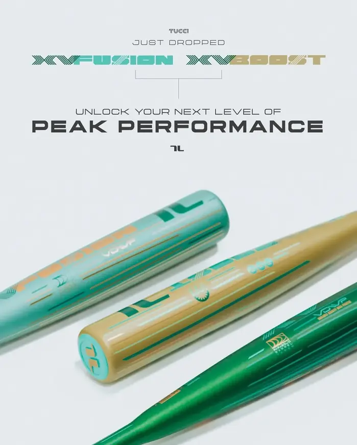
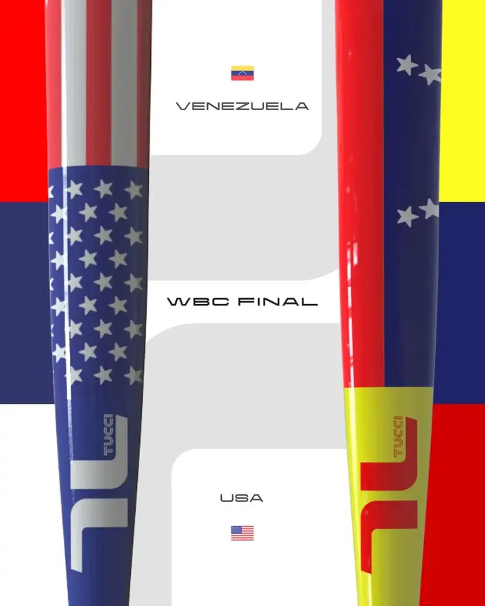
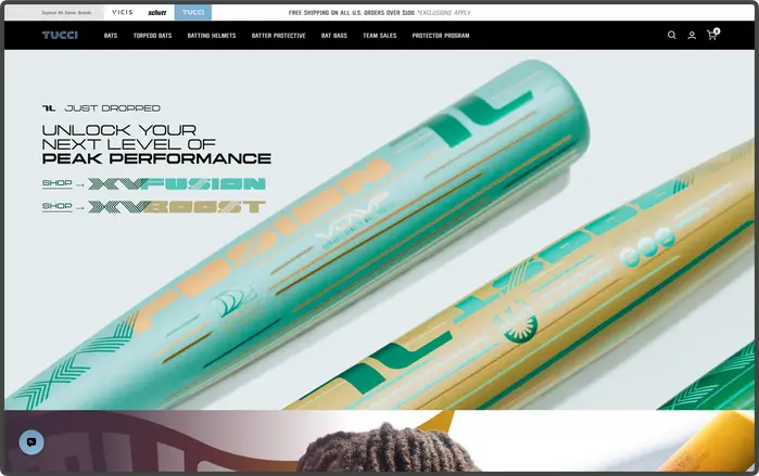
Positioned as a precision-driven, craft-oriented baseball brand, TUCCI defines itself through a balance of performance and authenticity. Rather than competing on mass appeal, the brand speaks to a more discerning segment—players who value control, detail, and material integrity. This positioning translates into a visual identity that is clean yet assertive, technical yet expressive, reflecting both the discipline of the sport and the individuality of its athletes. Every design decision, including typography, is treated as an extension of this philosophy.
Since March 28, 2025, as observed across its Instagram posts, TUCCI has consistently adopted Yapari as its primary typeface in both website copy and social media graphics. Inspired by street typography from Makassar, Yapari offers extended and expanded forms alongside a comprehensive weight range, enabling a flexible yet cohesive visual system. Its bold, stretched character introduces a distinctive voice that sets TUCCI apart from conventional sports branding, while its versatility supports both structured and expressive applications. In this context, Yapari is not merely a stylistic choice—it becomes a strategic tool that reinforces Tucci’s identity as a brand rooted in performance, yet unafraid to express a broader cultural perspective.

Source: www.instagram.com License: All Rights Reserved.

Source: www.instagram.com License: All Rights Reserved.

Source: www.instagram.com License: All Rights Reserved.

Source: www.instagram.com License: All Rights Reserved.

Source: www.instagram.com License: All Rights Reserved.
Source: www.instagram.com License: All Rights Reserved.
Source: tuccilimited.com License: All Rights Reserved.

Source: www.instagram.com License: All Rights Reserved.
This post was originally published at Fonts In Use