Taubmans – Chromatic Joy campaign
Source: letasobierajski.com Wade and Leta. License: All Rights Reserved.


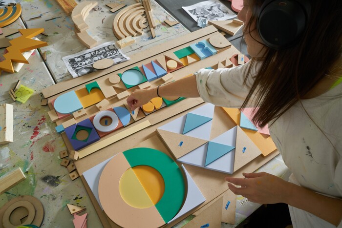
Initially beginning as a branding project, Wade and Leta designed and built the physical lockup for Taubmans’ 2021 campaign, Chromatic Joy. From their case study:
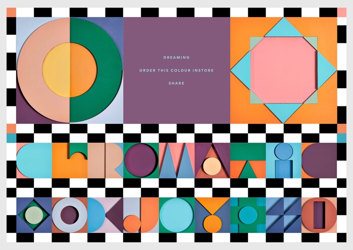
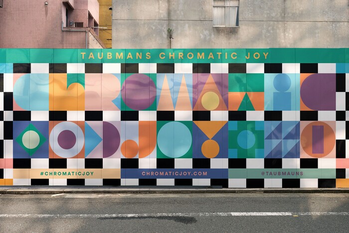
Our multi-layered logo and its system of glyphs existed as physical wall reliefs that, when assembled, would create a giant composition that we photographed for the header of the website. Each of these letters and glyphs were hand painted to showcase the vibrancy and tactility of Taubman’s colors for 2021. We had a lot of fun determining this modular typographic approach as it gave us infinite opportunities to showcase Taubman’s color pairing possibilities with our material approach.
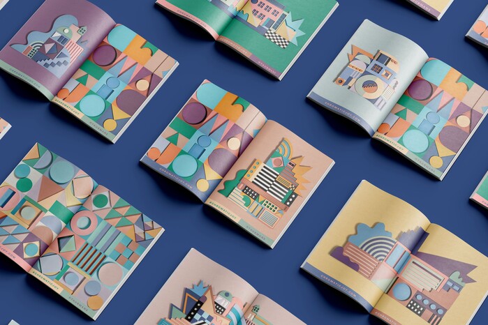
Additionally, we designed our own ideal buildings to supplement the site by pulling inspiration from architects like Kunihiko Hayakawa and Kazuo Shinohara. Everything was nicely linked together with the eclectic palette derived from Taubman’s colors of the year in order to exist on Taubman’s digital annual report website (designed by Sons & Co.) featuring loads of chromatic inspiration and insightful interviews with other colorful creatives such as Yinka Ilori, Camille Walala, and Adam Nathaniel Furman. We’re in there too ;)
Geometer is used alongside what looks like Gordita as well as an unidentified sans similar to LL Circular.
Source: letasobierajski.com Wade and Leta. License: All Rights Reserved.
Source: letasobierajski.com Wade and Leta. License: All Rights Reserved.
Source: letasobierajski.com Wade and Leta. License: All Rights Reserved.
Source: letasobierajski.com Wade and Leta. License: All Rights Reserved.
This post was originally published at Fonts In Use