Toronto Subway station names
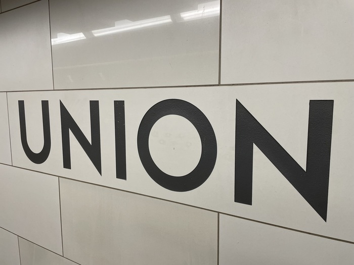
Photo: Ian Hooker. License: All Rights Reserved.

Toronto Subway is a geometric sans-serif typeface designed for the original section of the Toronto Transit Commission’s (TTC) Yonge subway. The typeface and TTC logo were developed during the construction of Line 1 Yonge–University in the 1940s, perhaps by draughtsman Philip Butt, but the original designer has never been determined. The font is a distinctive rectangular font composed of capital letters etched into the tiles of Toronto subway stations opened between 1954 and 1974, as well as on signs.
The sui generis Toronto Subway font was designed in 2004 by David Vereschagin, who visited stations, took photos, and made rubbings of the letters on the original Vitrolite glass tiles. Vereschagin also designed a matching lowercase, inspired by Futura and similar designs.
By 2007, “TTC wayfinding typography” was a case study in what not to do, confusing users and neglecting local typographic heritage by incorporating a jumble of Univers, Swiss 721 and Gill Sans, as documented by Joe Clark in a presentation to the 2007 ATypI conference.
In 2013, the TTC created a design and wayfinding team who readopted the typeface, calling it Bloor-Yonge after the busy station at the intersection of two lines, and they began to re-apply it through the system. Lines recently built by the new regional transit authority, Metrolinx, only use the iconic typeface in some signage as a “decorative element.” Most wayfinding signage is in the new Metrolinx standard of ClearviewADA,
The Union station signage shown is from the 2014 renovation and expansion. The Eglinton station signage is original to 1954 and is a lighter weight used this way only in one other station. The exit sign is also a first use from 1954. The St Andrew station and “PLEASE HOLD HANDRAIL” sign are from the first line extension in 1963.
See also the Toronto Transit Commission Signage and Wayfinding Standards (2023).
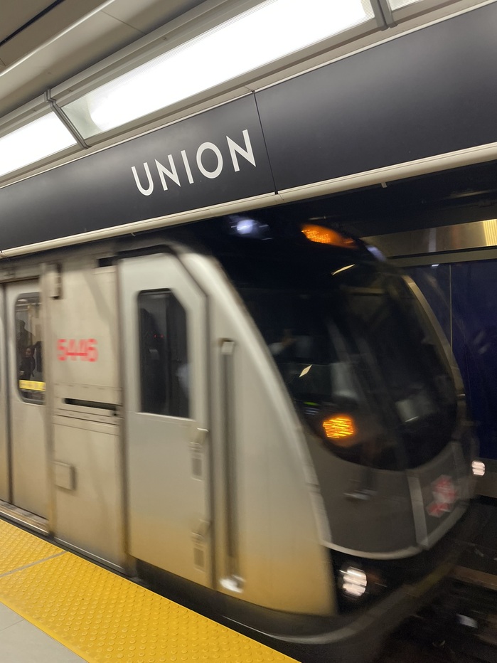
Photo: Ian Hooker. License: All Rights Reserved.
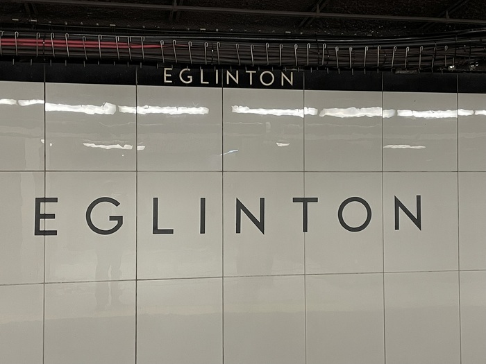
Photo: Ian Hooker. License: All Rights Reserved.
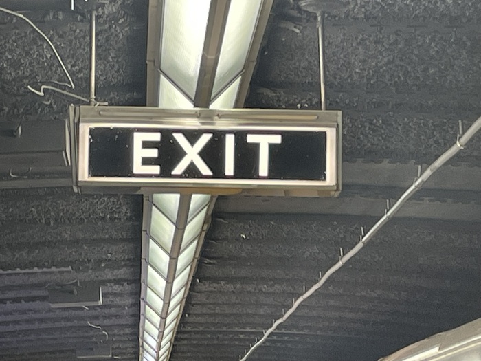
Photo: Ian Hooker. License: All Rights Reserved.
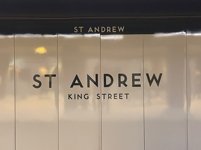
Photo: Ian Hooker. License: All Rights Reserved.
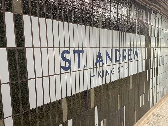
Photo: Ian Hooker. License: All Rights Reserved.
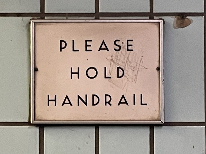
Photo: Ian Hooker. License: All Rights Reserved.
This post was originally published at Fonts In Use