The Toolkit
Source: beststudio.ca Best Studio. License: All Rights Reserved.




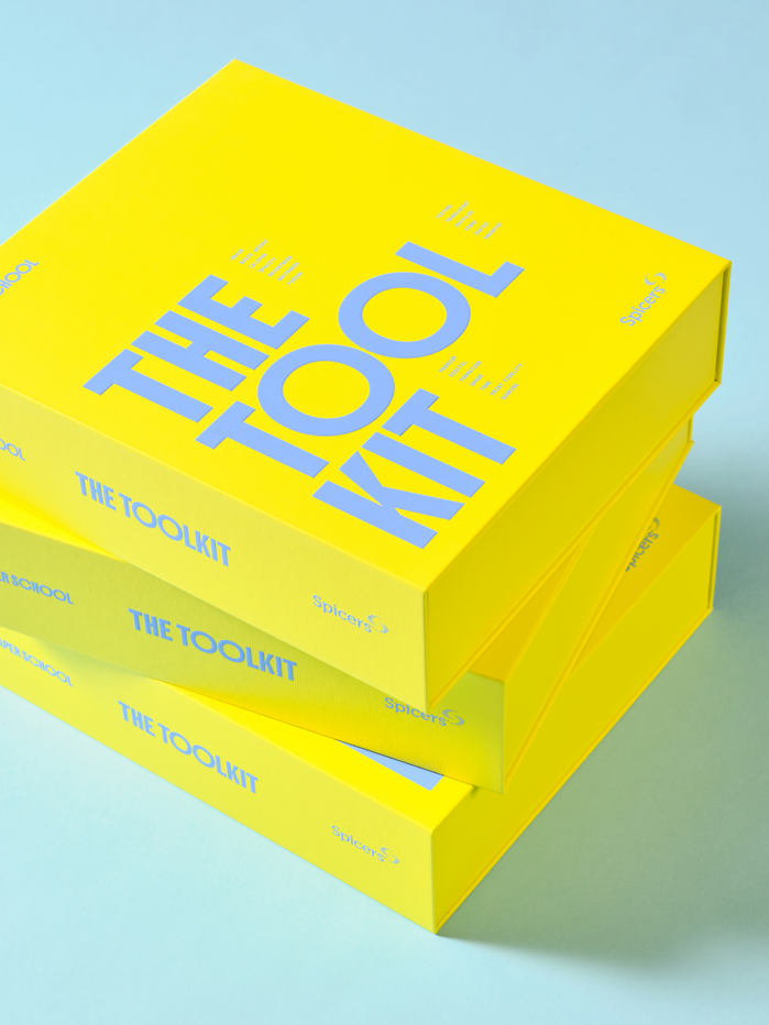
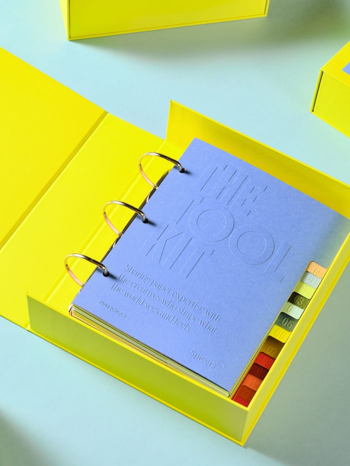
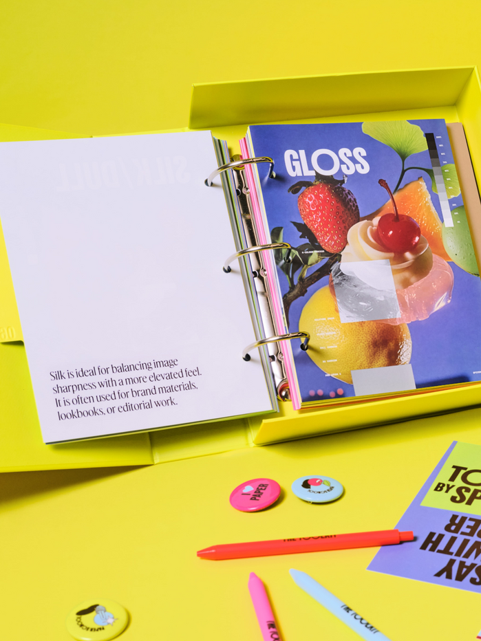
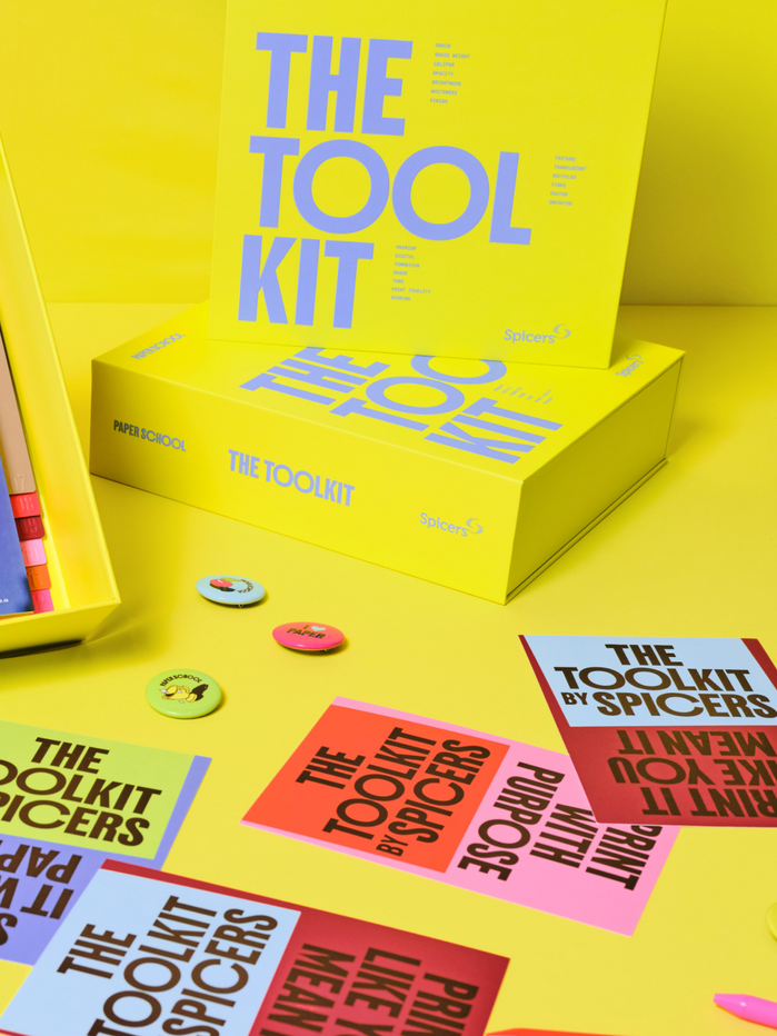
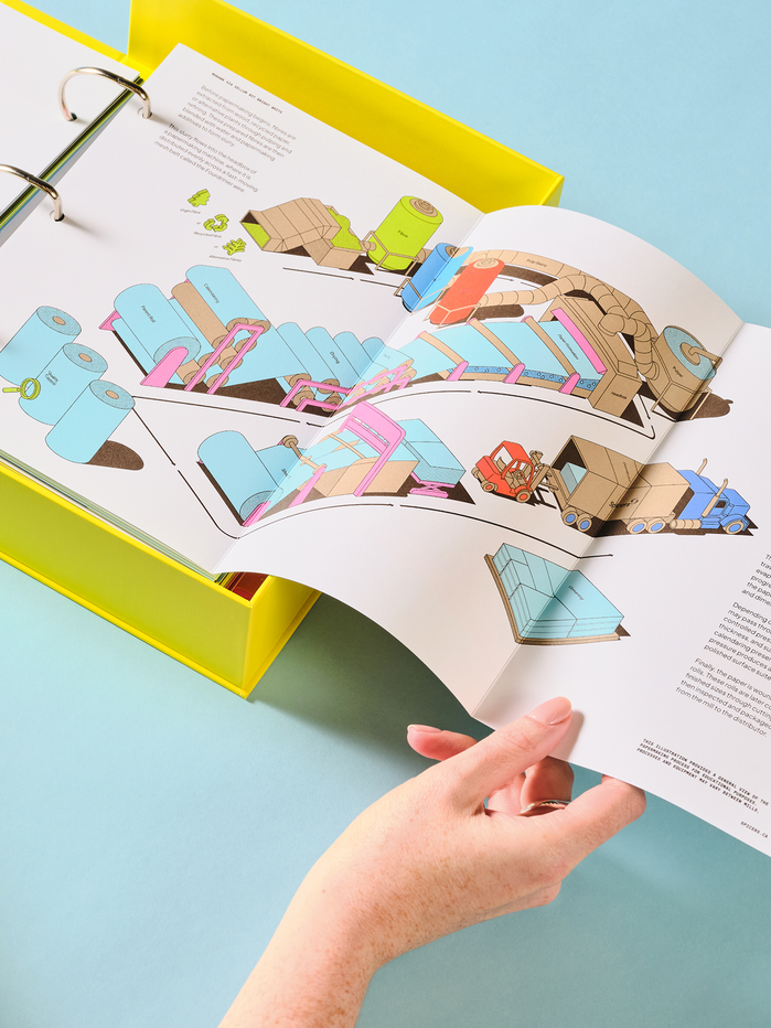
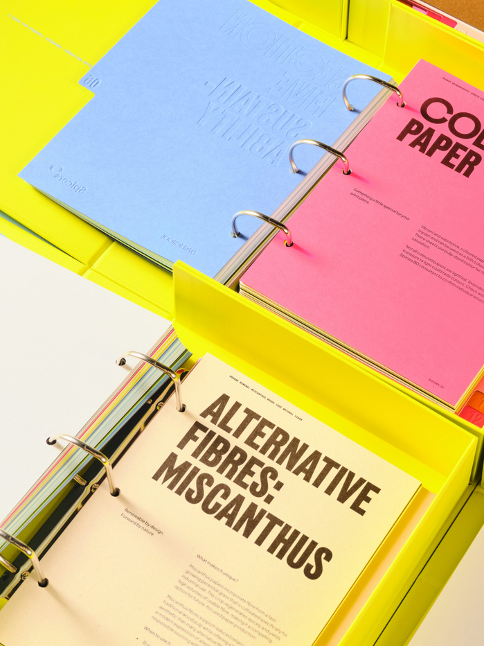
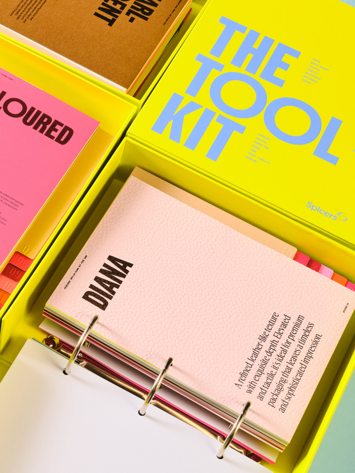
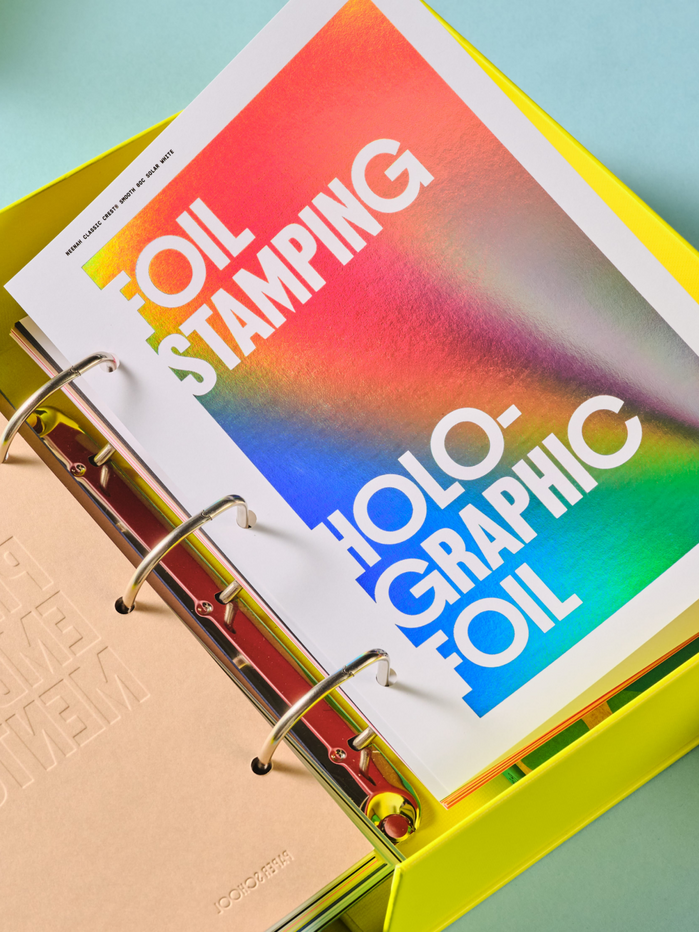
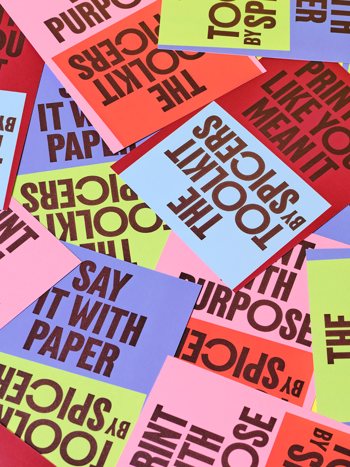
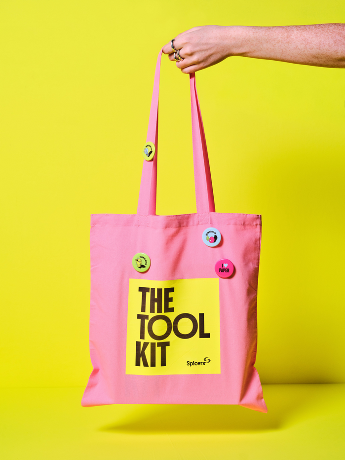
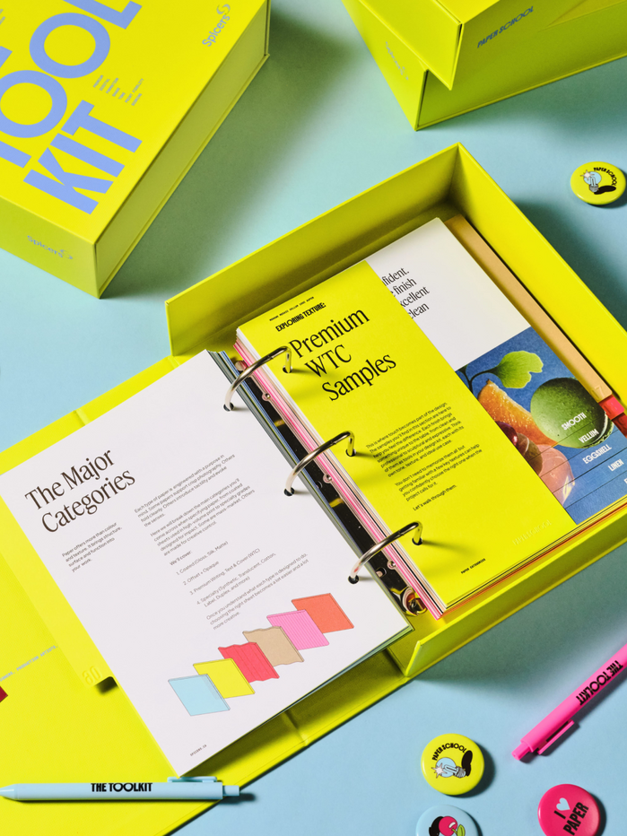
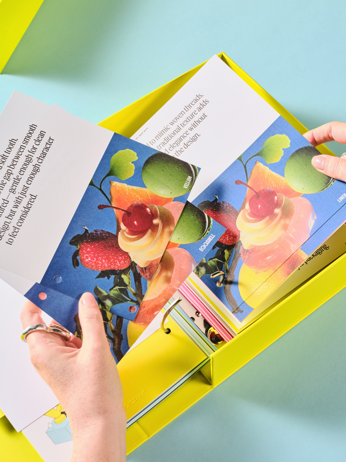
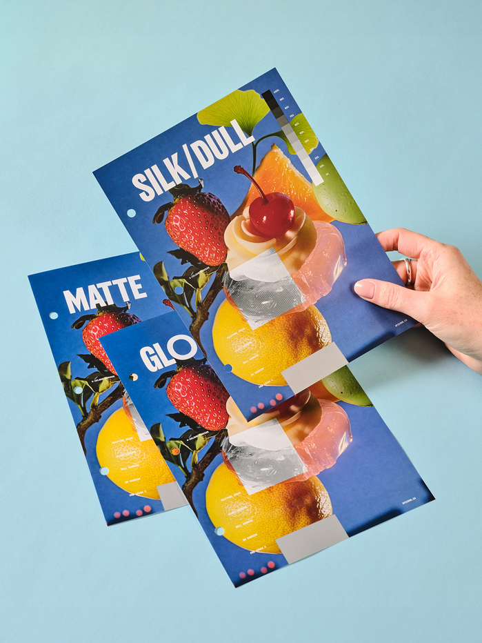
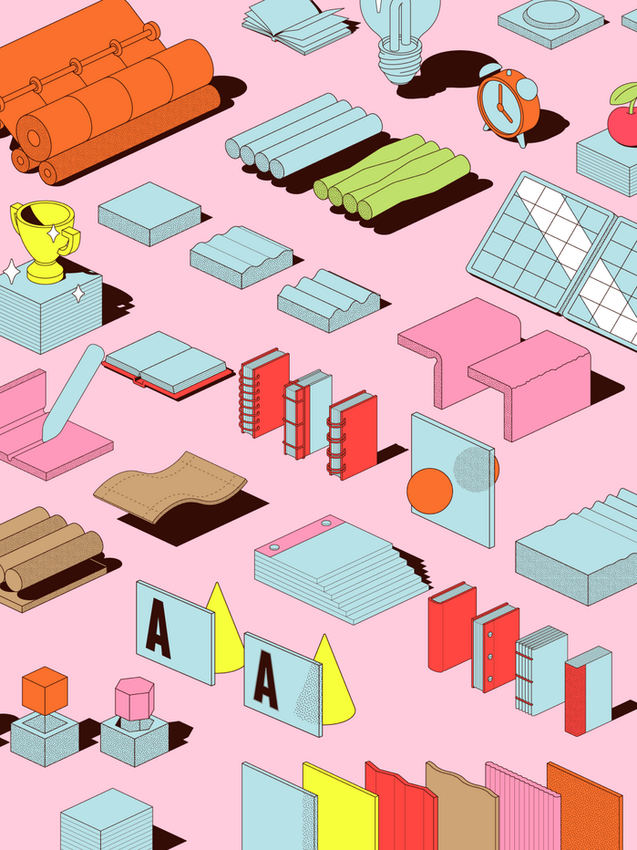
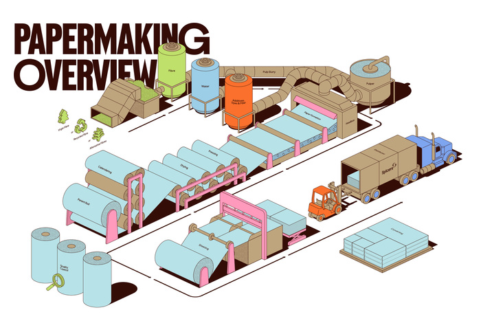
Best Studio worked with Spicers and their Paper School program to create The Toolkit, a comprehensive guide to print production. The guide encompasses paper, specifications, print production, finishing, and material exploration. Created to make paper education more accessible, The Toolkit brings together practical tools, insights, and guidance to help teams build confidence in paper selection, print applications, sustainability considerations, and performance. Alongside the physical guide, Best Studio produced several graphics and animations to extend the project’s reach across digital channels.
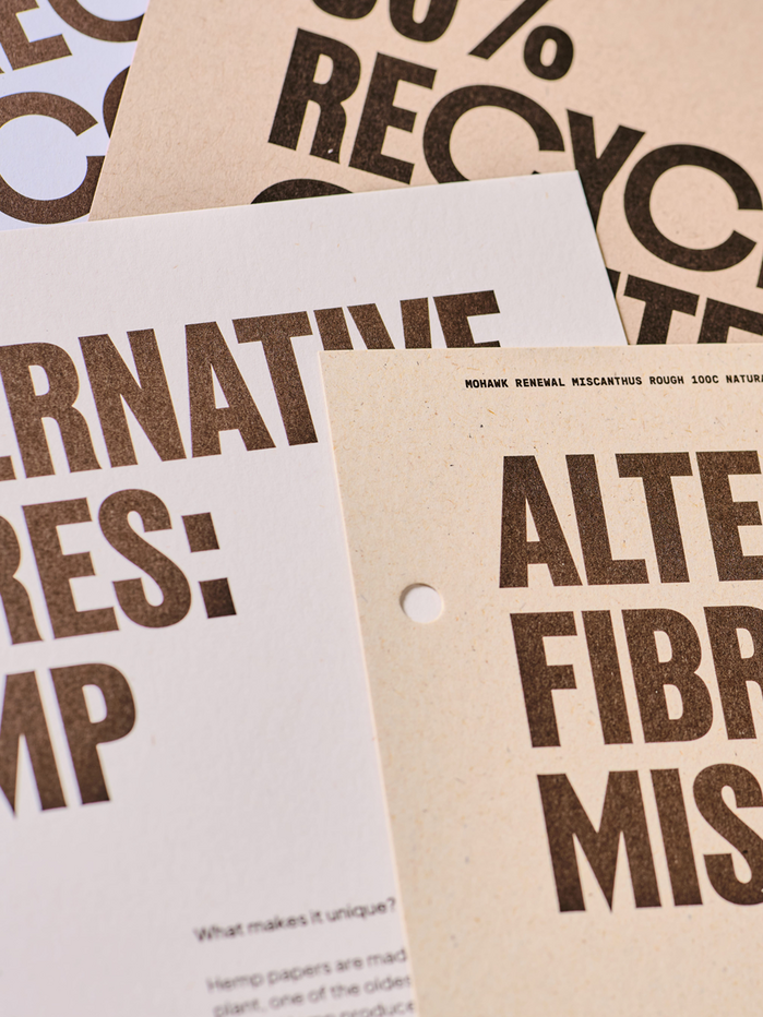
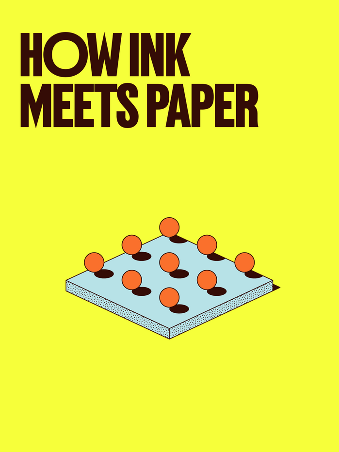
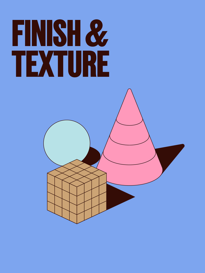
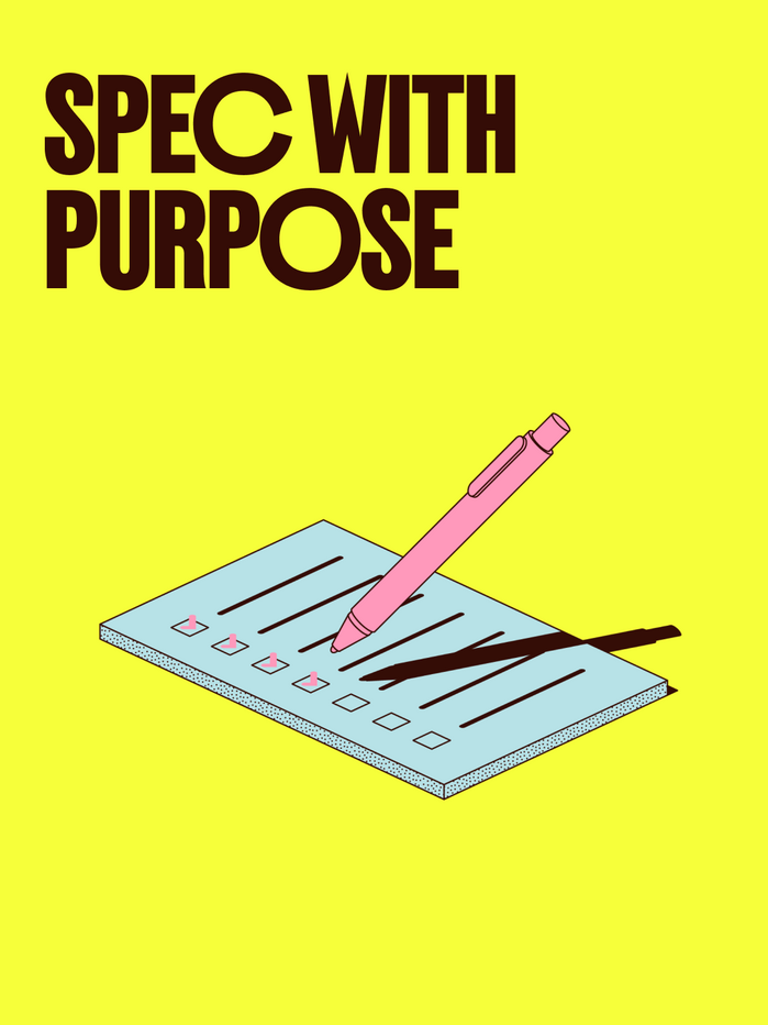
Farmacia by Nguyen Gobber was chosen as the main title font for its bold, graphic character, which makes it a natural companion to the illustrations. As Best Studio explains, the typeface has enough personality to hold its own against a vibrant, colourful palette without losing any of the project’s playful energy.
For the more technical, spec-driven copy, the monospaced version of GT Pressura by Grilli Type was used. Its precise, utilitarian quality doesn't pull focus from the main content.
Feature Display Condensed by Commercial Type adds a more editorial tone, as it carries a traditional, textbook-like quality suited to the content-heavy nature of The Toolkit. Best Studio notes that the contrast it creates against the other typefaces was particularly useful in establishing hierarchy and helping the reader navigate the piece more easily.
For body copy throughout, Plus Jakarta Sans by Tokotype was used as a reliable workhorse typeface that pairs naturally with Farmacia.
Source: beststudio.ca Best Studio. License: All Rights Reserved.
Source: beststudio.ca Best Studio. License: All Rights Reserved.
Source: beststudio.ca Best Studio. License: All Rights Reserved.
Source: beststudio.ca Best Studio. License: All Rights Reserved.
Source: beststudio.ca Best Studio. License: All Rights Reserved.
Source: beststudio.ca Best Studio. License: All Rights Reserved.
Source: beststudio.ca Best Studio. License: All Rights Reserved.
Source: beststudio.ca Best Studio. License: All Rights Reserved.
Source: beststudio.ca Best Studio. License: All Rights Reserved.
Source: beststudio.ca Best Studio. License: All Rights Reserved.

Source: beststudio.ca Best Studio. License: All Rights Reserved.
Source: beststudio.ca Best Studio. License: All Rights Reserved.
Source: beststudio.ca Best Studio. License: All Rights Reserved.
Source: beststudio.ca Best Studio. License: All Rights Reserved.
Source: beststudio.ca Best Studio. License: All Rights Reserved.
Source: beststudio.ca Best Studio. License: All Rights Reserved.
Source: beststudio.ca Best Studio. License: All Rights Reserved.
Source: beststudio.ca Best Studio. License: All Rights Reserved.

Source: beststudio.ca Best Studio. License: All Rights Reserved.
Source: beststudio.ca Best Studio. License: All Rights Reserved.
This post was originally published at Fonts In Use