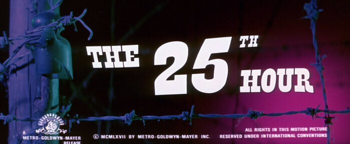
The 25th Hour (1967) title sequence
Metro-Goldwyn-Mayer. License: All Rights Reserved.

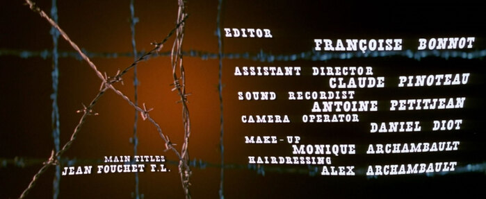
Jean Fouchet’s title sequence for the 1967 film The 25th Hour, an anti-war film set in World War II Hungary and Germany. I’ll admit I haven’t seen the film (it received poor reviews when it opened and seems to still disappoint audiences today, judging from its Letterboxd reviews), but the title sequence is classic Fouchet: a simple type treatment and graphic premise brought to life with beautiful colors and in-camera effects wizardy.
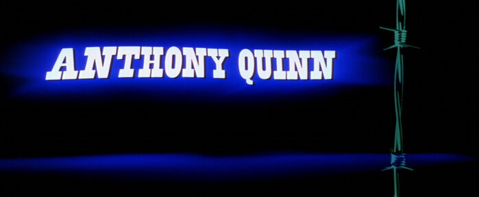
I’ve never been able to find anything precise about how Fouchet got these kind of undulating type effects (which occur at least briefly in most of his titles from the 1960s), but it definitely involves high-contrast film and shooting type through a liquid of some kind.
Credit for the typeface identification goes to Florian Hardwig, who answered my question on fontid.co.
Metro-Goldwyn-Mayer. License: All Rights Reserved.
Metro-Goldwyn-Mayer. License: All Rights Reserved.
Metro-Goldwyn-Mayer. License: All Rights Reserved.
Metro-Goldwyn-Mayer. License: All Rights Reserved.
This post was originally published at Fonts In Use