Archipolis architects
Published November 29, 2023
By FontsInUse
Contributed by Alexandra Rio

Source: lesformesassociees.com Les formes associées. License: All Rights Reserved.

Source: lesformesassociees.com Les formes associées. License: All Rights Reserved.
Source: lesformesassociees.com Les formes associées. License: All Rights Reserved.

Source: lesformesassociees.com Les formes associées. License: All Rights Reserved.
Source: lesformesassociees.com Les formes associées. License: All Rights Reserved.

Source: lesformesassociees.com Les formes associées. License: All Rights Reserved.
This post was originally published at Fonts In Use
Source: lesformesassociees.com Les formes associées. License: All Rights Reserved.
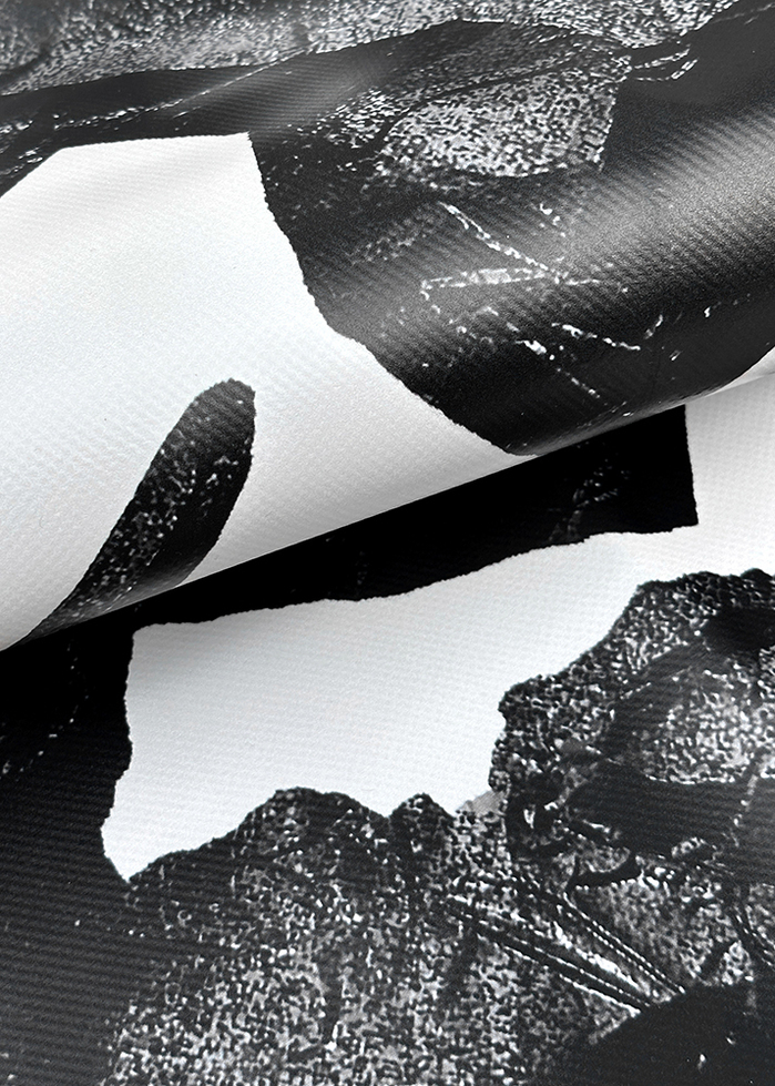
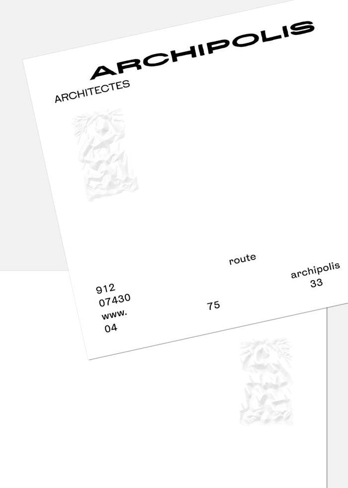
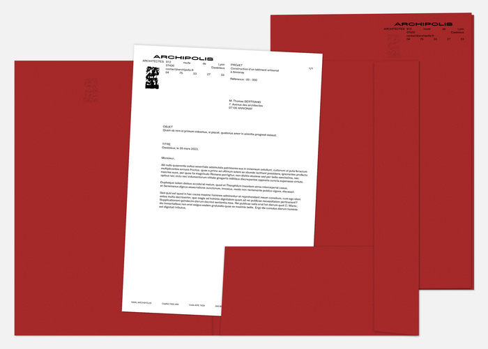
Archipolis is a well-known architectural office in the Annonay area. After changing the management team, the duo of associate architects called on the studio Les formes associées to imagine a visual identity that would convey the agency's new ambitions. The emblem, a constraint imposed by the architects, is a metaphor for their vision of architecture. It depicts an ungendered figure (architect) holding a box (tools) and sheltering (architecture) from the rain (climate) with branches (vernacular). The logo is based on HK Gothic, developed by Alfredo Marco Pradil, Hanken Design.
Source: lesformesassociees.com Les formes associées. License: All Rights Reserved.
Source: lesformesassociees.com Les formes associées. License: All Rights Reserved.
Source: lesformesassociees.com Les formes associées. License: All Rights Reserved.
Source: lesformesassociees.com Les formes associées. License: All Rights Reserved.
Source: lesformesassociees.com Les formes associées. License: All Rights Reserved.
This post was originally published at Fonts In Use
Read full story.
WRITTEN BY
FontsInUse
An independent archive of typography.
More from FontsInUse