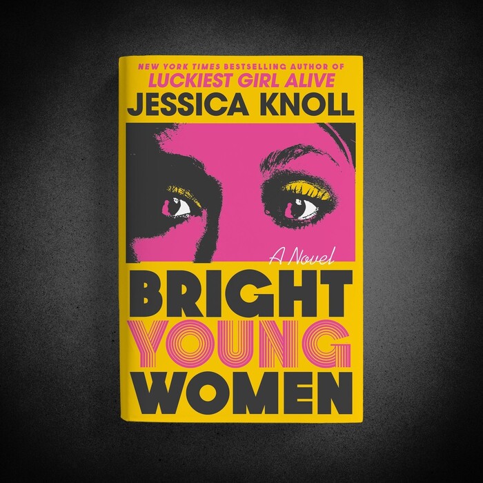
Bright Young Women by Jessica Knoll
Source: www.instagram.com Simon & Schuster Art Works. License: All Rights Reserved.


From CrimeReads:
Jessica Knoll is a careful writer, and this, her third novel, is a perfect match for her cold dissection of social mores and her fierce rage at misogyny. Knoll takes on the story of Ted Bundy, told from the perspective of a student who survives a horrific attack on a sorority house… Some may claim that the crime genre is rift with misogyny; those people have not read Jessica Knoll. She tears apart the restrictive world of women’s roles and lays bare the purpose of such hobbles: to keep women from making a scene, to keep them from seeking justice, and most of all, to keep them from seeking their own lives.
The book was published by Marysue Rucci Books, an imprint of Simon & Schuster. Kaitlin Kall designed the jacket, with art direction from Jaya Miceli.
The title typeface is Dazzle by Rian Hughes. It was released in 2006, but stylistically it references Op Art typefaces like Aki Lines and Concentra. Those were popular in the mid-1970s, the time in which the novel is set. Such extravagant multiline faces work best in small doses, and three lines of it would have been too much. For “Bright” and “Women”, Kall resorted to Dazzle’s Solid style, which provides a welcome contrast, and also is appropriately dark and ominous. Dazzle is caps-only, but offers two forms for a couple of characters (G J Q S W). Neither form of G was considered unambiguous enough, it seems: the aperture was opened up, and a fine bar added, for better legibility. You can see the font’s original G in the pink line at the very top.
Source: www.simonandschuster.com Simon & Schuster. License: All Rights Reserved.
This post was originally published at Fonts In Use