Teatro Stabile dell’Umbria
Source: www.instagram.com © Due Studio. License: All Rights Reserved.


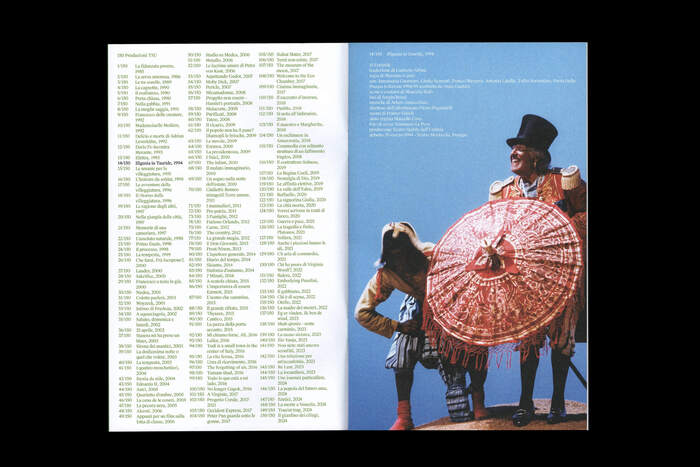
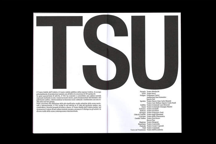
The Teatro Stabile dell’Umbria (TSU) is a public theater institution in the Umbria region of Italy, officially recognized by the Ministry of Culture as a teatro di rilevante interesse culturale (“theater of significant cultural interest)”. Established in the mid 1980s, the TSU has produced over a hundred theatrical works, both regionally and beyond, in collaboration with many prominent directors. It operates across many of Umbria’s historical theaters, promoting theater and dance, supporting both national and international artists, and contributing significantly to the cultural life of the region.
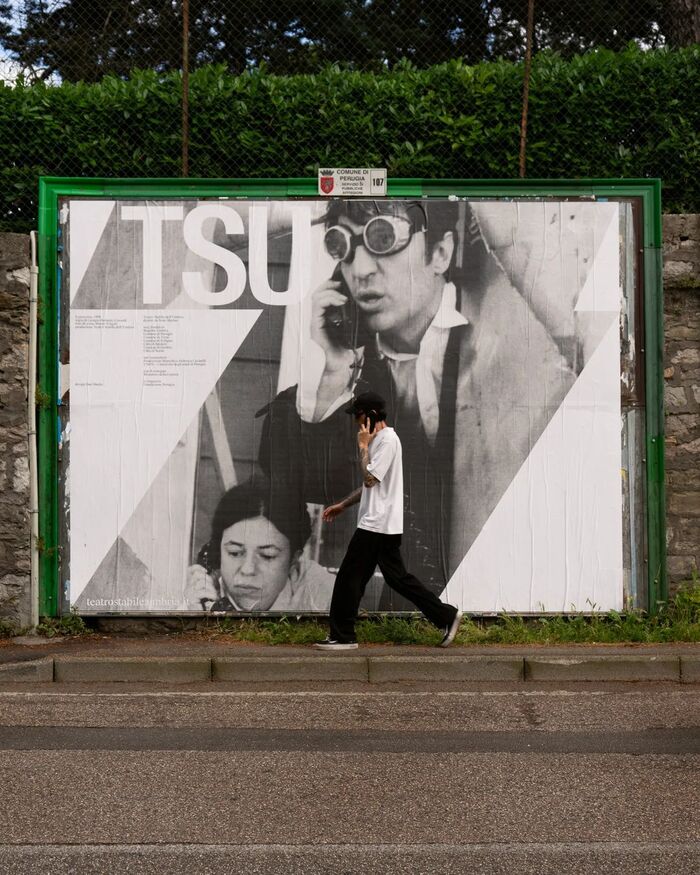
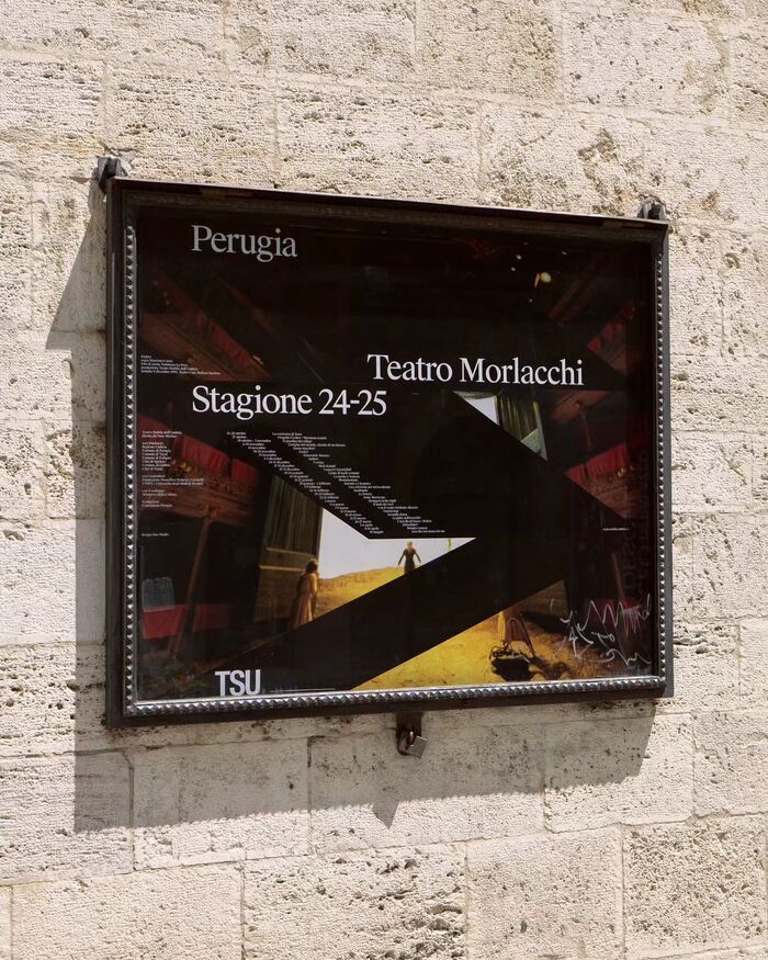
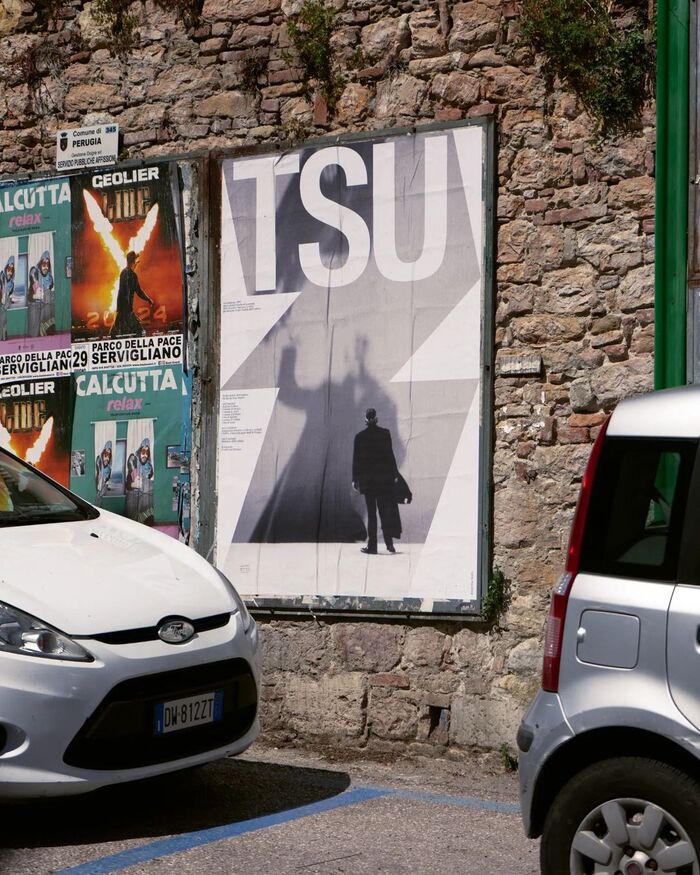
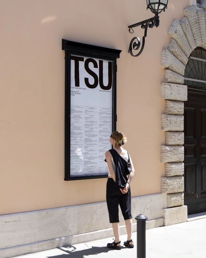
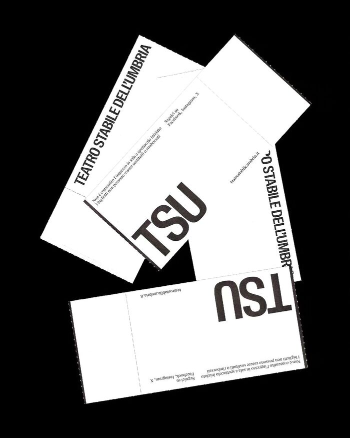
In 2024, the Teatro Stabile dell’Umbria introduced a new visual identity to mark the milestone of its 150th production and to project a more contemporary, dynamic image of the institution. Designed by Due Studio, the rebranding was applied across posters, billboards, tickets, and other materials. A key feature of the project was the use of photographs from TSU’s historical archive, reinterpreted through a bold and flexible graphic system that highlights the theatre’s dual role as both pillar of cultural heritage and a space of ongoing innovation.
From Due Studio’s website:
The new visual identity of Teatro Stabile dell'Umbria for the 2024-2025 season celebrates the 150 TSU theatre productions with a bold and contemporary design. A geometric and dynamic system that evokes the theatre wings, both container and mask for the images of the productions from the historical archive of the TSU and the typography. A versatile visual system that reflects dynamism and innovation.
One element of this new identity is the adoption of Suisse Int’l Condensed and Suisse Works, whose clarity and flexibility support the dynamic system of shapes and imagery. These typefaces not only provide a strong visual backbone for the 2024–2025 season but are also adopted in the 2025–2026 campaign, where they are paired with a striking fluorescent green. This continuity strengthens TSU’s refreshed identity, while the bold new color highlights the launch of a new season of productions, all within a contemporary brand language that continues to evolve.
Source: www.instagram.com © Due Studio. License: All Rights Reserved.
Source: www.instagram.com © Due Studio. License: All Rights Reserved.
Source: www.instagram.com © Due Studio. License: All Rights Reserved.
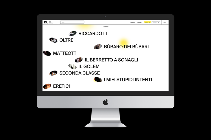
Photo: Swiss Typefaces. License: All Rights Reserved.
Source: www.due-studio.com © Due Studio. License: All Rights Reserved.
Source: www.due-studio.com © Due Studio. License: All Rights Reserved.
Source: www.due-studio.com © Due Studio. License: All Rights Reserved.
Source: www.due-studio.com © Due Studio. License: All Rights Reserved.
Source: www.due-studio.com © Due Studio. License: All Rights Reserved.
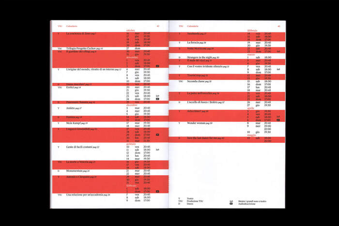
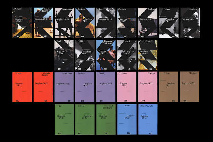
Fourteen booklets were designed for the 2024-2025 season.
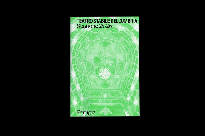
Photo: Swiss Typefaces. License: All Rights Reserved.
Photo: Swiss Typefaces. License: All Rights Reserved.
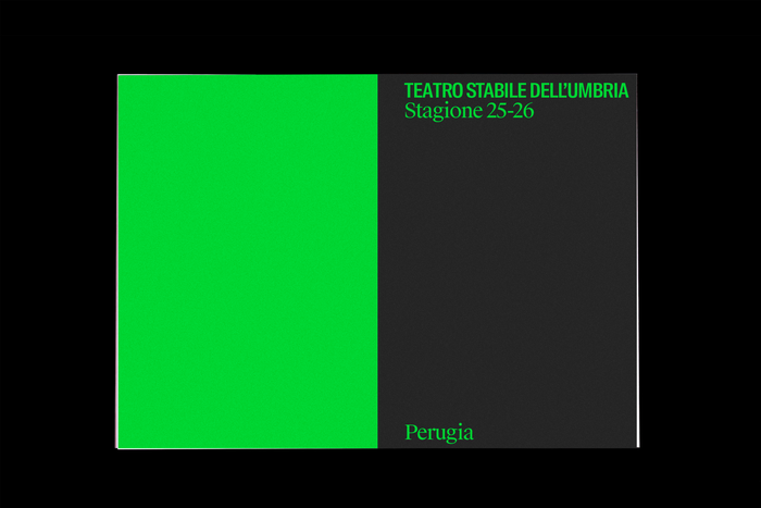
Photo: Swiss Typefaces. License: All Rights Reserved.
This post was originally published at Fonts In Use