PAPIER, in Bausch und Bogen exhibition at Turm 9 – Stadtmuseum Leonding
Source: alwaysinbetween.com Hanna Priemetzhofer. License: All Rights Reserved.

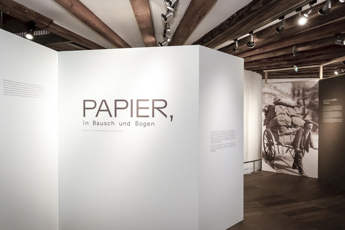
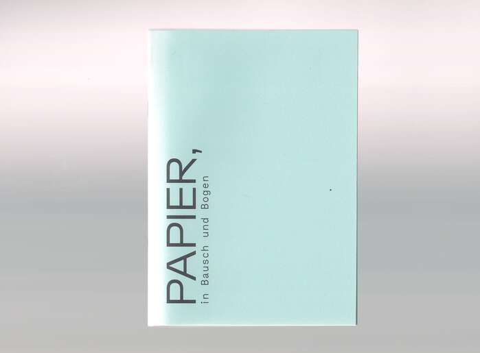
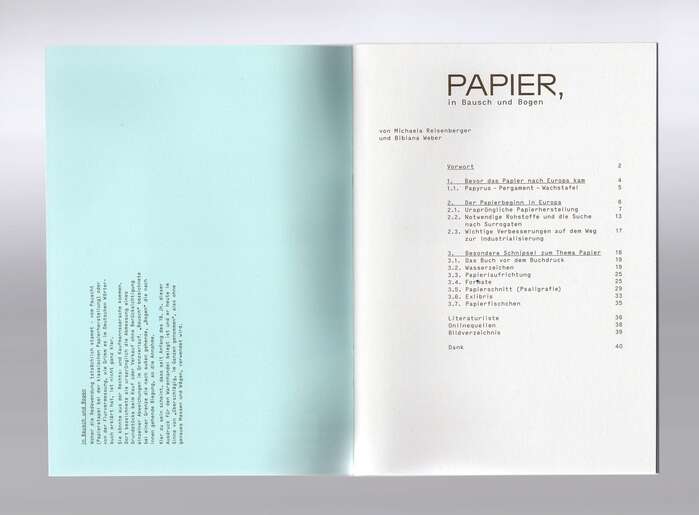
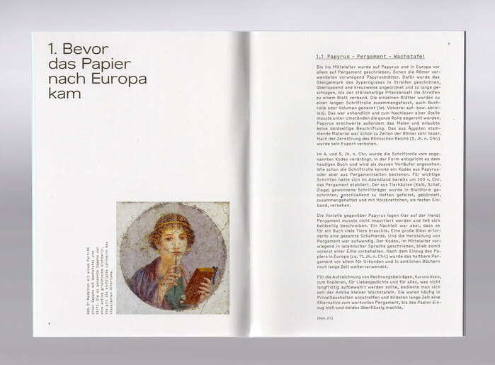
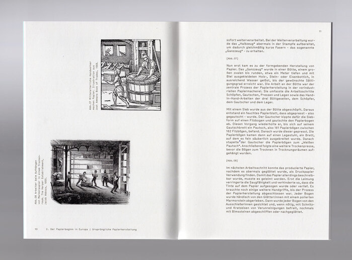
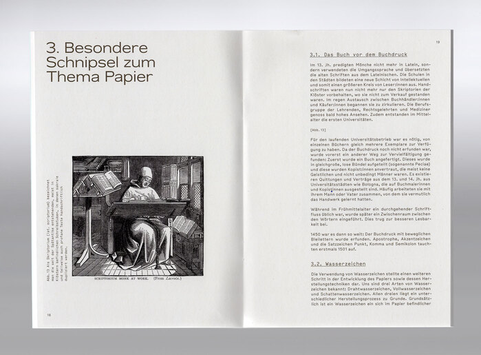
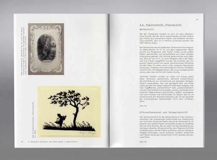
For the thematic exhibition PAPIER, in Bausch und Bogen (“Paper, in all its forms”) at Turm 9 – Stadtmuseum Leonding, the typefaces Bolivia and Bull-5 Mono were combined. Bolivia, used for primary headings, offers clean, geometric shapes that lend structure and calm clarity, guiding visitors through the interactive narrative of paper from its medieval beginnings to contemporary artworks. Its open letterforms ensure legibility on wall text and printed guides alike.
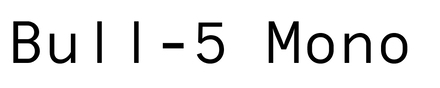
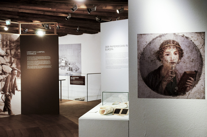
Complementing Bolivia, Bull‑5 anchors the secondary information and captions. Its firm, monospaced voice introduces a subtle rhythm that grounds the more geometric headings. Together, the two typefaces create a balanced layout: Bolivia frames large graphic elements, while Bull‑5 defines detail blocks, ensuring text feels integrated yet distinct from the visual flow of the exhibition.
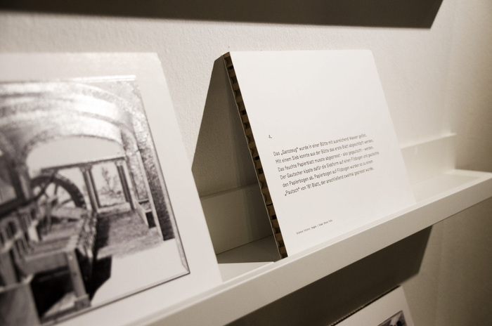
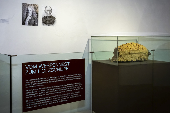
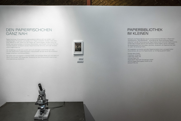
Typeface usage is consistent across wall panels, printed materials, and digital signage, supporting a cohesive visitor experience from entrance to curated displays.
Source: alwaysinbetween.com Hanna Priemetzhofer. License: All Rights Reserved.
Source: alwaysinbetween.com Hanna Priemetzhofer. License: All Rights Reserved.
Source: alwaysinbetween.com Hanna Priemetzhofer. License: All Rights Reserved.
Source: alwaysinbetween.com Hanna Priemetzhofer. License: All Rights Reserved.
Source: alwaysinbetween.com Hanna Priemetzhofer. License: All Rights Reserved.
Source: alwaysinbetween.com Hanna Priemetzhofer. License: All Rights Reserved.
Source: alwaysinbetween.com Hanna Priemetzhofer. License: All Rights Reserved.
Source: alwaysinbetween.com Hanna Priemetzhofer. License: All Rights Reserved.
Source: alwaysinbetween.com Hanna Priemetzhofer. License: All Rights Reserved.
Source: alwaysinbetween.com Hanna Priemetzhofer. License: All Rights Reserved.
Source: alwaysinbetween.com Hanna Priemetzhofer. License: All Rights Reserved.
This post was originally published at Fonts In Use