Cleo y Teo restaurant
Published November 5, 2025
By FontsInUse
Contributed by Adam Ladd
Source: www.behance.net © Moises Visuals. License: All Rights Reserved.


Source: www.behance.net License: All Rights Reserved.

Source: www.behance.net License: All Rights Reserved.

Source: www.behance.net License: All Rights Reserved.

Source: www.behance.net License: All Rights Reserved.
This post was originally published at Fonts In Use
Source: www.behance.net © Moises Visuals. License: All Rights Reserved.
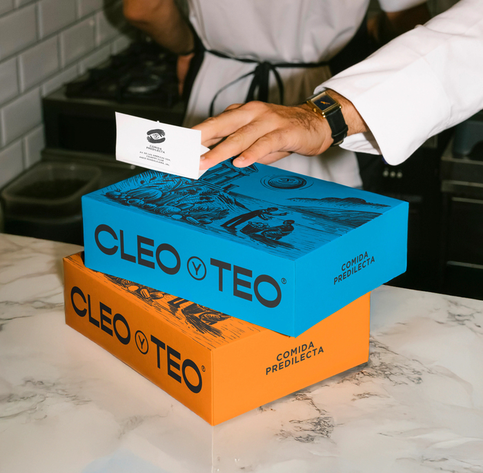
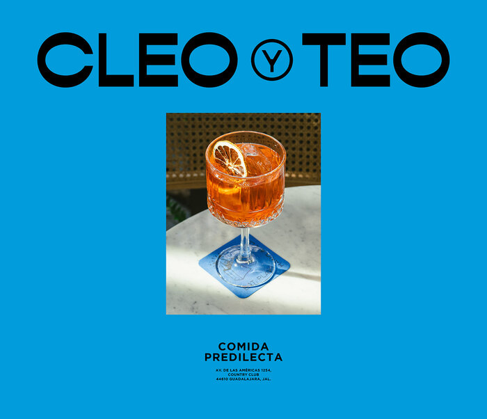
In Guadalajara, brand designer Moises Visuals created a bright, modern identity for Cleo y Teo, a local restaurant celebrating the flavors of the Mediterranean. The illustrations are unfussy and playful, setting an approachable tone that pairs naturally with the typography: Gopher, a reverse-contrast modern typeface from Adam Ladd Design, appears in the logotype and large headings, while Gotham from Hoefler & Co. brings structure and clarity to supporting text.
The result feels open and joyful – minimal without being sterile. Each element works in harmony to express the restaurant’s welcoming spirit and contemporary take on, as they say, “comida predilecta” (favorite food).
See the full project on Behance.
Source: www.behance.net License: All Rights Reserved.
Source: www.behance.net License: All Rights Reserved.
Source: www.behance.net License: All Rights Reserved.
Source: www.behance.net License: All Rights Reserved.
This post was originally published at Fonts In Use
Read full story.
WRITTEN BY
FontsInUse
An independent archive of typography.