Martin Romanella website
Published November 4, 2025
By FontsInUse
Contributed by Store Norske Skriftkompani

Source: martinromanella.com License: All Rights Reserved.


Source: martinromanella.com License: All Rights Reserved.

Source: martinromanella.com License: All Rights Reserved.

Source: martinromanella.com License: All Rights Reserved.

Source: martinromanella.com License: All Rights Reserved.

Source: martinromanella.com License: All Rights Reserved.
Source: martinromanella.com License: All Rights Reserved.
Source: martinromanella.com License: All Rights Reserved.
This post was originally published at Fonts In Use
Source: martinromanella.com License: All Rights Reserved.
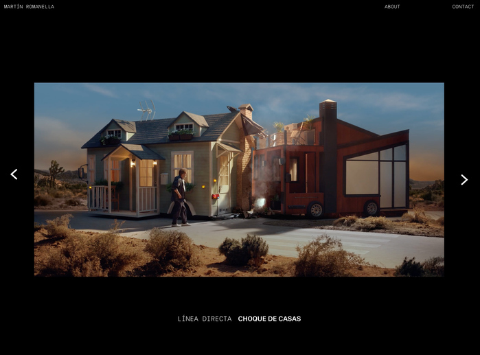
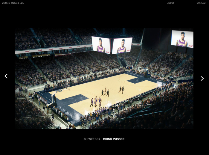
The newly redesigned website of director Martin Romanella is a finely tuned stage for his cinematic vision—a digital space where typography, like his filmmaking, strikes a balance between precision and expressive flair. This relaunch features two Skriftkompani typefaces: Store Norske Ja Mono and Store Norske Jazz, underscoring Romanella’s commitment to storytelling through form and function.
The website features the Light cut of Store Norske Ja Mono and the Medium cut of Store Norske Jazz, an unusual and interesting pairing that immediately draws attention. Ja Mono brings clarity and order, reflecting Romanella’s disciplined approach, while Jazz adds warmth and improvisational energy, echoing the emotional range in his work.
Source: martinromanella.com License: All Rights Reserved.
Source: martinromanella.com License: All Rights Reserved.
Source: martinromanella.com License: All Rights Reserved.
Source: martinromanella.com License: All Rights Reserved.
Source: martinromanella.com License: All Rights Reserved.
Source: martinromanella.com License: All Rights Reserved.
Source: martinromanella.com License: All Rights Reserved.
This post was originally published at Fonts In Use
Read full story.
WRITTEN BY
FontsInUse
An independent archive of typography.